In this second tutorial, we will build the letter M in the style of a folding ribbon using Adobe Illustrator
Welcome to the second installment in our new series where we help you create unique typographic designs in Illustrator. In this episode, Martin is going to make the letter M in the style of a fun and floaty, folding ribbon!
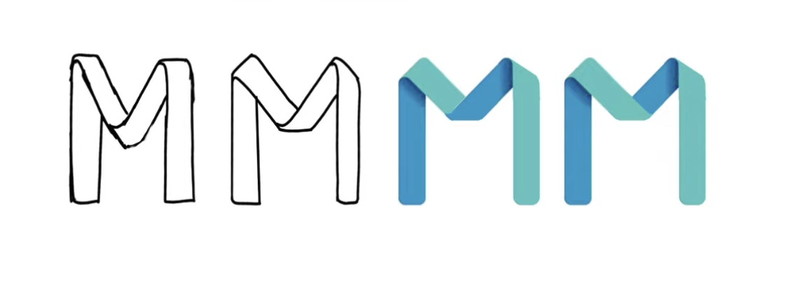
Here is an overview of the design process!
Start with sketches
As we know from the first episode, it’s best to start working with sketches. In this instance, Martin began working in Procreate, then further refined in Photoshop, before creating the final artwork in Illustrator. It can be quicker and easier to start in Photoshop but working in Illustrator keeps everything completely vectorised, giving you the massive benefit of being able to amend everything at any point.
Check out the video where Martin explains what everyday household object he used to understand better how ribbons twist and turn – it might surprise you! He also gives his insight into the decision process he used to come up with the final design.
Create a vector illustration
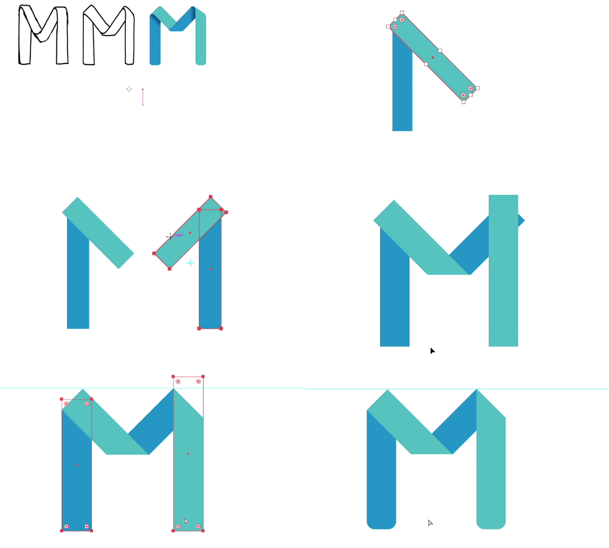
Make sure you watch the video as Martin takes you step by step through creating the vector illustration. He uses the rectangle tool to draw the shapes that make up the letter, he also explains how to use the transform options to alter the angles of the shapes, and the eyedropper tool to sample colors used in the sketch. If you find that the eyedropper tool doesn’t pick up colors from raster images, Martin also shows you the settings you need to have set up.

Use an opacity mask
When using a clipping mask, you have to define the areas you want to keep visible. In this example, an opacity mask works best as there are fewer details to remain visible than parts to hide.
You can easily apply an opacity mask to a group by selecting all the shapes, making it a group (Cmd/Ctrl+G) and clicking Make Mask in the transparency panel. By default, it applies a black mask that hides everything, but by clicking on Clip in the transparency panel, this changes to white and instead shows everything.
It’s helpful to keep the transparency panel always visible and close to the layers panel as you need to keep an eye on these two panels at all times to avoid making mistakes. It’s also important to regularly switch back and forth between the object view and the mask view (by clicking on the two thumbnails).

Are you interested in becoming a Graphic Designer or Illustrator?
Join 10,000+ creatives and subscribe to our FREE Graphic Design Survival Kit newsletter.
You’ll get instant access to our resource library and feel well equipped to make that next big leap in your design career.
You’re definitely going to want to check out the video for the next part as Martin shows you how to use additional elements to create the realistic ribbon folds. Setting up folds and corners is quite fiddly, but the benefit of working non-destructively is you can go back and make changes at any time. Follow along with Martin to get a great understanding of how to turn sharp corners into smooth folds.
Add shading
Shading helps to create a 3D illusion of the ribbon folding. Watch Martin as he explains how to copy the shapes you want to shade, and use the shape builder tool to merge the shapes into a single path. Once you apply the gradient to this new shape, you can easily adjust the angle and length of the gradient to get the effect you want. Using the eyedropper tool allows you to repeat this process on other shapes quickly.
Conclusion
Although some of these steps are quite involved, keeping everything as vectors mean that you aren’t deleting anything and you can make any changes in the future quickly and easily. We think you’ll agree that the final effect is pretty impressive and well worth the effort.
UP NEXT
Learn to build the letter P from two intertwining tubes using Adobe Illustrator!


