Justification vs Alignment
Graphic Designers often need to communicate a message predominantly by using text in their design. How you place your text will play a massive difference in your design and overall readability!
This post will discuss the pros and cons of using Justification and Alignment text and share some simple tips to make your copy look great while improving readability.
Be sure to watch for the full tutorial for clarity!
Which to choose?
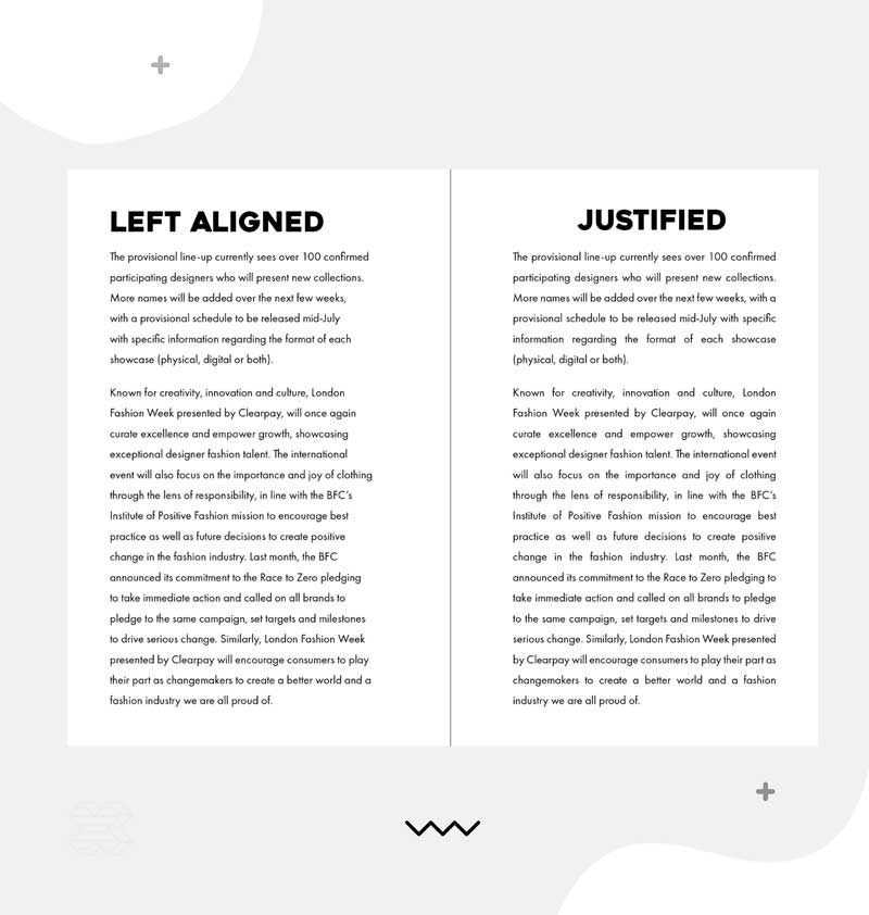
Justified text has a unified line length created by increasing the spacing between the words. While the structured shape of justified text can initially look neater (with hard edges on both sides as opposed to the soft edge of left-aligned text), it can lead to unpleasant rivers (or gaps), which can cause the design to be more disorganised.
The job of a graphic designer is to create functional, aesthetically pleasing designs. Readability is one of the essential functions of designs containing text. Left-aligned text can be easier to read due to the varying line length, which helps the reader track where they are.
Tips for using Justification!
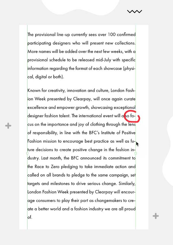
Example of Hyphenation!
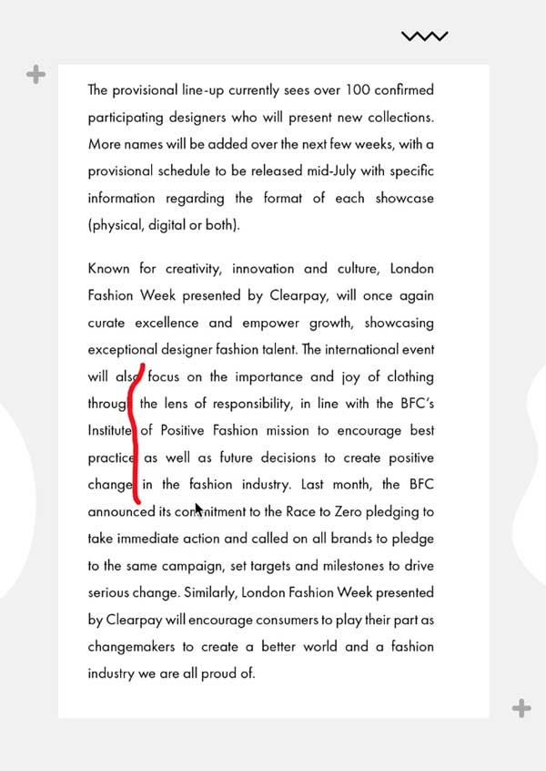
Example of Rivers (gaps)
Hyphenation
Lots of creatives stay clear from Hyphenation as it can create short sections of words at the start or end of lines; however, used with the proper settings, Hyphenation can be a great tool to explore.
You can add Hyphenation by using the shortcut Cmd+Opt+Shift+H or Ctrl+Alt+Shift+H, which will usually improve the spacing between words but can introduce other issues
You can resolve these issues by going to the additional options within the Type tool and choosing Hyphenation.
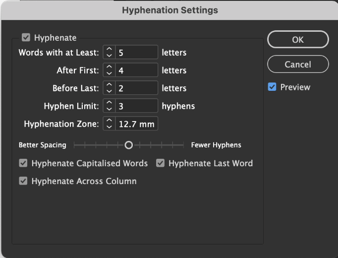
In this dialogue box, you can alter how long a word must be to allow it to be hyphenated, the minimum number of letters at the start or end of a line, and even control whether you would like to see better spacing or fewer hyphens.
Optical Margin Alignment
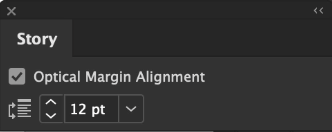
This is a very subtle effect but helps make the text's edge even straighter by aligning the hyphens with the outside of the text frame. You can turn it on from the Window menu, under Type & Tables, then the Story panel.
Justification Settings
By going to the additional options within the Type tool, you can choose Justification, and just by tweaking these settings slightly, you can significantly improve the quality of the text.
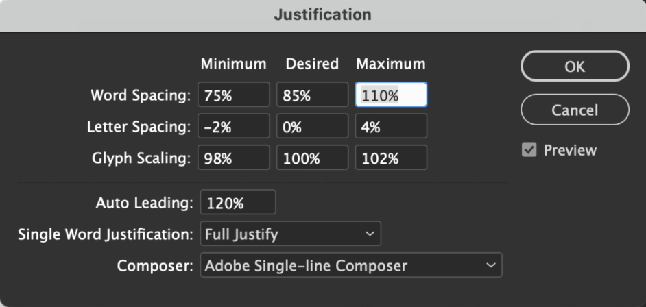
Word Spacing – making tweaks here can help avoid massive gaps and keep the spacing tighter.
Letter spacing – by default, InDesign doesn't allow letter spacing; however, some minor tweaks can help remove gaps and potentially reduce the number of lines in the text frame.
Glyph Scaling – again, by default, the characters are not set to scale up or down but introducing a tiny amount of tolerance can further improve the appearance of the text.
Composer Settings - The default setting will be Adobe Paragraph Composer, which is usually fine. However, if you work with small amounts of text and want better control over keeping certain words on one line, you can change this to Adobe Single-line Composer. Then when adding a soft break (Shift+Enter), only the following line changes, rather than the whole text frame being affected.
Tips for using Alignment
There are a couple of ways to improve the quality of text when using
left or right Alignment.
Hyphenation
Generally, left or right-aligned text does not need hyphens unless you have a very narrow line length to help make the edge less ragged.
Balance Ragged Lines
You can create a slightly more refined edge by choosing Balance Ragged Lines (from additional options within the Type tool).
Be sure to watch for the full tutorial for clarity!
Conclusion
As a general rule, Justification is great when you have a lot of text to condense into close columns; Justification helps create imaginary boundaries between the columns. However, if you have more space between columns, using left-aligned text can help with the readability.
Don't restrict yourself to always using one – have the confidence to see what works best for different designs.
Want to learn more?
Check out the following tutorials on improving your Typography skills!


