In our latest tutorial on YouTube, Martin explores a technique to create an optical illusion with individual letters. When you work with letters and Typography in this way, you are creating imagery by manipulating type. You can check out the full technique in the video below:
Inspired by the theme of this video, I will introduce you to some successful Designers who use Typography as image in their work. I've included a combination of well-known industry leaders and designers/artists who make a living doing this full-time. All of these people are able to communicate ideas, feelings and style through manipulating Typography. There's loads we can learn from their work and process. Ready to jump in?
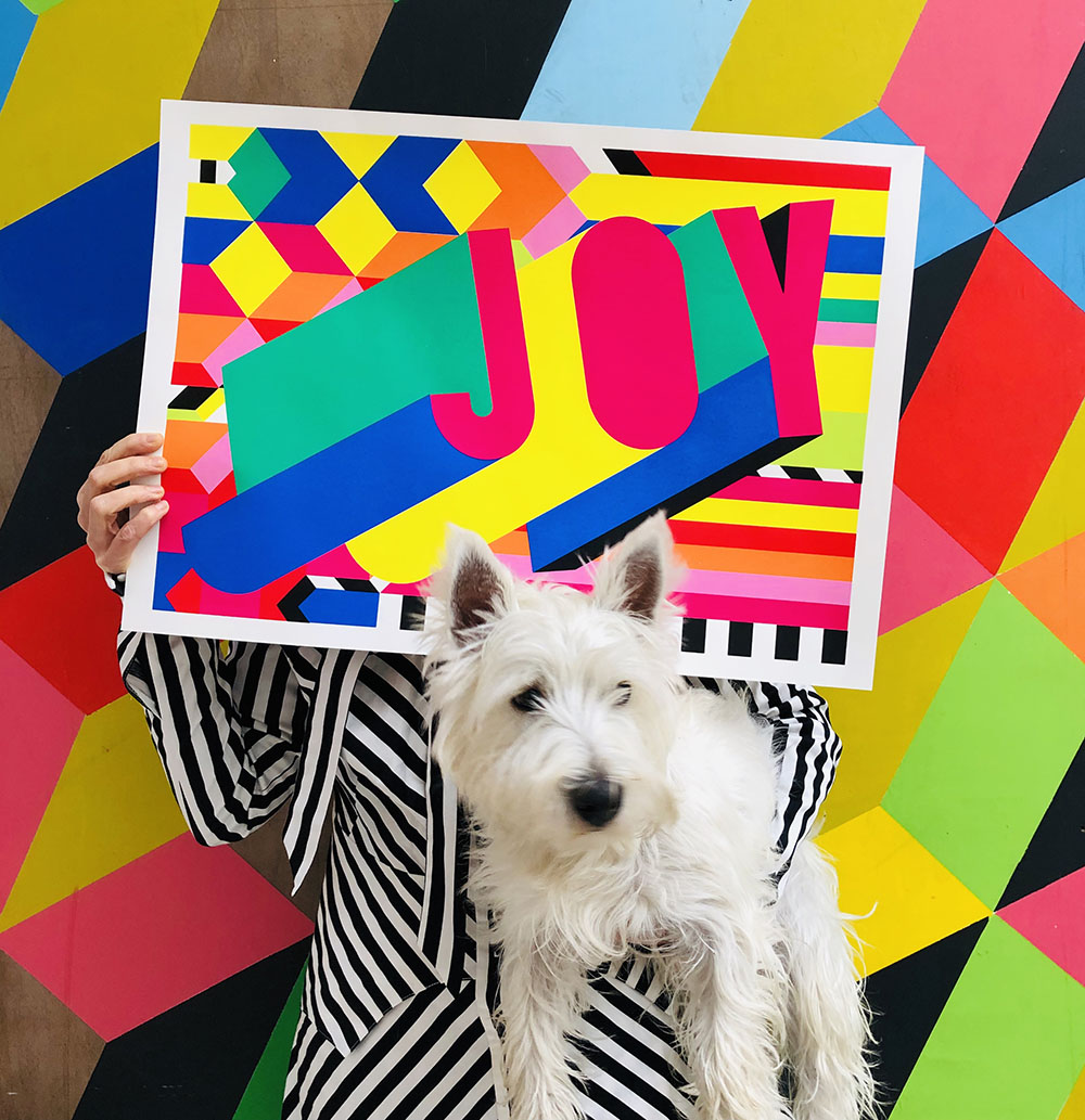
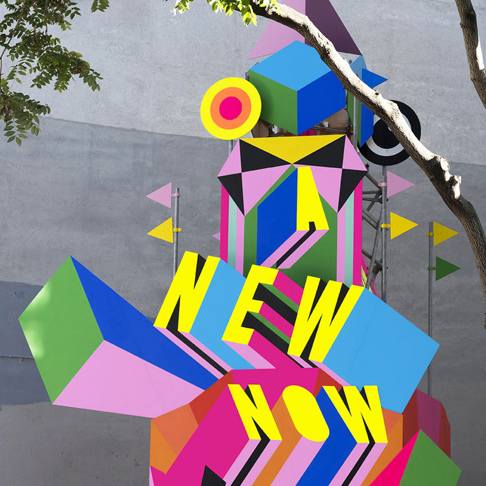
Morag Myerscough is a London Based Artist and Designer her work is known for its bold, colourful and attention-grabbing style. Sh works on large scale installations and exhibitions and is also available to hire for commercial projects. These include renovating spaces like bars and coffee shops (pretty popular with the hipsters).
Her work focuses on making positive environments which encourage visitors to feel happy, energised and lifted. We are going to take a look at the way she uses Typography to achieve this aim.
Here bold and blocky words stand out against the bright background colours used in Morag's work. Adding dramatic drop shadows makes it look like the Typography itself is in motion. It shoots upwards to reinforce the positive message of the words. Playing with depth, composition and contrast gives this work extraordinary energy.
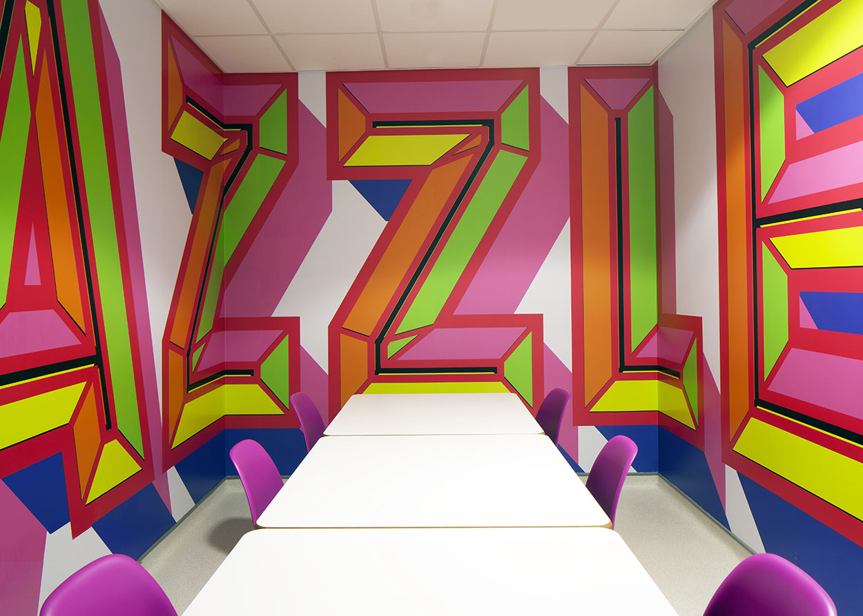
This is a great example of how Morag Mysercough can use Typography to transform a space from ordinary too extraordinary. The use of colour, style and scale creates an immersive effect for people who enter this room, leaving them feeling dazzled.
Anu Manohar - Futuristic Effects
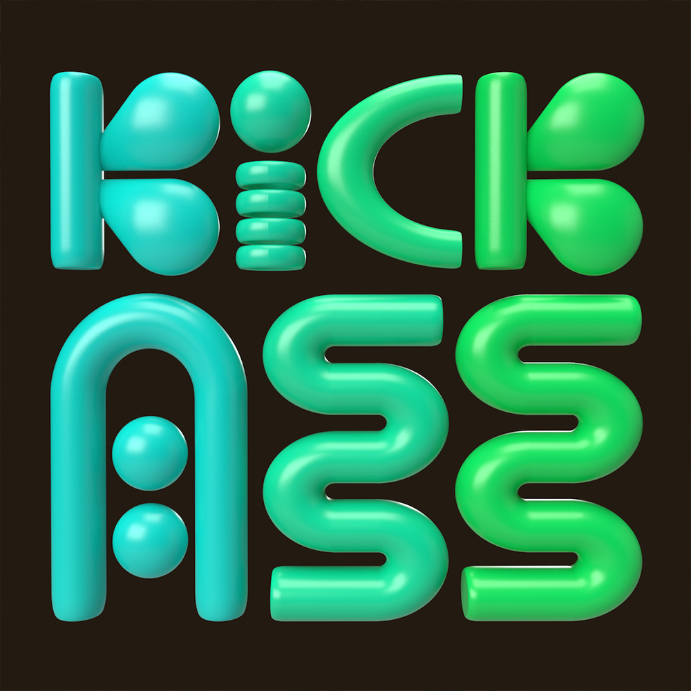
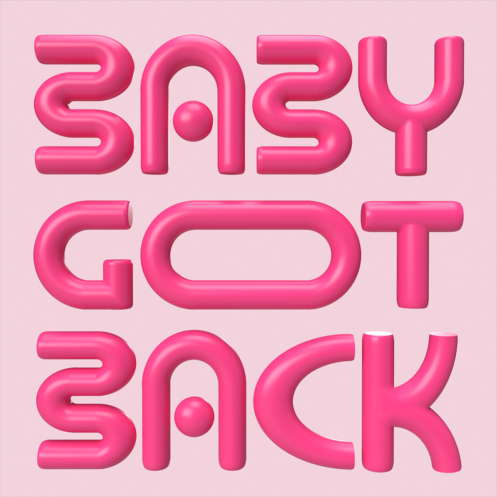
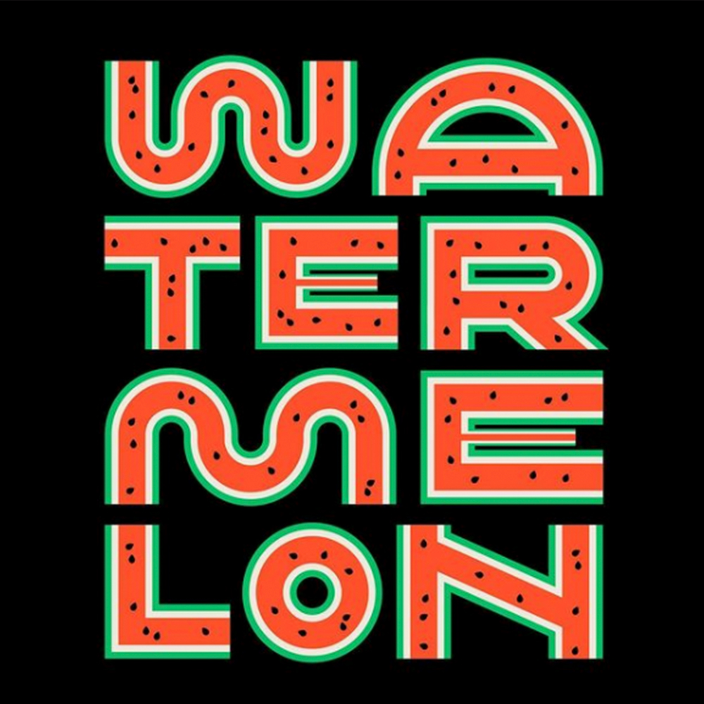
We are switching up styles with this next feature. Anu Manohar is a Visual Designer based in Bangalore, India. I discovered her Typography through Femme Type late last year and love the way she distorts letterforms. She manipulates the traditional shape and structure of letters to make them more unique. She also works to fit type together in beautiful ways in her compositions. Anu has said her typographic work is more about creating a scene or experience for a viewer.
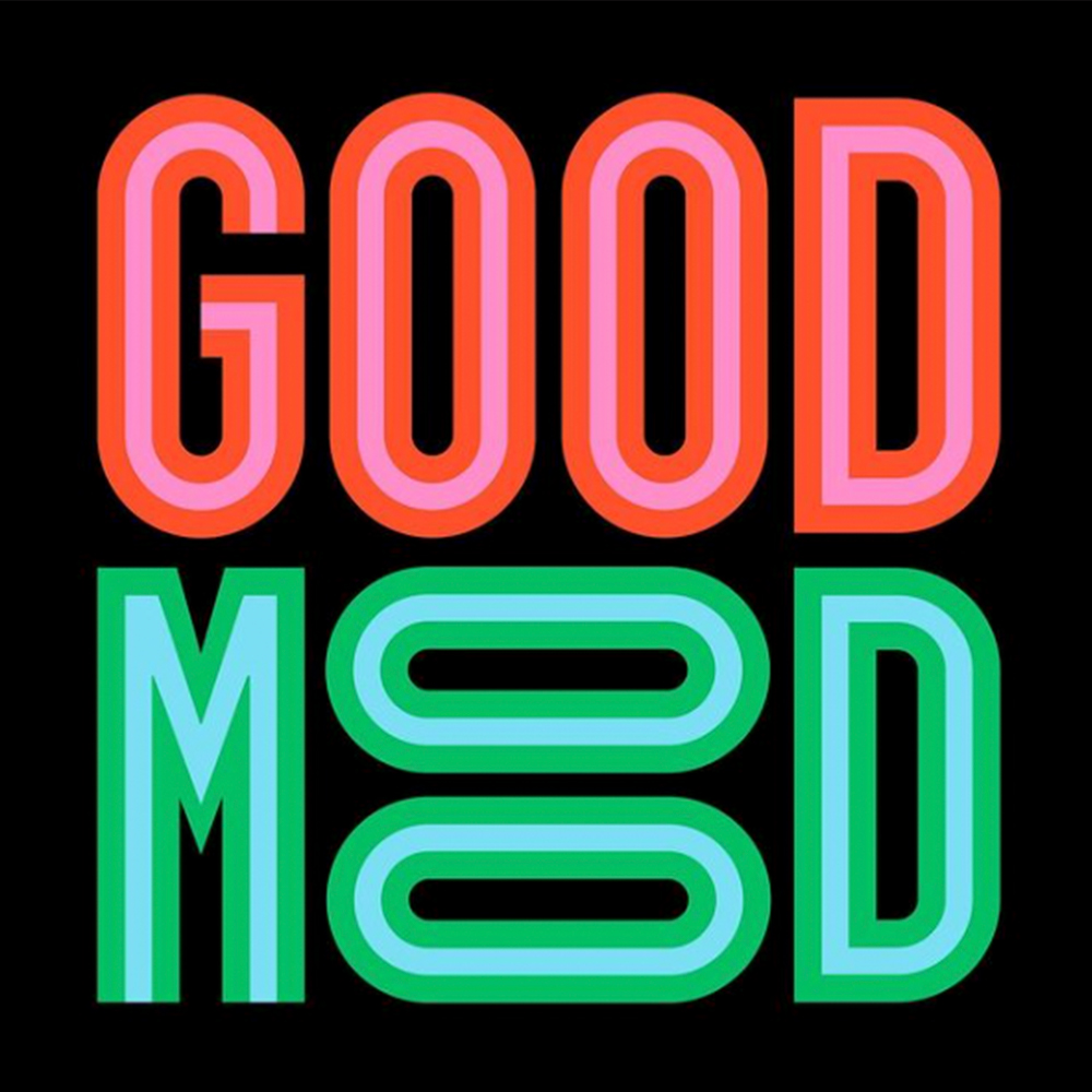
She specialises in Branding, Typography and 3D Design and to create the 3D Designs she works in Adobe Dimension. Her work is a perfect example of how you can reimagine they way letters look. She loosely uses letterforms but recreates them in her own style. Doing this means the compositions can be more relaxed and playful because the letters are less structured.
My favourite image in this collection is the image on the right. By flipping the O's in 'mood' Anu was able to add a sneaky smily face into the work. This shows that you don't necessarily need illustration to create an image or communicate a message.
Anthony Burrill - Rigid Typography
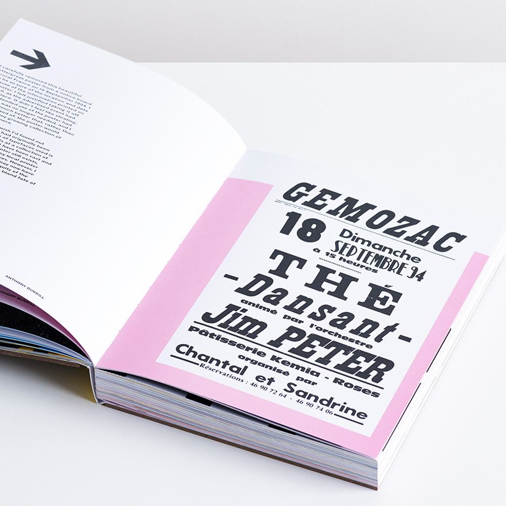
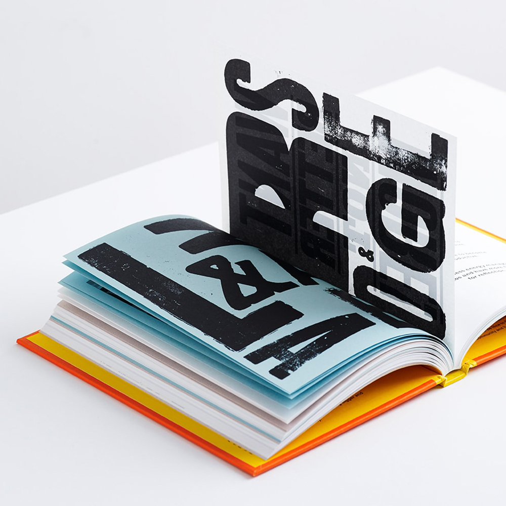
Burrill is a well-known designer who made a name for himself using bold, minimal and traditional letters and shapes. He creates beautiful, typography-based posters packed full of meaning and advice. He works with Letter Press which is an older, manual printing method. I included him on this list because of his brilliant eye for composition and the upbeat nature of his work.
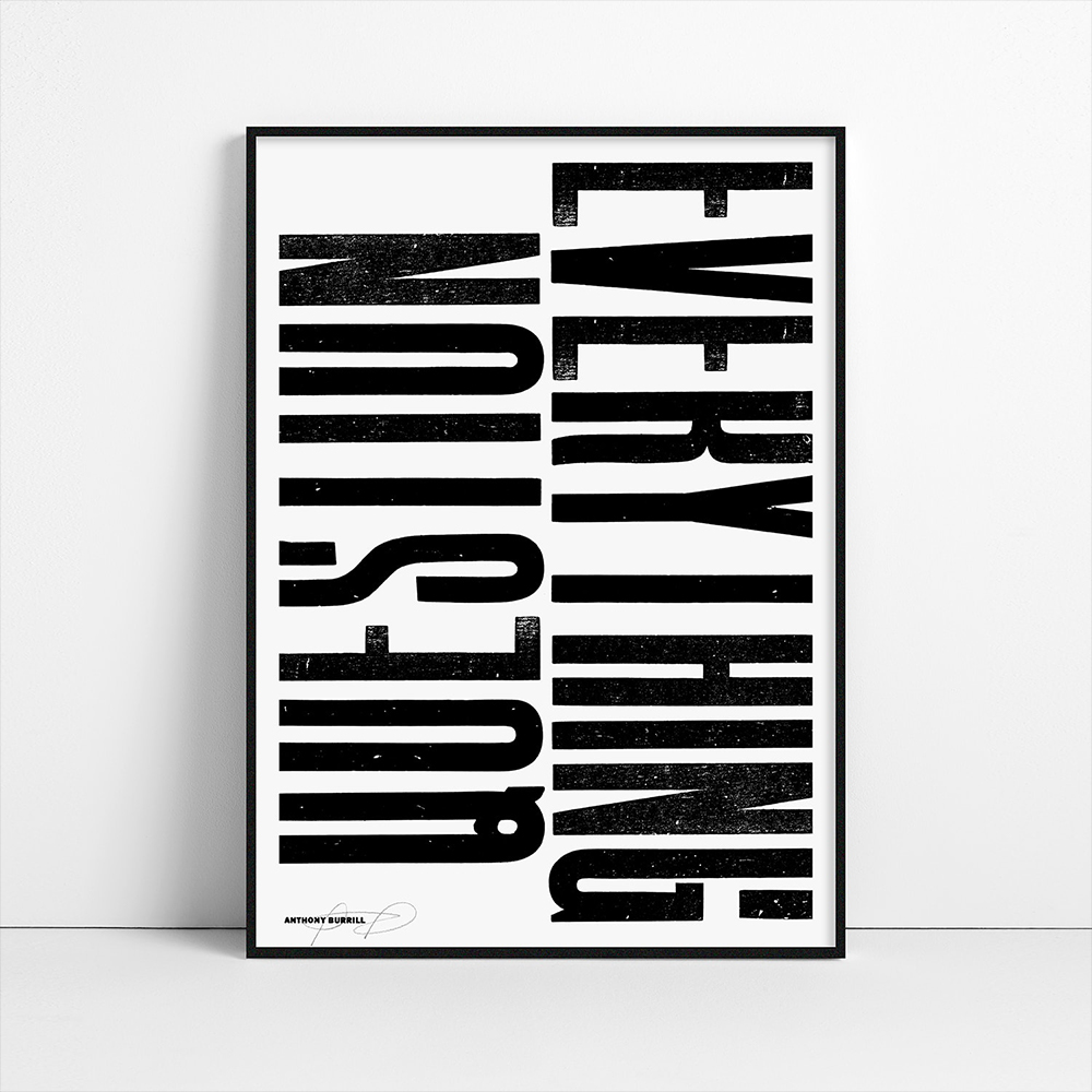
He uses letters in a very pure and through provoking way to communicate with a viewer. Let's take a look at the first two examples below. On the right, Burrill explores letters of different sizes and the way the shapes fit together on a page to create design work.
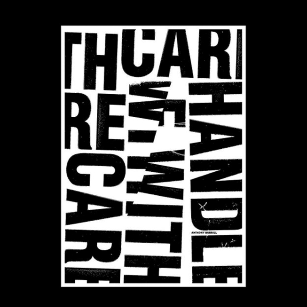
The style of his work is very minimal but very purposeful. This is also shown in the image on the left where he has created an impactful poster. It uses several typefaces with very different styles. It can be extremely hard to pair typefaces but when it is done this well it looks perfect!
In these examples there is lots of meaning behind the placement of the Typography. The left image says 'Handle With Care' yet the letters are clearly broken up this hints at a kind of irony. Or that we should prioritise taking care of ourselves more highly. While the image on the right cuts the top of all the letters used. Leaving you wondering why? Which communicates the point of the piece.
Jasmina Zornic - Fun Letterforms
Jasmina Zornic is a Graphic Designer based in Belgrade, Serbia and is another creative known for her use of bold Typography and bright colour. She also works on Branding, Packaging and Book design projects as part of her full-time design job.
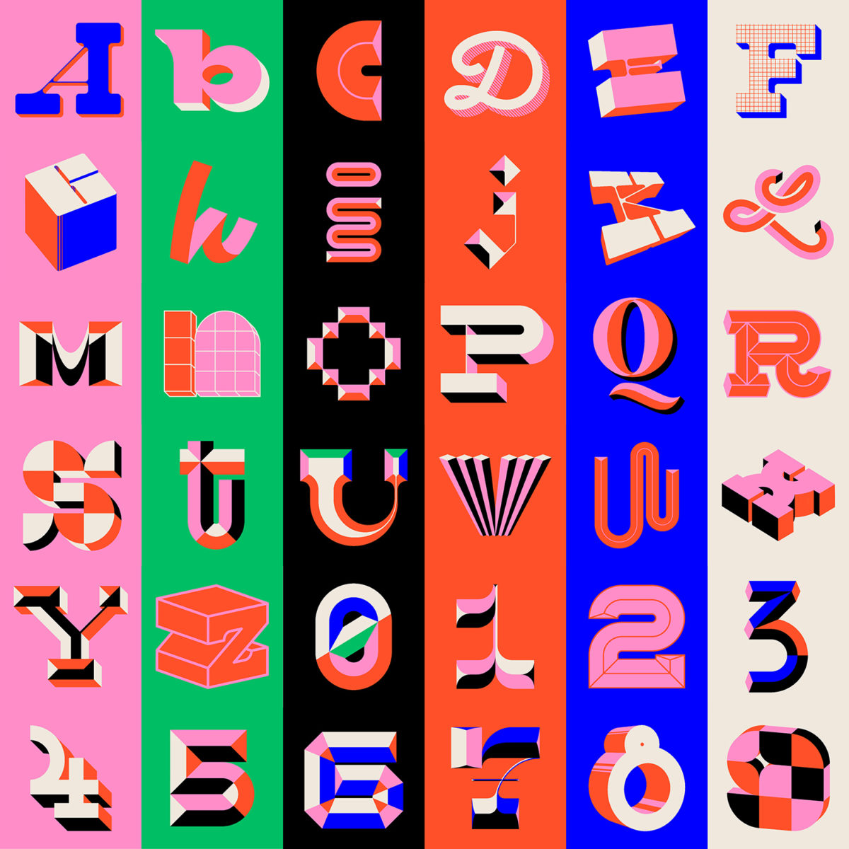
She describes the shapes of the letters she creates as expressive and finds both old packaging and signage very inspiring. When creating these compositions her process begins with a set grid within which she builds the letters. Then the fun, unique aspects come toward the end of the process.
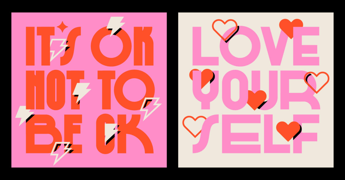
You can see the inspiration she has taken from old signage throughout her work. However she has modernised it in her own way to make something completely new and fun! Below are so many incredible examples of how you can manipulate letters to create image. Using pattern, depth, colour, perspective and shadow, spend plenty of time looking at this image.
Here I love the subtle addition of the hearts and lightning bolts and they way they interact with the Typography itself. The small details in this composition really make the work stand out.
If you love Typography and want to explore all the possibilities in Typographic design you are in luck! This is the third video in a series based solely Creative Alphabet Design. Check out the previous parts tutoials below!
Thank you for taking the time to read this blog and I hope you found it useful and inspiring!
If you want to step up your game as a Creative Professional, you can challenge yourself in our Pro Membership with individual and group project briefs - like Logo Design - and get feedback on your work. You will also have access on our entire course library to hone your skills. See the details here
UP NEXT
How to Design Typographic Posters
This post shares a collection of over 20 tutorials focusing on creating custom typography using applications such as Adobe InDesign, Illustrator and Photoshop.

