In this post we discuss why professional graphic designers always present more than one option to clients and teach you how to improve the composition and layout of your designs!
Creating more than one version doesn’t have to be incredibly time-consuming. Gaining a solid understanding of applications and design theories will allow you to create multiple designs in the time it takes others to create one!
So how do you get to that stage? Watch our latest InDesign tutorial below, where Martin takes you through an entire magazine spread design process. Starting from one design, he shows you how spending a little time and creative thinking can help explore exciting possibilities that will bring your concept to life.
If you follow along with the step-by-step process (links to the elements are in the video comments), you’ll be able to see the theories in practice and have a go yourself at some of the powerful design concepts covered.
Below, we summarise some tips and tricks you should consider to improve your design layout!
1. Start with sketches
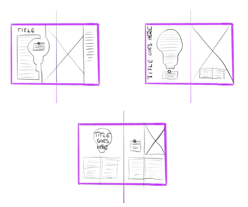
Always start with creating rough sketches of ideas you are going to develop. You’re not changing the content but considering where to place existing elements. Create a minimum of three thumbnail sketches before actually getting started creating them in the application!
2. Use Negative Space
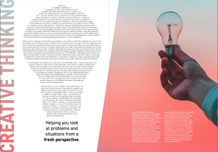
In the examples below, Martin re-purposes a small lightbulb icon to create a focal point perfect for containing the intro copy. Watch the video to learn how careful positioning and altering some simple settings can create a powerful silhouette that ties in with the subject matter and image.
3. Consider Gutter / Creep / Margins
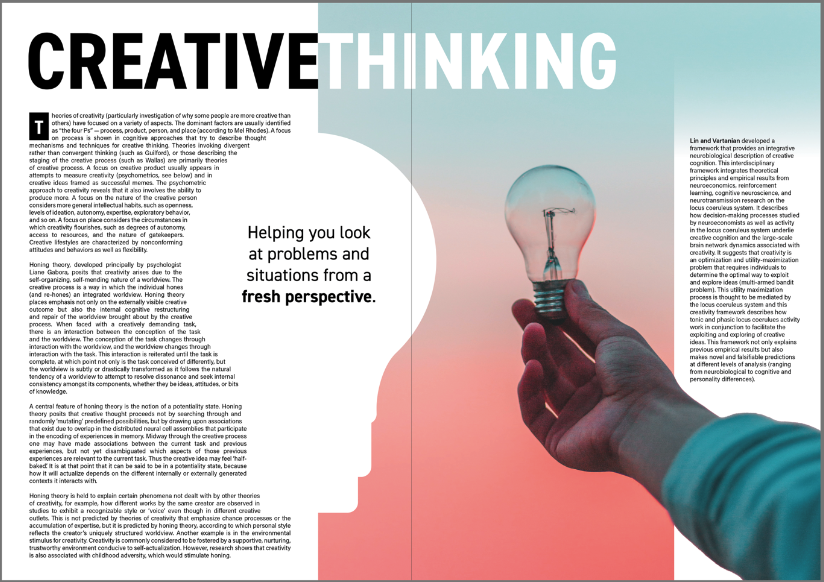
With printed materials, you can’t have copy close to the centre of the spread (known as the gutter or creep) as this is where the stitching will be, and it will become distorted and hard to read. You should also avoid having important parts of images directly in the centre of the spread.

4. Create Hierarchy
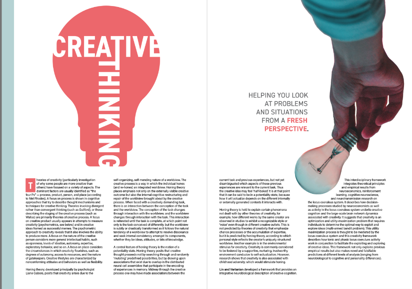
As per the example above, notice how Martin makes a statement by increasing the size of the headline, so it runs across the two-page spread. Use Kerning (Alt/Opt+Left/Right arrow) to drag the text in or out, allowing you to create custom spacing between letters/words!
5. Entry points / Drop Caps
Using a Drop Cap can help tie the headline to the body copy and create an interesting entry point for the reader!
6. Create Contrast
Contrast is important in any design as it creates visual interest and sets the pacing. This can range from simple highlighting to the use of negative space. You don’t want too many busy elements in one place, so create breathing space next to a dense area of text.
If you are using bold to highlight parts of your text and the font has multiple styling options (e.g. demi, bold etc.), don’t just go one step up, but go two so there is enough contrast between regular text and the highlighted parts.
Other considerations
Give depth to the design by having elements coming in front of a text frame!
Applying repetition creates cohesiveness, so think about repeating colours from the headline in the drop cap and highlighted parts of the intro copy.
Consider using alternating colours across the spread to create balance and rhythm, which set the visual pacing.
Don’t be afraid to place text on the edge of shapes, so they disappear into white space. Giving a visual challenge will make the composition more intriguing and engaging.
Get creative with your frames and try overlapping images across a two-page spread or use diagonal lines to help improve the integration of text and images on the page.
I hope you enjoyed this topic and feeling more confident at creating better Compostions! If you enjoyed this post, you might like the following tutorials.
Conclusion
Never just stop at creating one single design – no matter how good you think it is! Create multiple simple sketches to get ideas flowing and experiment with different compositions of the elements. You can then present several almost finalised versions to the client before making minor adjustments to the final design.
Improve your technical ability by learning shortcuts and practising, so you get proficient at using the software and tools. Understand the theory by analysing good examples and seek feedback on your work so that you can improve. We provide students with personalised feedback as part of Yes I’m a Designer’s Pro Membership!
