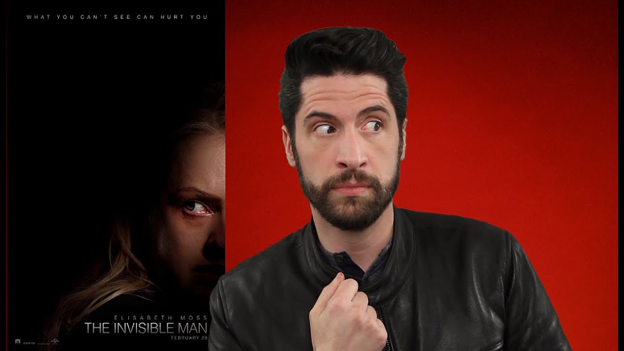
Do you create YouTube videos? Whether you plan on creating your own YouTube videos or just landed a design job that requires you to create Social Graphics, here are our tips on creating stunning YouTube Thumbnails that get clicks.
The Ultimate Guide to YouTube Thumbnails!
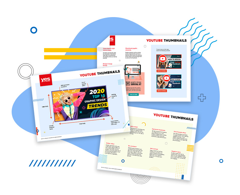
Get your hands on our FREE YouTube guide that will walk you through the do's and don't of creating engaging thumbnails that get clicks!
1.ADD BIG, ENGAGING TEXT
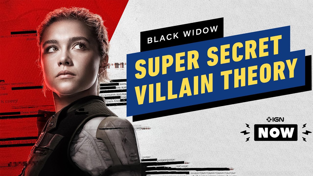
Adding readable, engaging text on your thumbnail can be very useful as many people don't often read the title of the video. Usually, users tend to scroll until they are visually attracted to a thumbnail and are most likely to click. Useful advice is to limit text and DO NOT repeat the title!
On the right is a great example of
engaging text used for the thumbnail!
Click Here to see video!
2. ADD CONTEXT
The thumbnail should describe and tell the audience what to expect in the video. Do not mislead people for the sake of clicking. You will get a lot of dislike and negative comments and unlikely to be picked up by the YouTube algorithm.
3.ADD EXPRESSIVE HEADSHOTS
Include an expressive headshot of a single person or even groups. Emotions such as being scared, shocked, angry and surprised usually work the best and captivates people to click.

Source Image
4.OUT OF BOUNDS EFFECT
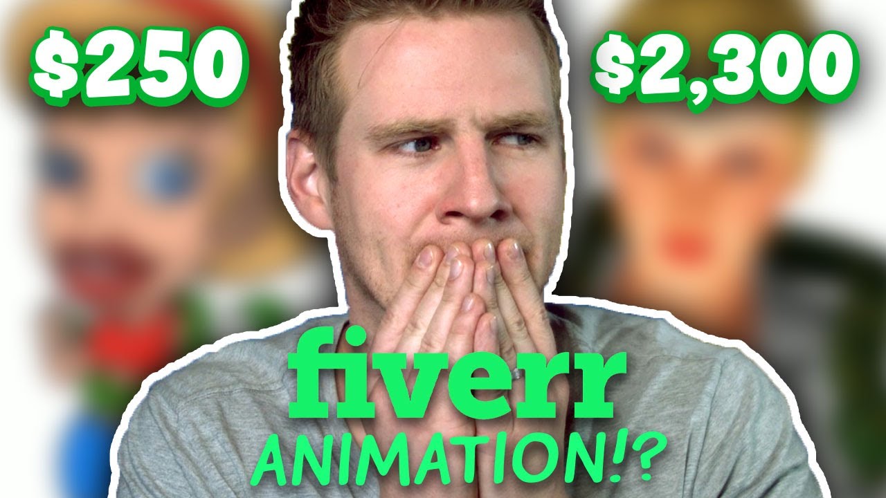
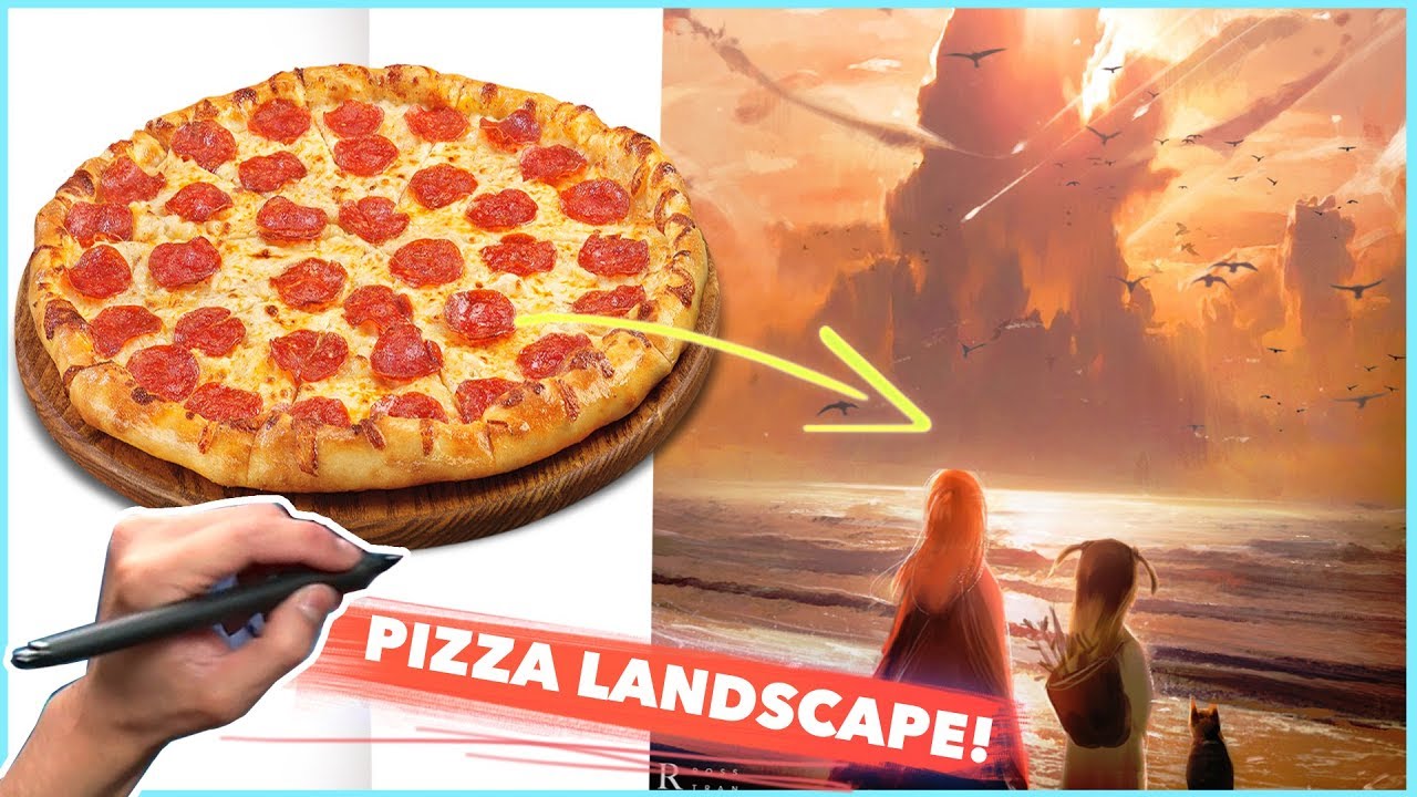
Out of Bound effect essentially is a pop-out effect style whereby one to two graphics overlaps. It is a popular design technique used by YouTubers to add depth and attract attention.
On the right is a great example by Ross Draws overlapping the Pizza image and using a stroke frame around the thumbnails to create out of bounds effect!
5. STICKER EFFECT
Another style that works well is the sticker effects where we have a thick stroke around a graphic. The sticker effect acts in a way to separate graphics from one another and create a multi-layered composition.
6.BE CONSISTENT
Experiment with different thumbnail designs when you first start your channel. However, over time analyse your thumbnails and see which one gets more clicks! By style, we mean fonts, colours, and overall layout. For best practice, be consistent with video uploads too.
7. ADD CONTRAST
Keep in mind that YouTube thumbnail is so small, so it needs to stand out immediately. Experiment with vibrance, saturation, or sharpen your graphics.
8.NEGATIVE SPACE
Avoid filling the whole canvas, allow some breathing space on your thumbnail design as too much clutter can become less engaging.
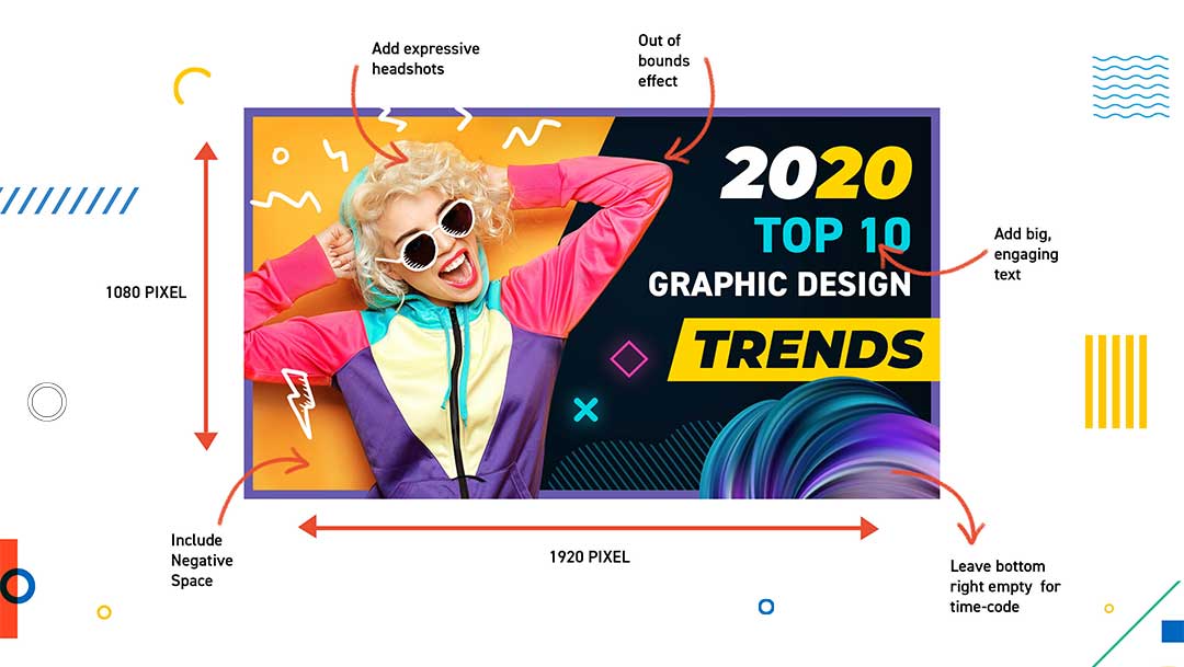
9.LEAVE BOTTOM RIGHT CORNER EMPTY
YouTube automatically adds the timecode on the bottom right. Best to avoid having any graphics here as it will be covered.
10.DESIGN IN LARGE FORMAT
Ideally, design your Thumbnails using 1920X1080 size so that the design and resolution always look sharp. (YouTube will automatically resize for web and mobile)
11.DIRECTIONAL GRAPHIC ELEMENTS
Graphic elements such as circles, arrows, diagonal lines can be an effective way to direct viewers to click on the thumbnail. Directional Graphics are heavily used for comparison videos or showing before and after content.
To learn more on this topic, watch the following tutorials!
I hope that you found those tips useful and feel inspired to create some awesome YouTube Thumbnails!
The Ultimate Guide to YouTube Thumbnails!
Get your hands on our FREE YouTube guide that will walk you through the do's and don't of creating engaging thumbnails that get clicks!

UP NEXT
Composition in Graphic Design is a vast yet complex area. Learn about various theories which will help you produce impactful/engaging work


