The most important compositional principles in graphic design
Today we will explore compositional techniques in graphic design; you will learn about design principles, design theory and in general rules to follow on your next project. Understanding composition techniques will help your artwork to be more engaging and impactful.
What makes a
composition great?
There are several things to consider, but primarily, a great designer will ensure the following in every design:
Key Term : Compositions (also referred to as Layout, Artwork, Design) means the placement or arrangement of visual elements on a blank page.
- Purposeful arrangement of elements (e.g. images, shapes, type)
- Your design should tell a story (and without needing for you to explain it)
- Visually communicate the message
- Create an impact and attract viewers attention
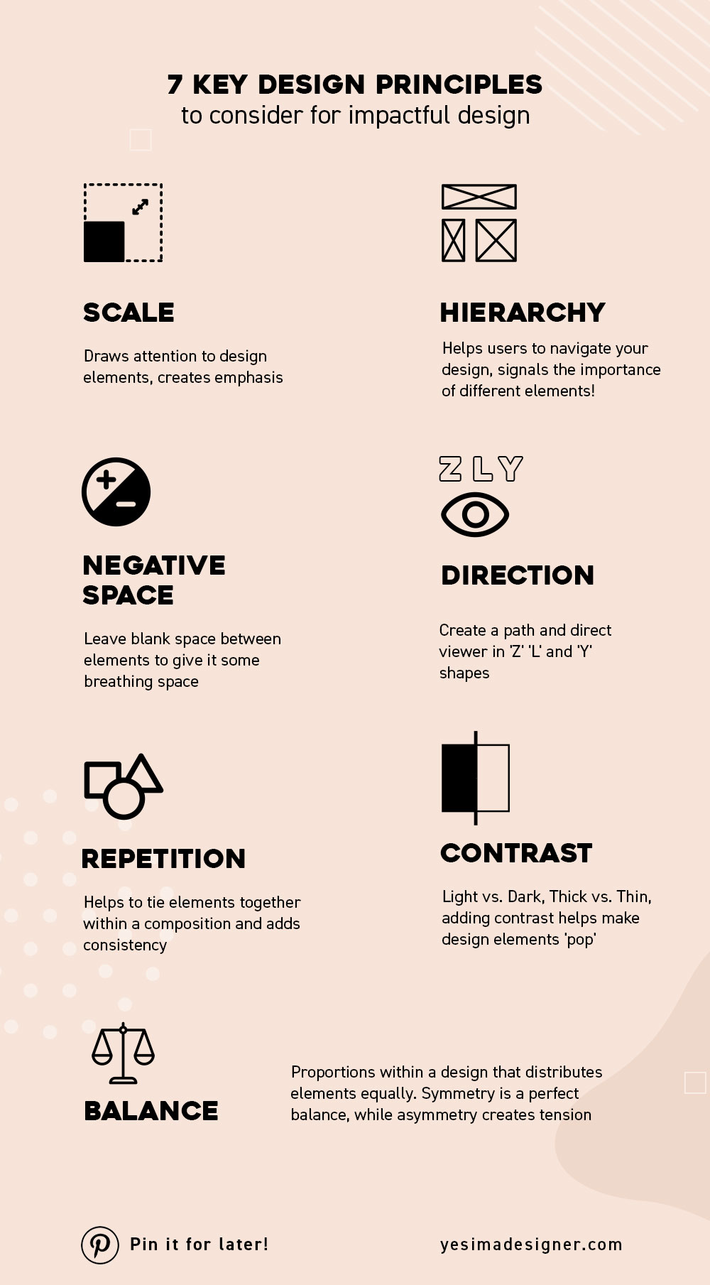
Composition: 7 Key Design Principles
There are many Design Principles to consider for a great layout. However, when starting as a graphic designer, it can be quite challenging to get your head around them. Being a self-taught designer myself, it took me a while to understand them and continuing to learn on the job.
Below we listed 7 Key Design Principle to consider for impactful design. Don't worry, your sense for design principles will improve the more you practice, and if you are lucky, some may even come to you naturally.

Do you need to apply all the Principles?
In short, no, only use some of these principles in your design. Generally, all principles work alongside each other. For instance you will need to use design elements such as colour, images and typography in combination with the design principles.
Ready to create visually engaging compositions? Watch the tutorials below!
5 Creative Layout Techniques with InDesign and Photoshop
Here you will learn 5 Creative Layout Techniques with InDesign and Photoshop. We will focus on designing eye-catching drop caps, which are the most common entry points used in magazines.
In this video you will learn 5 creative compositional techniques in Photoshop, that you can use for posters, brochures, magazines, websites, packaging and pretty much everything else.
Design Theories:
Aside from Design Principles, there are 2 Theories to consider in every compositions: Apply one, and you're guaranteed to create a beautiful layout.
Rule of Thirds
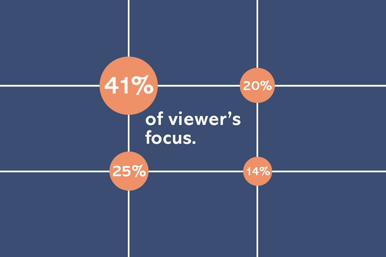
The Rule of thirds can be applied to any subject to improve the composition and balance of your images. It is one of the most useful composition techniques, acting as a guideline that helps creatives determine where to place an object or asset.

This theory is a simple, effective method of dividing your canvas/artboard into thirds both horizontally/vertically, resulting in 4 intersection points. These are the ideal spots for placing focal points within your design (top left is the most looked at by your viewers)
Using Rule of Thirds will enable you to place design elements in the right way, so the overall composition communicates the right message, is well balanced, easy to understand and looks fantastic!

The Golden Ratio

The Golden Ratio is a standard mathematical ratio found in nature to create natural-looking compositions in your design work. Sometimes it is referred to as Divine Proportions. A series of interlocked golden rectangles establish the shape of a golden spiral.


Want to know more about Composition? Watch the tutorial below! (This was a live webinar all about Compositions, it is a little dated, but the content is very relevant)
Click here to see all the examples used in this webinar .
Fantastic artists mentioned in the webinar:
10 Top Tips to Get Your Composition Right:
To conclude, there are many design rules to follow ; you don't need to follow all principles, but applying a few in your layout will ensure a successful a composition. The more you design, the better you will get to understanding the rules and even eventually breaking them.

UP NEXT
The ultimate guide to becoming a Graphic Designer


