Graphic design theory is a complicated topic as there are so many terms, elements, and principles that you need to follow which will ultimately make you a better designer. To better understand some of the most important rules, check out our latest tutorial, where we go through the 5 Golden Rules that will improve your designs!
In this tutorial, we will cover contrast, diagonals, balance, depth, and unity. Once you learn and apply these rules, we guarantee it will help your layout and enhance your designs skills!
Here is an overview of 5 Golden rules of Graphic Design!
1. Contrast
Establishing the right amount of contrast in compositions is crucial. Not only does it help viewers focus on the essential details, but it also helps to separate different elements in your designs and create depth.
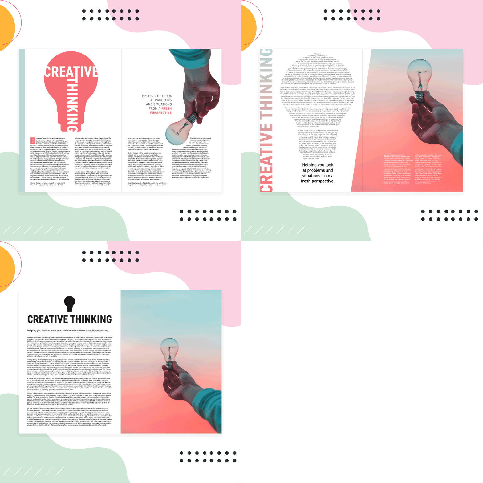
Take this Magazine Design example where we applied contrast in the color tone as well as typography.

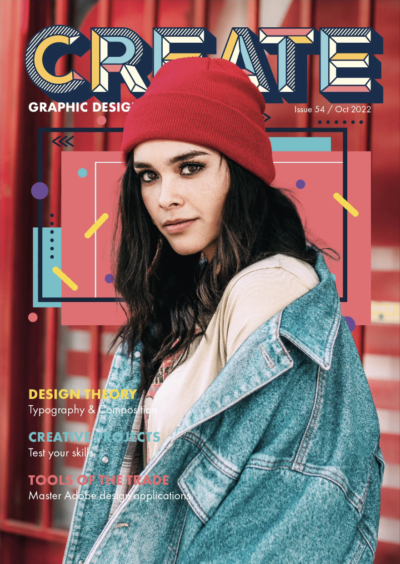
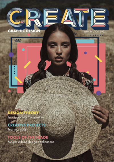
In comparison, these examples below show that the tone of the photo and typography are similar, which doesn't make the text stand out and has poor visual contrast!
2. Diagonals
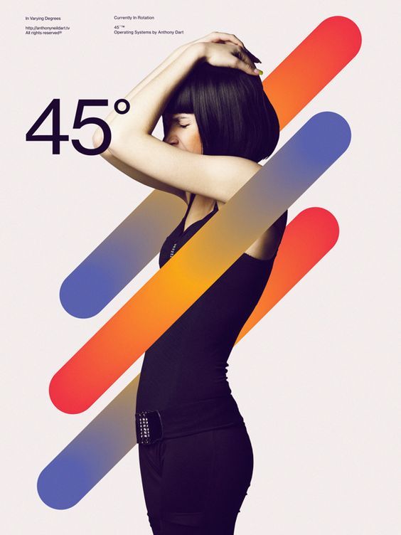
Regardless of whether your design is for online use or print, most designs are in a square or rectangular format. To break up this rigid format, try utilising diagonal lines within the composition. This doesn’t just mean adding lines, but creating angles with text, images, or shapes.
Here are some cool examples of how diagonals are used in designs! Images sourced from Pinterest!


3. Balance
Another critical compositional skill is how you establish balance in your designs. For wide designs, aligning to the left and right can create interest and tension, whereas taller designs generally work best to keep things centred (see example video on the left)
However, don’t limit yourself by relying on purely symmetrical designs. You can still have balance by placing roughly the same amount of detail on the left and right and top and bottom. Less obvious and more subtle ways of establishing balance are usually much more effective.
4. Depth
Establishing or simulating depth in designs is very important as designs are always two-dimensional. You can make things look more engaging and exciting by creating the illusion that viewers can enter your compositions!
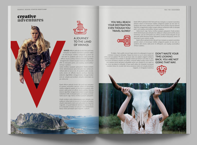
Techniques include out of bounds effects with elements coming out of the original frame or an image merging into the rest of the background. It is, however, something you can overdo, so use it sparingly for greater impact!
5. Unity
Repeating colors or elements can help achieve unity and harmony in composition. Repetition can also help establish rhythm (or patterns), which can make designs more engaging.
Here is an example of unity and repetition of smaller and larger triangles, in different orientations, having some filled and some not, and alternating between three different color schemes.

Text formatting also creates unity. It can establish the hierarchy in the composition so the viewer can see text that has the same significance and group similar text together!
The examples in the video are from our new graphic design Starter Bootcamp, which is a 12-week online program for beginners. By dedicating just a few hours each week, you will learn to work with Adobe Photoshop, Illustrator, InDesign, and XD simultaneously!
We hope you enjoyed this post and feel confident in applying these Golden Rules to your designs! If you want to learn more about Design Theory, then check out YouTube playlist on Graphic Design Theory!
UP NEXT
How to Get Better at Composition and Creative Layouts
Learn how to create original and creative designs layouts!


