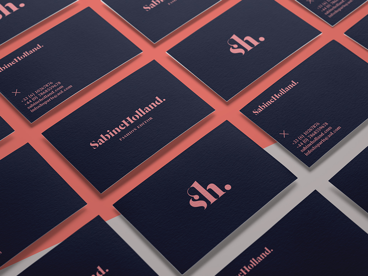
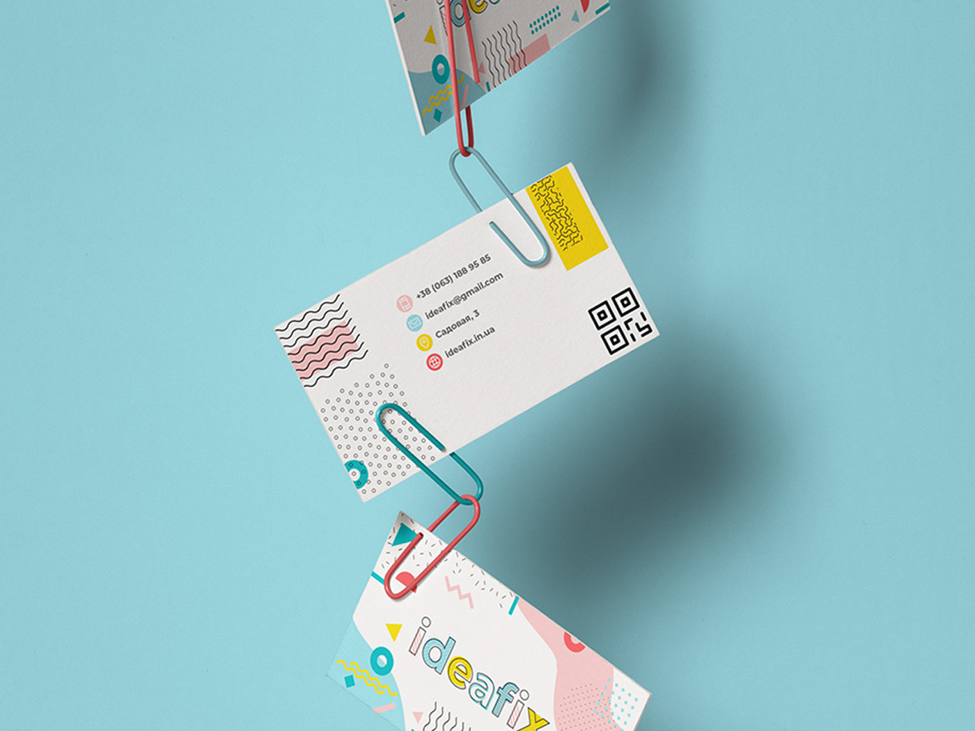
In a lot of cases your business cards are your first impression and first impressions count! That's why it's important to know how you can professionally set up a design ready to send for print.
In this video tutorial Martin will walk though two ways to use Adobe Illustrator to create Business Card templates where you are able to work confident in the knowledge none of your design will be trimmed off. Setting up a document wrong can also result in it coming back from the printers looking very different to how you imagined.
Watch the tutorial to learn two reliable print set-ups in Adobe Illustrator.
1. The first teaches you to set up a Crop Mark effect and use a Clipping Mask so you are able to define the edges of your business cards and see how the final design will turn out.
2. The second shows you how you can use the Art-Board Tool to define the size you want to use for your business cards. Then how to ensure you export your artwork with Crop Marks using the Marks & Bleeds settings.
Both of these methods are technically correct. As with most things in the Adobe applications there are a few ways to get to the same result, you just need to find the one you prefer working with. We recommend trying both out, perhaps do some test prints and just get a feel for which method you naturally gravitate towards.
Business Card Design
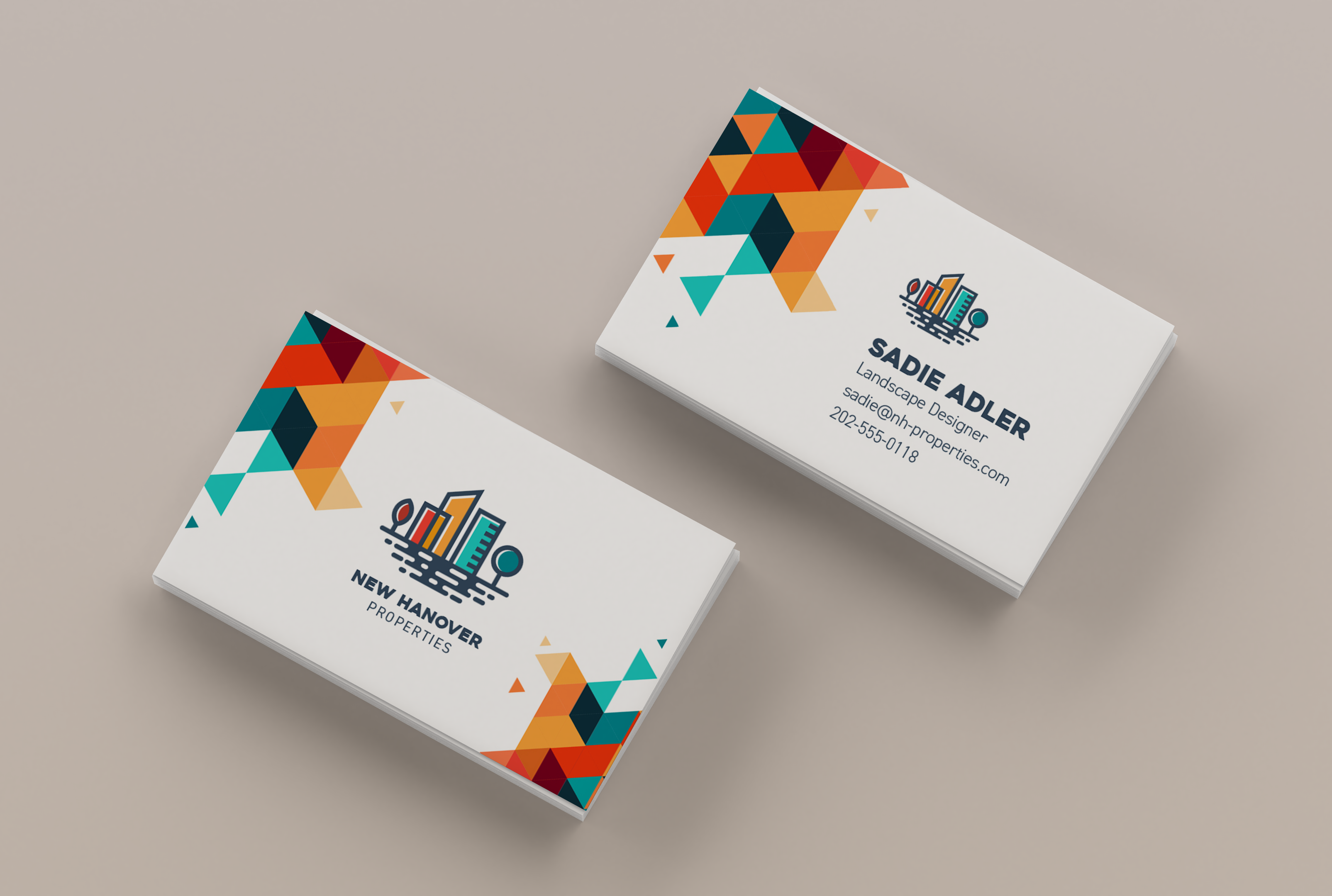
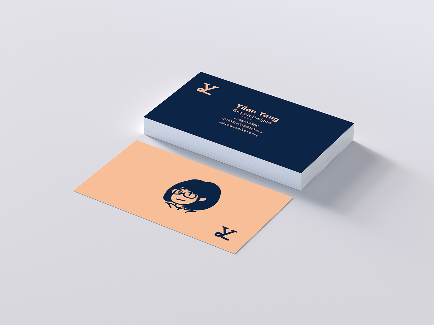
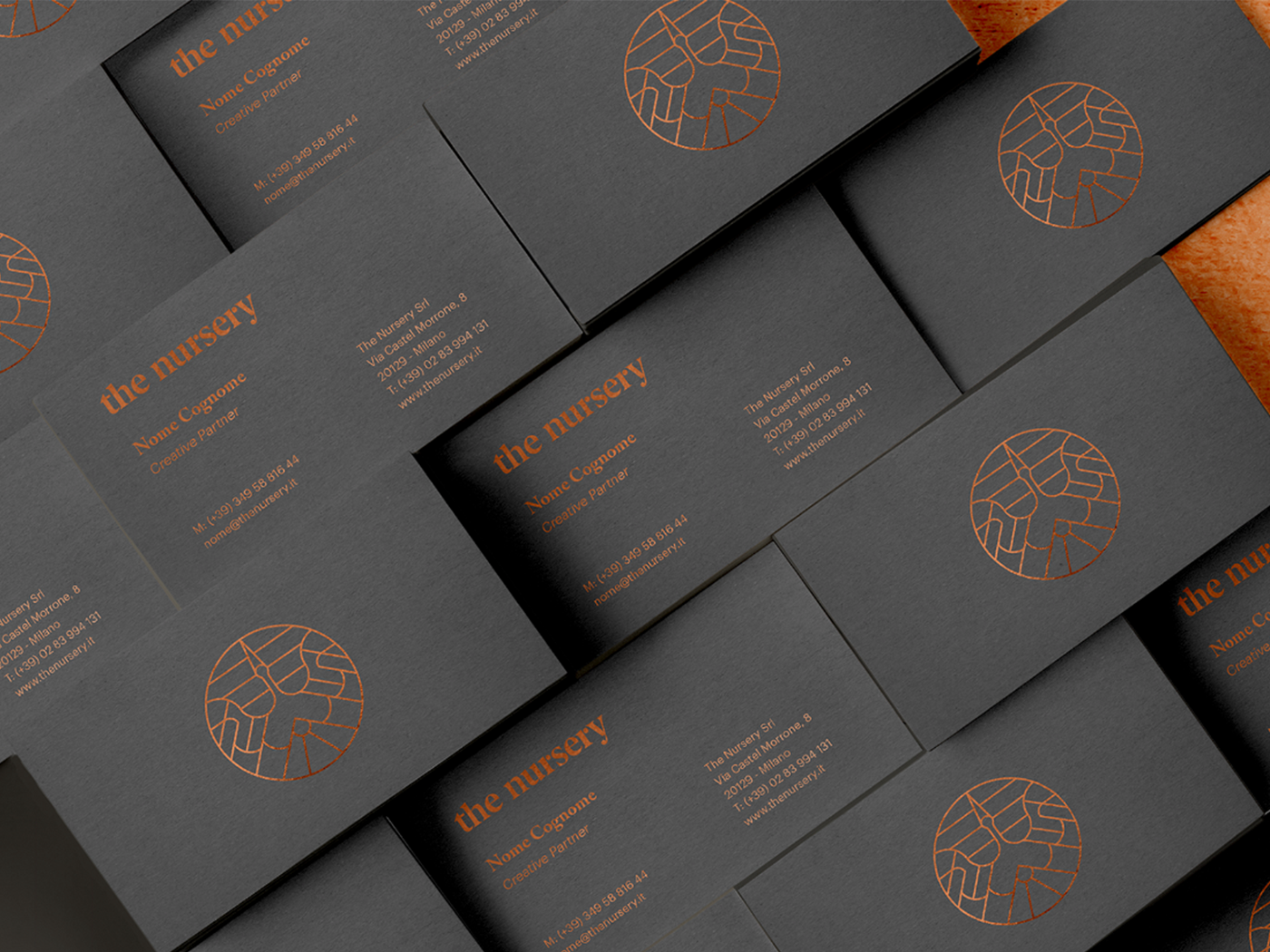
So you have the technical skills covered, in the rest of this post I will talk a little more about the design process, what information to include and show you some examples of great designs.
What Information is Important
If your business card is looking sleek and makes a great first impression but does not make it super easy for potential employers or clients to contact you then really it's still not useful.
It's essential that your contact information is
clearly displayed, easy to read & up-to-date.
It's up to you what you decide to prioritise however I would absolutely always include the information below.
I have listed them in order of importance which always consider, what information should someone see first off all the way to the last thing they should read:
- Name
- Job title/role
- Email address
- At least one phone number
- Website (either yours or your companies)
You can also add other information if you feel it is necessary like where to reach you on social media.
However only include these if they are professional accounts and it doesn't feel like over-kill.
Design Tips
Here's 5 top tips to keep in mind whilst designing business cards:
Gallery
Thanks for reading we hope you found this useful & inspiring.
Let us know what you think or of any topic you would like to see covered in a blog post in the comments below!
GRAPHIC DESIGN
& ILLUSTRATION
Adobe Certified Online Courses
