5 common Typography Mistakes To Avoid
We have listed a few of the most common typography mistakes designers should avoid!
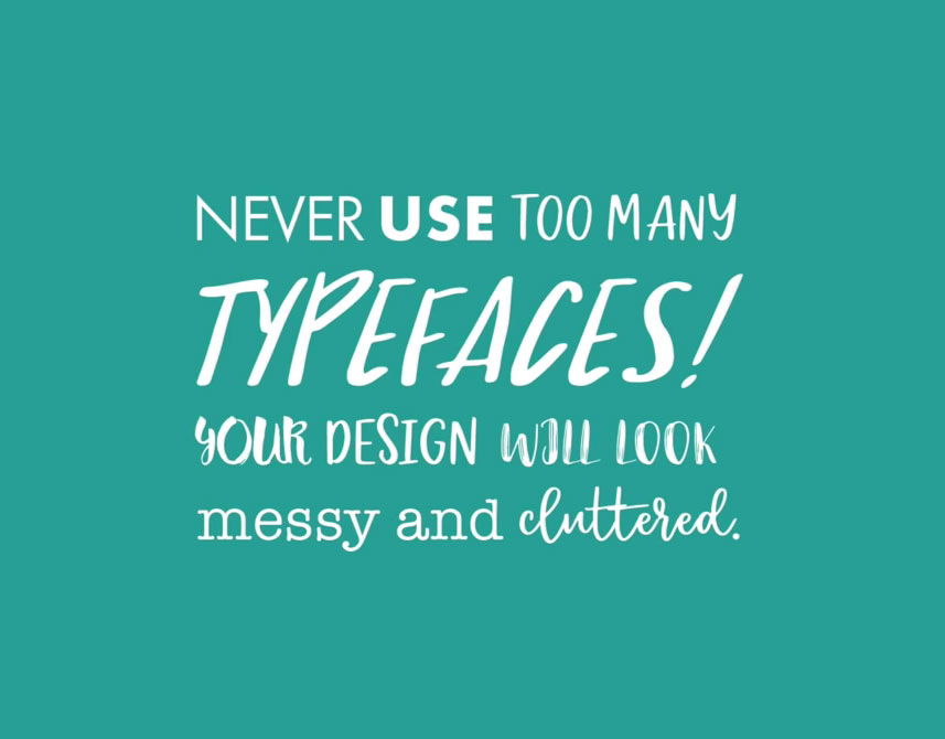
1| Too many typefaces
Using several typefaces make the layout look amateur and noisy! Instead try to use fonts with multiple styles and size to show type variations! We suggest trying the Variable fonts feature in Photoshop!
Watch tutorial on Variable Fonts
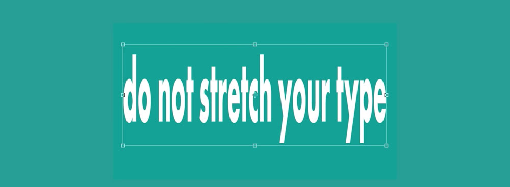
2| Never stretch
Never stretch type in any direction. Try to use condensed or bold styles instead, which is always taller and thicker in weight! Remember if you use Photoshop CC 2019 you no longer need to hold the Shift key to enlarge your text
in proportion!
Watch tutorial on Photoshop Features
3| Always Kern
As a designer you should always check that your titles and sub-headers are evenly spaced out! Make sure your text is not joined together as it will affect readability!
Watch tutorial on Kerning

Do you want to become a Graphic Designer?
Sign up to our newsletter, and you’ll get instant access to our resource library, including this guide to becoming a Graphic Designer!
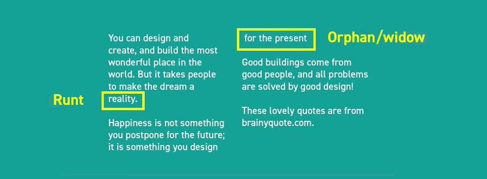
4| Aviod Runts & Widows
Try your best to avoid having separated first/last lines and single words at end of paragraphs and columns.
These are very common typography mistakes we face as a designer!
Watch tutorial on Runts & Widows
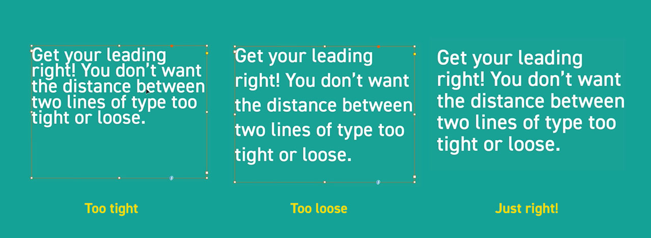
5| Check Leading
Keeping an eye on the length and space of your lines is incredibly important. Not only to ensure your design looks professional and consistent but more importantly so the text is easy to read and understand! Make sure the space between your copy are evenly spaced out and not too tight or loose!
Watch tutorial on Line Length
Thanks for reading!
If you have enjoyed learning about typography mistakes, we also have these post you may enjoy learning from:
Why using contrast is essential to good creative work and Graphic Design Trends
and don't forget to watch our Typography Techniques tutorials below!


