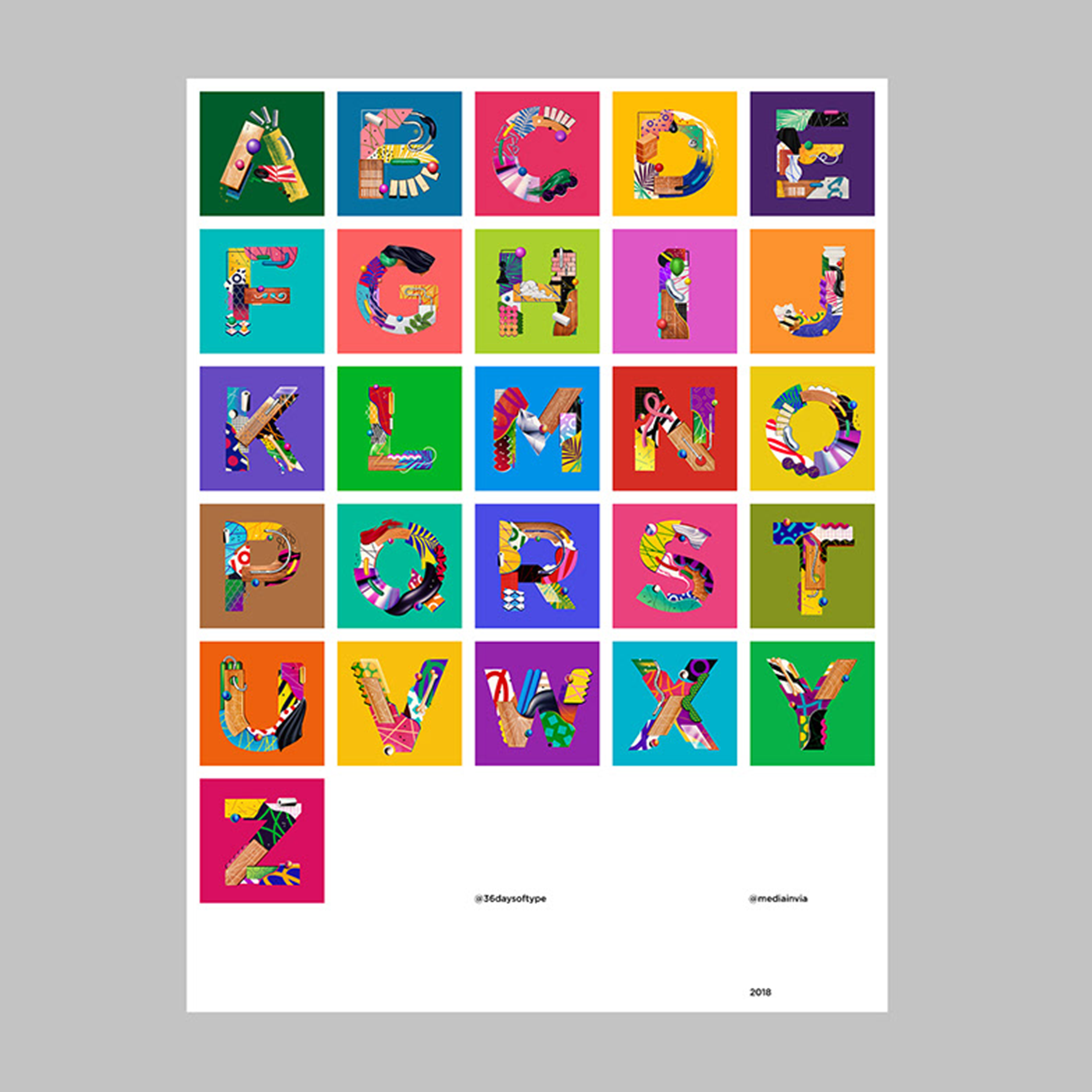
When you are thinking of producing amazingly creative and innovative design work it might seem a bit dull to consider the concept and importance of using consistency in the visual style you are creating.
However I promise using this piece of design theory will improve the overall quality of your designs. First off lets explore what it means in a design context, then look at why it's so crucial to good work and finish off by learning how you can introduce it into your own work.
What does the term 'consistency' refer to?
Consistency ties separate pieces of design work together, meaning an audience can immediately understand that these pieces of work are connected and are usually working together to communicate with an audience. This applies to every area of design you work in.
Think of a famous brand like McDonalds. I bet there's immediately a colour and logo that comes to mind and this is because their branding is consistent. The logo is used on their store fronts, packaging, advertisements, even napkins so people remember it and it seems to be working!
Also think how weird would it be if every-time you turned a page in a magazine there was a totally different typeface which used a different pt size. This would look confusing, would be hard to read and generally would be off putting. All magazines, newspapers etc use a consistent style to ensure their readers have the best experience possible.
Why is it so important?
So consistency is used in all areas of design from packaging to UI/UX to branding and adverting. Let's look a little more at why it's so important!
It helps to build a relationship with an audience - We all like things to look and feel familiar and that's definitely true when it comes to visual design. We come to expect a certain style from a magazine or brand or website. Now this isn't to say you always have to stick to the same look and design. The trick is knowing what and how much to change.
It can save time in the design process - If you are working on a big project which involves creating work for print, the web, social media etc having a style and set of assets to work into each design provides a starting point. You also know each piece needs to work to communicate a united message and that they need to work together. So you can still be creative but you don't have to start from scratch every time!
It helps design work communicates clearly and look professional - Consistency looks professional and helps to ensure design work is communicating the intended message. A lack of consistency in design elements, sizes, colours etc can leave people confused and compositions looking messy!
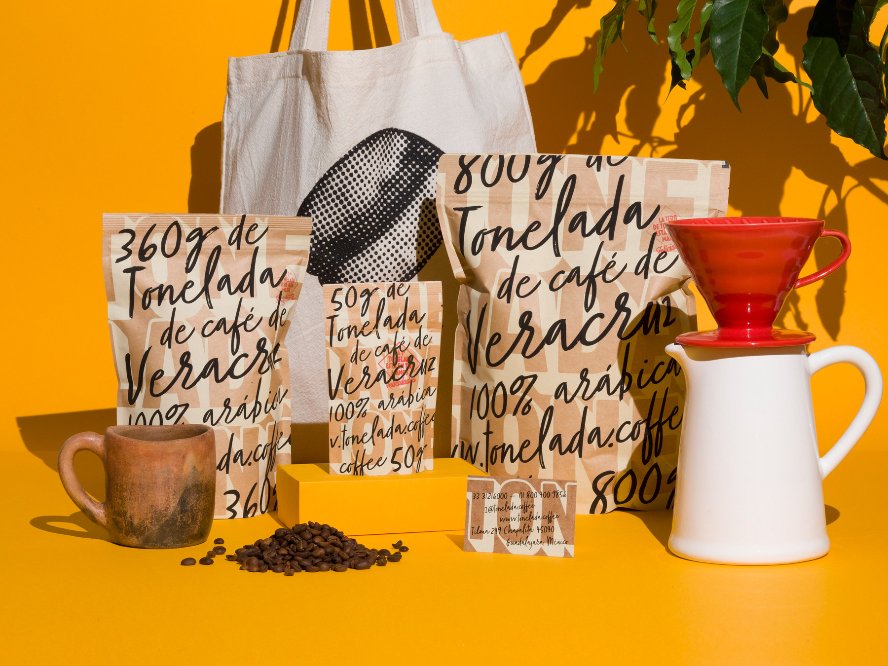
Created for: Tonelada® Coffee
Designed by: YuJo! Applied Creativity
Here there's a very obvious repetition in the choice of type through the packaging and branding. However there is also a more subtle repetition in the choice of materials used for this brand.
How to create consistency in design projects:

Free email-course on the essentials
1. Colour
Colour is a great way to start creating consistency. A lot of big brands will have one core colour they are recognised for. Then maybe 2/3 supporting colours to add visual interest. This can also be applied to a set of illustrations etc. Colour is very noticeable and people will connect with it quickly if you use it constantly in a project.
2. Type
Typography is another thing people will notice pretty quickly. Again choosing one core font to use and then a second supporting font will mean viewers make the visual connection but the work can also still look diverse. Think about a set of posters for a new movie, it would be strange is each poster used a totally different font. People might not realise they are all advertising the same film!
3. Size/ Elements relationship to one another
This one may sound a little weird but a sense of consistency can also be achieved though the size of your design elements/assets. Having the same size titles, images or illustration in a website or publication gives the design rhythm, lets the viewer know what to expect and makes it easy for them to focus on the content. The same could be said of poster design, packaging etc.
4. Using the same imagery across all design material
In a singular design project you may need to create work for websites, print and social media and these should all share the same visual imagery (i.e photos, illustrations, icons.) These don't need to be used in exactly the same way but again this is a good way to introduce consistency. So if you use a set of icons online make sure you keep using that same set throughout the project.
Consistency in action
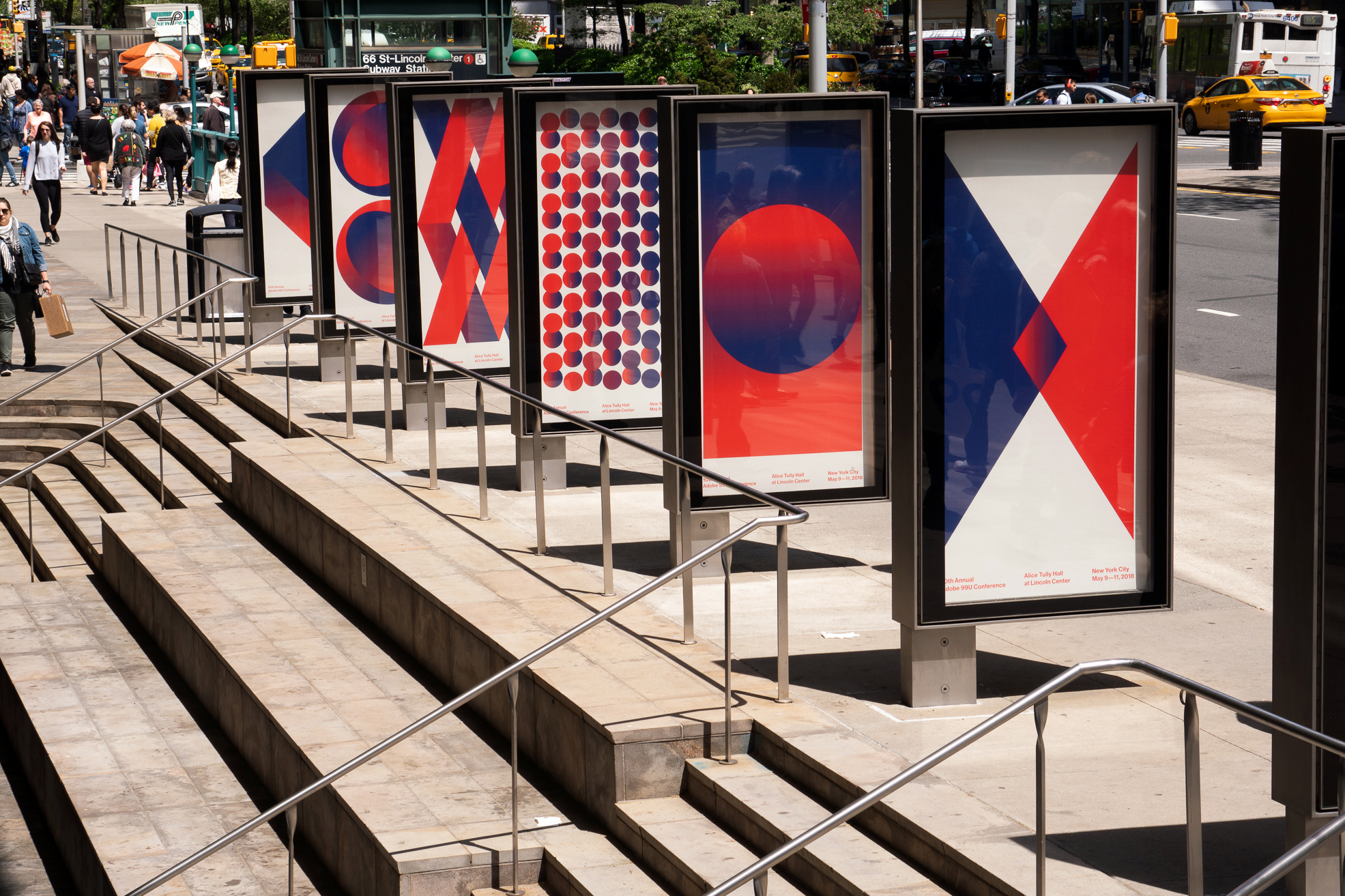
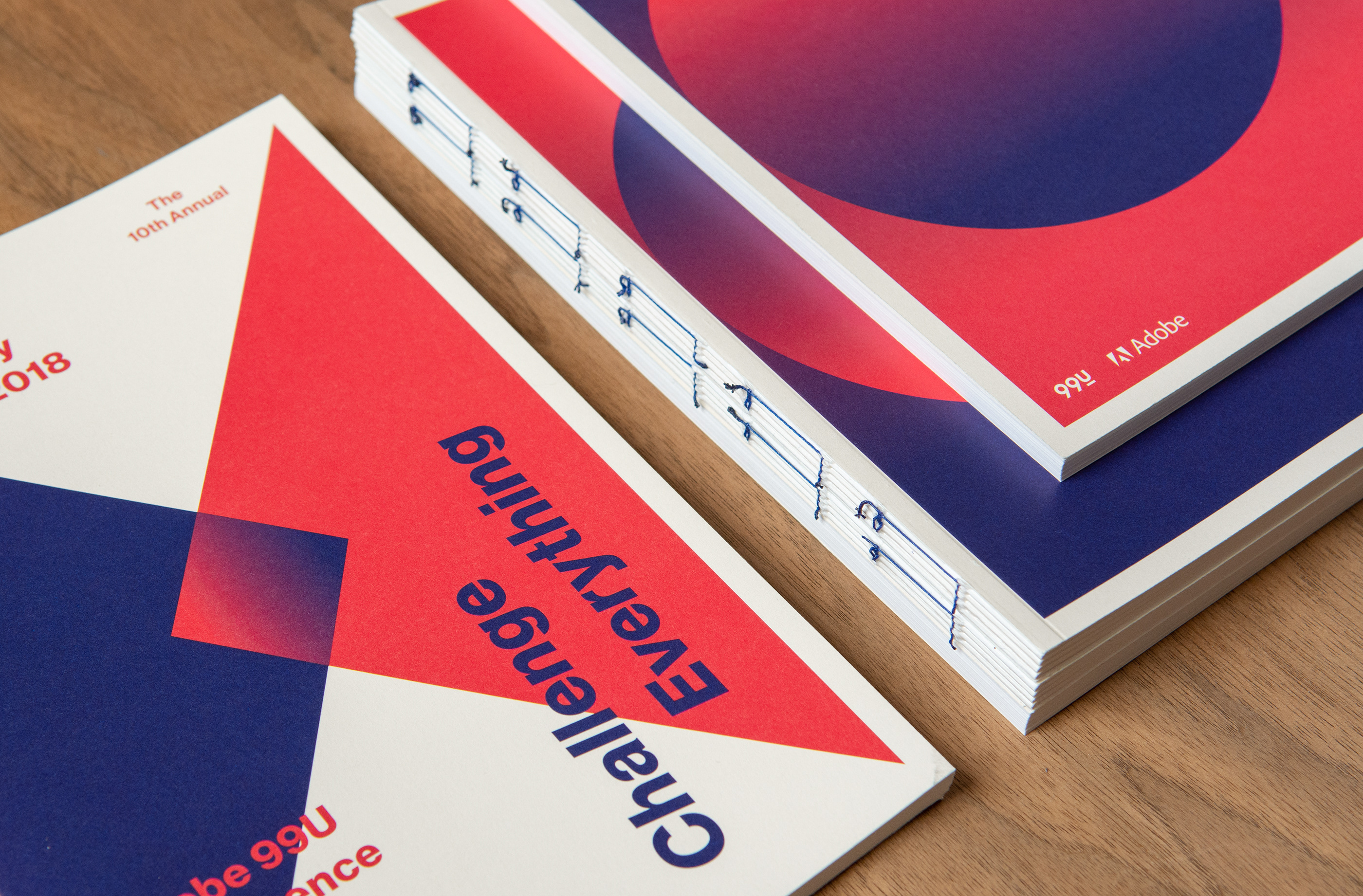
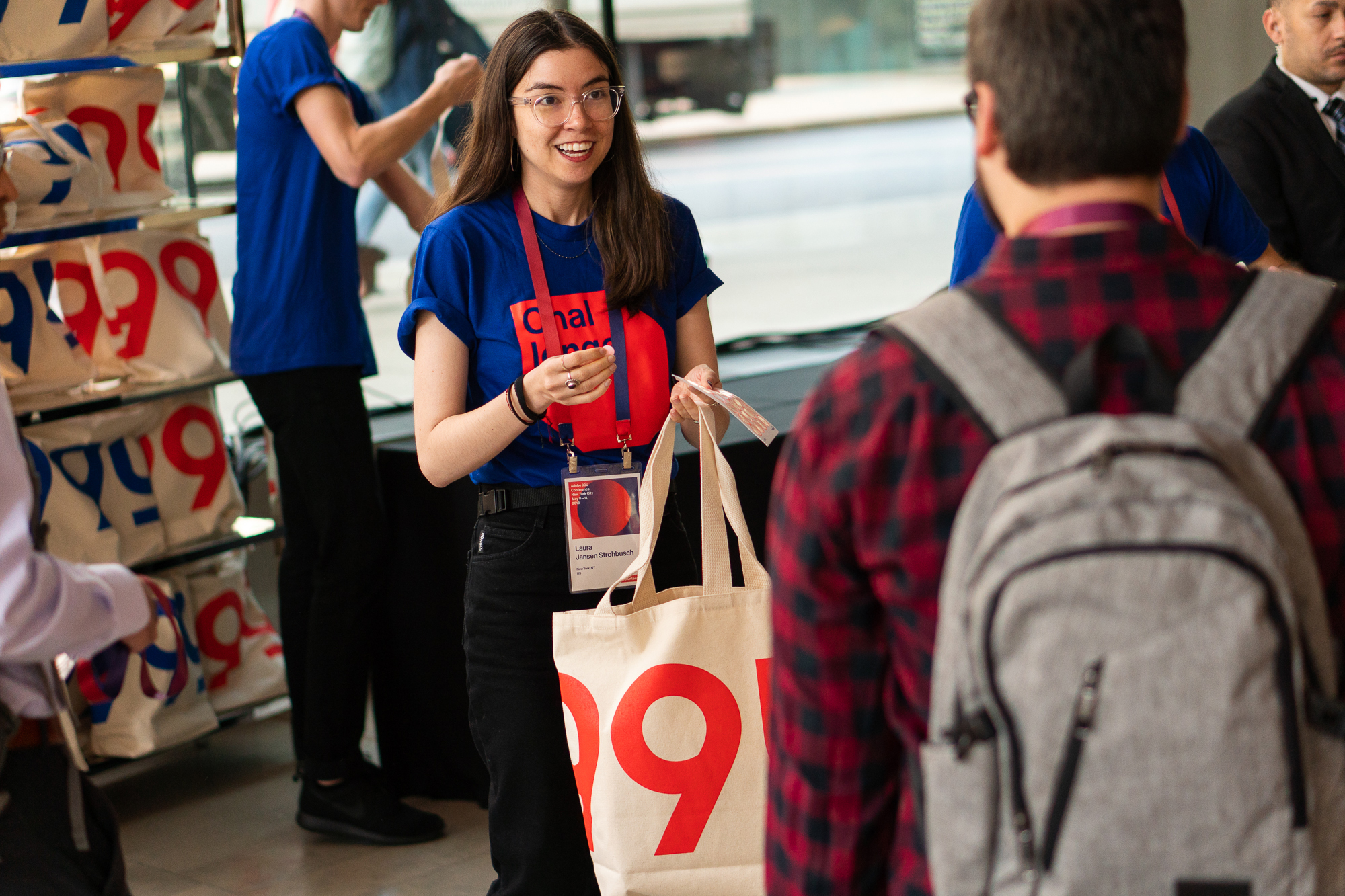
Created for: Annual 99U Conference New York City (2018)
Designed by: Mark Brooks
This is a great example of consistent design elements being used across a large branding project. You can see the repetition of colour and type in particular to link all of these separate elements and designs together. There is also the use of a gradient which ties the print and poster products together but notice that it does not have to be present everywhere the branding is still perfectly recognisable when it relies on other visual devices.
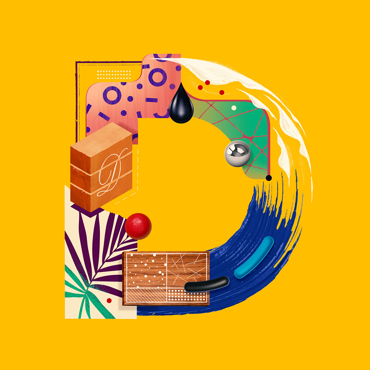
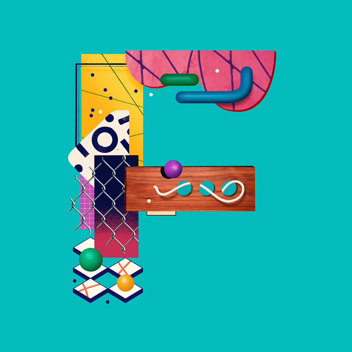
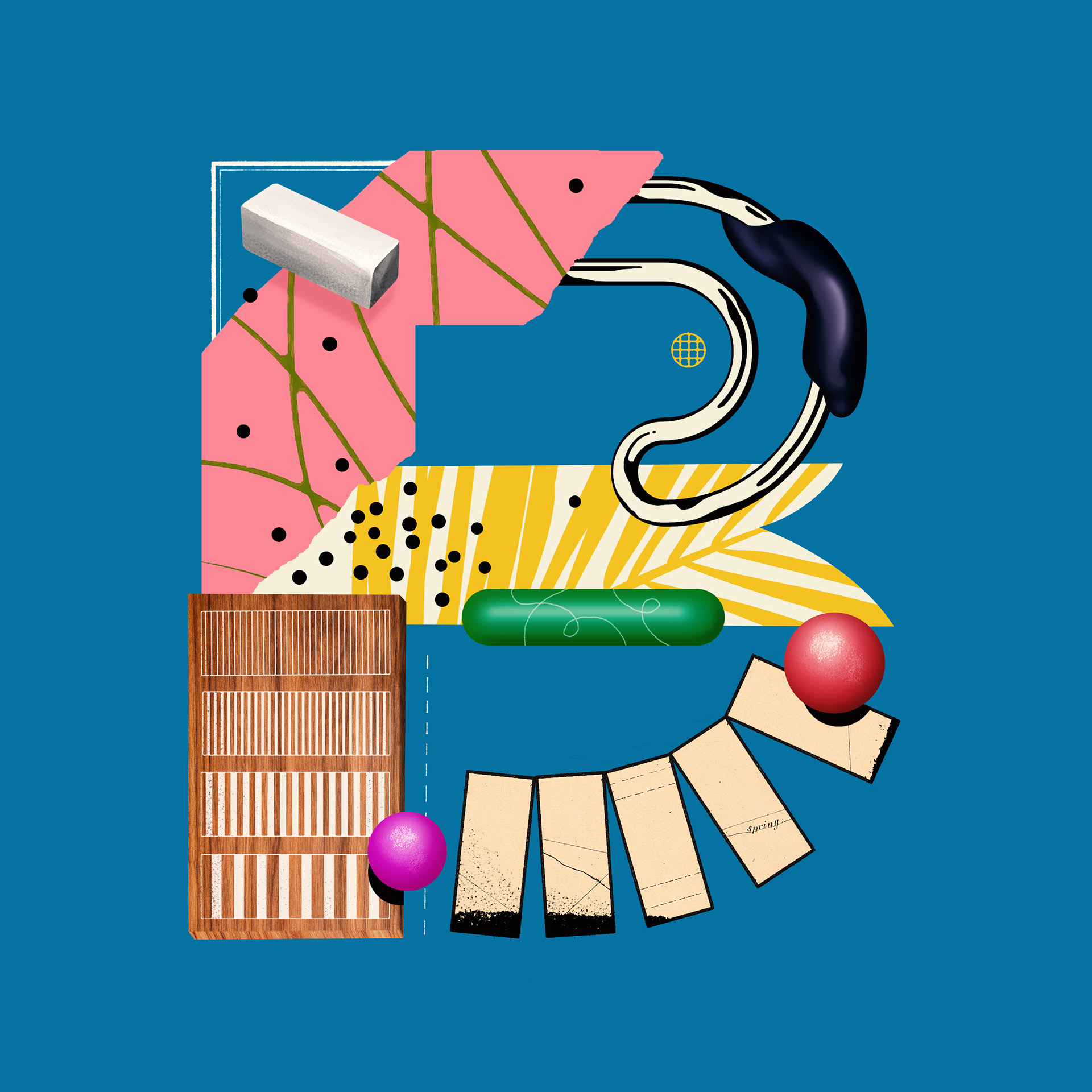
Created for: 26 Days of Type challenge
Designed by: Diego Morales
Here consistency is present in a totally different but equally as useful way. Each letter is made of totally different illustrative compositions, however they are all tied together by the repetition of colour, styles, shapes and the form of the letters themselves.
You can see repetition in the use of various patterns and textures. All of this means the letters look brilliant independently but also form part of a larger set, giving the project far more strength and unity.
Overall consistency creates a sense of structure for the viewer. Which helps them understand more about your product, idea or message. It also helps to form a framework for a designer to work within. Saving them time and focusing the work they create so it is as successful as possible!
Thanks for reading!
If you enjoyed learning about this piece of design theory we also have these post you may enjoy learning from:

