How to Crop Photos in Photoshop - 5 Pro Tips
You might be wondering, what can be so complicated about cropping photos? And in a way you are right, it is a reasonably straightforward process. You keep the useful bits of an image, and you scrap the rest. However, cropping plays a crucial role in defining your design composition and can make or break a layout. We will share five Pro Tips and techniques that you should consider when it comes to cropping images using Photoshop.
We highly recommend watching our tutorial below!
Pro Tip 1 : Rule of Thirds
For Portrait cropping in Photoshop, you should use the Rule of Thirds overlay, so it keeps the original aspect ratio of the image. Make sure to align the eye level to the top 3rd if you are creating a close-up crop.

Pro Tip 2 : No Crop Zones
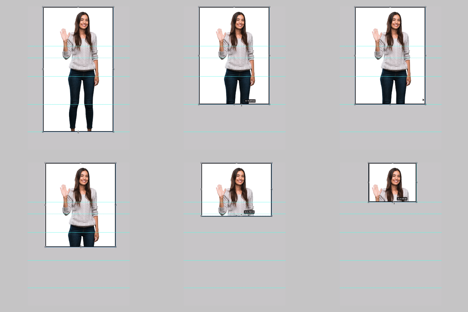
When working with full-body images on your designs, try to avoid cropping on the joint of the human body. This looks visually uncomfortable and awkward.
Pro Tip 3 : Face- ism Ratio
Some important theories to consider when it comes to cropping images.
Low face-ism- Ratio is when you empathize full body and less the personality — most likely to be used in fashion and editorial layout to show physical attributes.
Higher Face- ism Ratio - is when you to empathize and focus on the personality of the person and show more of the face.

Example No Crop Zones!
Pro Tip 4 : Use Golden Spiral Ratio
Using Golden Spiral Ratio is also useful for creating a good composition. The Spiral Ratio brings the focal ( in the case the Camel) closer to the center of the frame but still applies the Rule of Thirds overlay.

Pro Tip 5 : Straighten Tool with content Aware
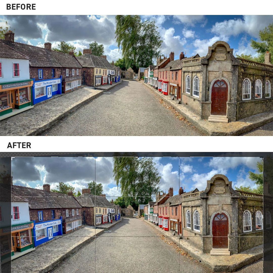
Ever taken a wonky Photo that needs straightening? Be sure to try the Photoshops Straight tool with content-aware to quickly and easily straighten your images.

We hope you have found these Pro Tips useful, and you are excited to try out some of these cropping techniques on your next project.
If you know any remarkable Cropping techniques, we have missed out, let us know in the comments!
UP NEXT
5 Composition Rules to follow
We share 5 important Graphic Design rules to follow along with useful tips and tutorials on better design layout and composition!
Want to master design trends?
We think you will enjoy our online courses!


