Are you interested in magazine cover design? Would you like to understand the terminology and get advice on how to design beautiful magazine covers?
Watch our video below as we go through the terminology for all the different elements found on professional magazine covers as well as shares top tips on how to create stunning cover designs.
Here is a summary of standard terms and definitions!
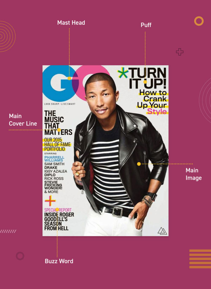
Mast Head (short for Master Head)
Mast Head is the name of the publication. It is generally situated on the top third of the cover and will usually fill the whole width of the page. If it’s shorter than the width, it will be in the top left corner as the left third of the magazine is the only part visible when stacked on shop shelves.
It will usually be made with a custom font, using colour, size and kerning to help appeal to the magazine’s target market.
While the colour may change, the Mast Head is generally kept consistent across all issues to help make it recognizable.
Tagline (Sell Line / Strapline / Magazine Deck)
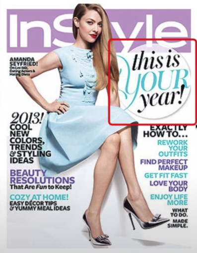
Positioned close to the Mast Head is the tagline. Taglines are a smart and witty way to define what the magazine and can act as a mini table of content to show whats will be inside the magazine.
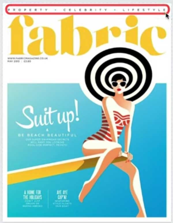
Skyline (Banner / Strip)
Skyline is usually on the top or bottom of the cover. It highlights titles or names related to that particular issue, much like a mini table of contents.
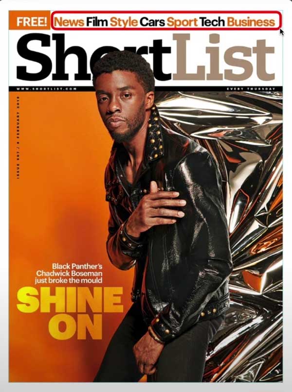
Pug
Generally located on the corner or attached to the side of the cover, these elements are used to promote exciting news or promotions, for example, if the magazine is free. The idea is to make it stand out from the rest of the magazine by using bright colours and high contrast.
Puff (Qualifier / Flash)
Puff is an eye-catching graphic or text to draw attention. A popular convention is the sticker effect, using drop shadow, a strong outline or using a star shape. However, it can just be text that uses a symbol like an asterisk to attract the eye.
With both pugs and puffs, you should be careful not to overuse them as it generally looks more stylish to have the front cover clean and neat without lots of distractions.
Are you interested in becoming a Graphic Designer or Illustrator?
Join 10,000+ creatives and subscribe to our FREE Graphic Design Survival Kit newsletter.
You’ll get instant access to our resource library and feel well equipped to make that next big leap in your design career.
Main Image
The largest element of magazine cover design will be the image. It’s common to have a person looking into the camera as this is a great way to get the customer’s attention.
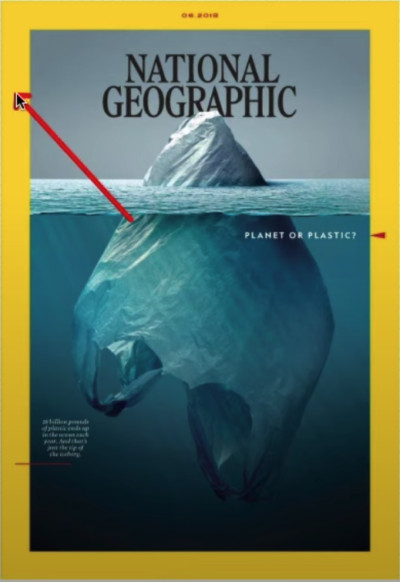
Alternatively, you may wish to use an illustration or even typography. Some publications may call for images to be used in a very creative way, using negative space to make a powerful impact.
Frames
Frames can help to make the magazine stand out on the shelf, but it does reduce the available space for the main image and additional information
When it comes to professional magazine cover design, consistently is vital as this helps readers to recognize the publication and to learn where to find the relevant information.
I hope you enjoyed this topic and feeling more confident in getting started with Magazine Cover Design. If you enjoyed this post, you might like the following tutorials.
LEARN ADOBE APPLICATIONS
from Adobe Certified Instructors and industry professionals
UP NEXT
Learn how to apply some simple composition techniques that can turn a design from good to great!

