Part 1: Color Terms & Meanings
If you want to understand design on a deeper level, our new Design Theory series will be very beneficial to you. In this post we go back to the roots, and learn about Color Theory.
We will take a look at the science and psychology behind the most popular colors used in graphic design. By the end of this post (and video) you will also have a clear understanding on the common design terms of colors. Let's dive in.
Please click on the video below to watch our full tutorial! (15min)
Definitions
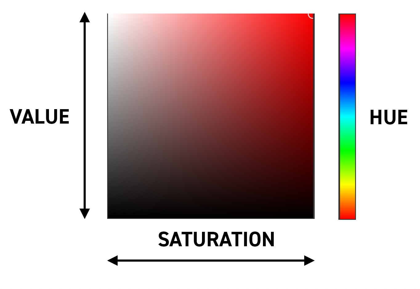
Hue – the primary value of a color and how the eye perceives it.
Saturation – the comparative measure for the intensity of a color.
Chroma – the purity of a color, with the highest chroma value being the purest color.
Value – the brightness of a color.
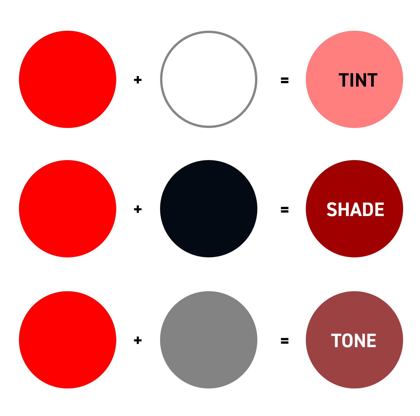
If we take red as an example, complete red would have the highest chroma i.e. the highest purity. When you add white to it, you create different tints, if you mix black, you end up with different shades, and if you add grey, you get different tones.
However, the hue can also impact the value of a color, so even without mixing white, black, or grey with pure colors, you will still have differences between the values. For example, yellow is very bright, so it has a higher value than dark blue.
It’s vital to choose your color theme carefully, as this will determine whether you have a dark composition (picking dark, lower value colors), or a vivid and bright design (choosing bright, higher value colors).
Color categories
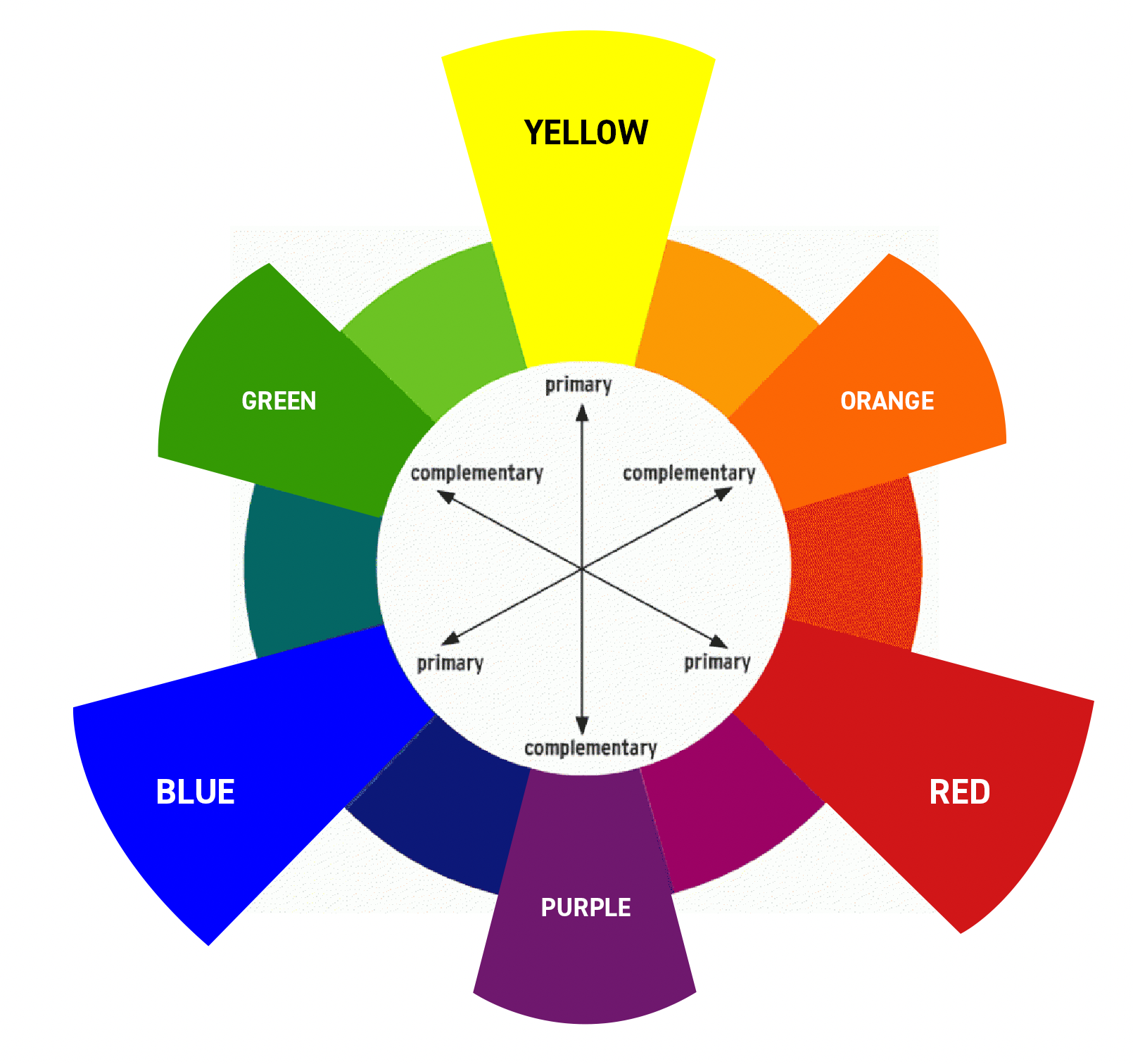
As a designer or illustrator, it’s useful to have a good understanding of the color wheel which shows the primary colors, secondary colors (a mix of the two neighbouring primary colors), and tertiary colors (when you mix a secondary color with a primary color). The color wheel can also help you to find color harmonies and complimentary colors. You can also categorise colors based on temperature and wavelength, which Martin explains in the video.
Color spaces
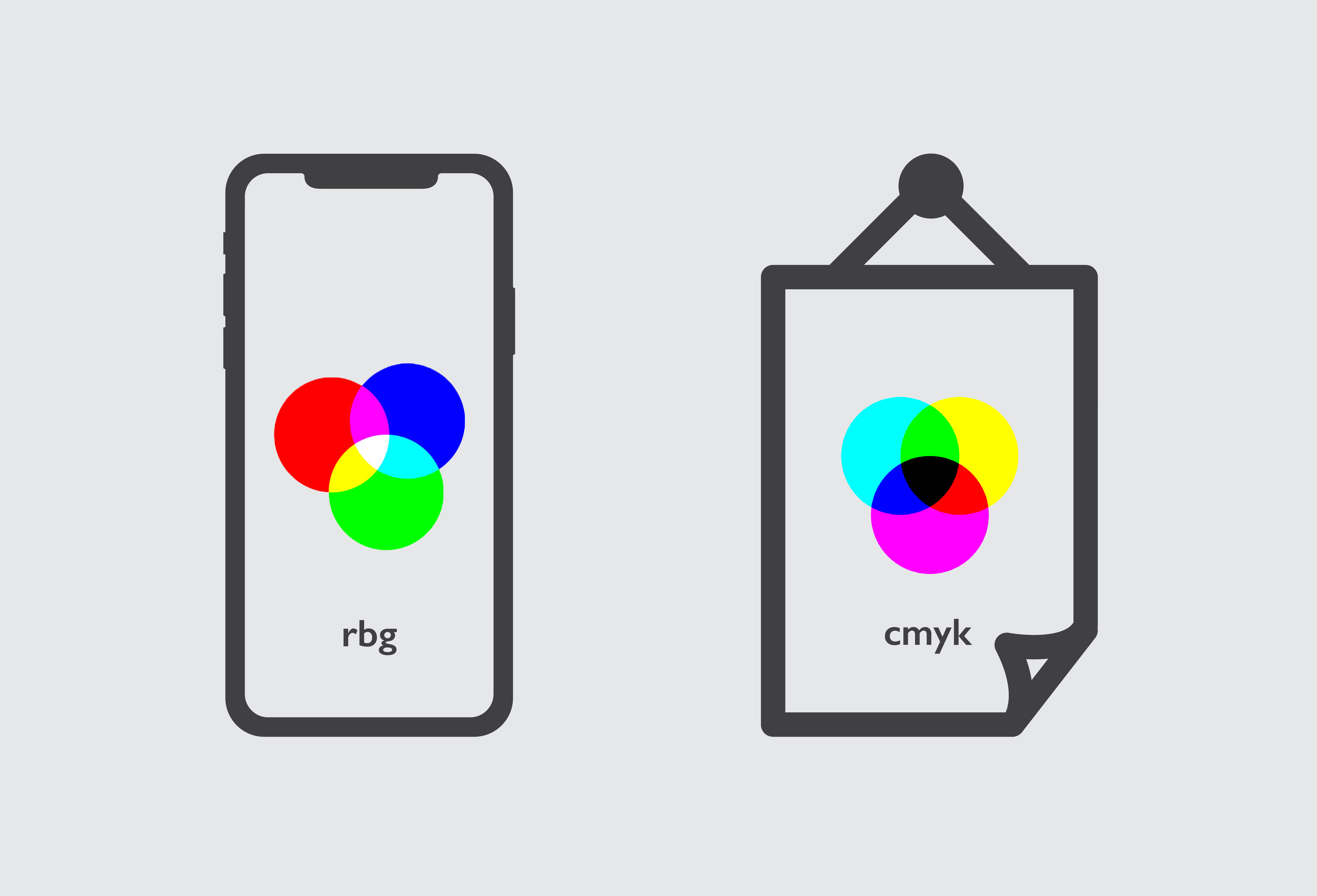
There are two color spaces used for different mediums. Devices that need light to represent colors (e.g. a projector, camera, and monitor) mainly use RGB, whereas print uses CMYK.
CMYK is a subtractive color method where you start with white and subtract from it until you get to black. RGB is an additive color method where you end up with white when you combine all the colors. It’s important to keep in mind that colors on-screen will not print as vibrantly due to differences in the spectrum (as RBG can represent more colors than CMYK).
Key and contrast
Understanding key and contrast can help you create really striking compositions, whether in photography, illustrations, or graphic design. Make sure you watch the video, as Martin illustrates this important topic with some great visual examples.
High key values are lighter being at the top of the coordinate system, the mid key is in the middle, followed by low key (darker values) at the bottom. Contrast is where two clearly different colors are next to each other. Combining low key and high contrast usually has the most powerful effect.
Meaning of colors
Colors can have different effects on different people and cultures, but below are some common uses of colors.
Red – represents power, aggression, lust, and prosperity. Red is great for grabbing attention and is particularly striking when combined with black or white.
Blue – represents trust, pureness, tranquillity, and stability. Blue is the most used color on
the internet, with corporations, especially brands related to safety and cleanliness, favouring
this color.
Green – represents harmony, serenity, and safety. Medical and ecological brands commonly use green.
Yellow – represents joy, happiness, and energy. Yellow evokes pleasant and friendly feelings, with entertainment and toy brands using this color.
Purple – represents luxury, nobility, and ambition. Luxury brands and high-end goods and services use this color.
Orange – represents communication and optimism. Orange combines the energy of red with the happiness of yellow, and usually gives the sensation of heat.
Conclusion
There are a lot of interesting details to learn about color theory, and it’s worth taking time to get confident with the terms involved to help you confidently apply these theories to your work.
UP NEXT
Red is a dynamic and intense color which can grab a lot of attention. In this post learn more about how to use it in creative work.

