Discover some amazing work submitted to a recent competition hosted by Talenthouse. The task was to create a movie poster design for the Godzilla: King of the Monsters movie. We review the 5 winning posters from the hundreds of submissions. Perfect if you want to geek out over monsters & design at the same time.
Ready to discover the ultimate Godzilla Fan Art?
In the video tutorial discover the full creative brief, see the 5 winning designs & discover Martins personal top picks from the hundreds of entries!
The Brief
Below are the details of the brief set by Warner Bros. Pictures and Legendary:
- Please use Godzilla: King of the Monsters' provided imagery, and trailer as inspiration for your submission.
- You can include the title treatment in your work.
- Godzilla shall be depicted with scaly skin, four fingers on each two hands, four toes on each of two feet, short arms and three rows of fins along the back.
Restrictions:
The official movie poster designs used for the film:
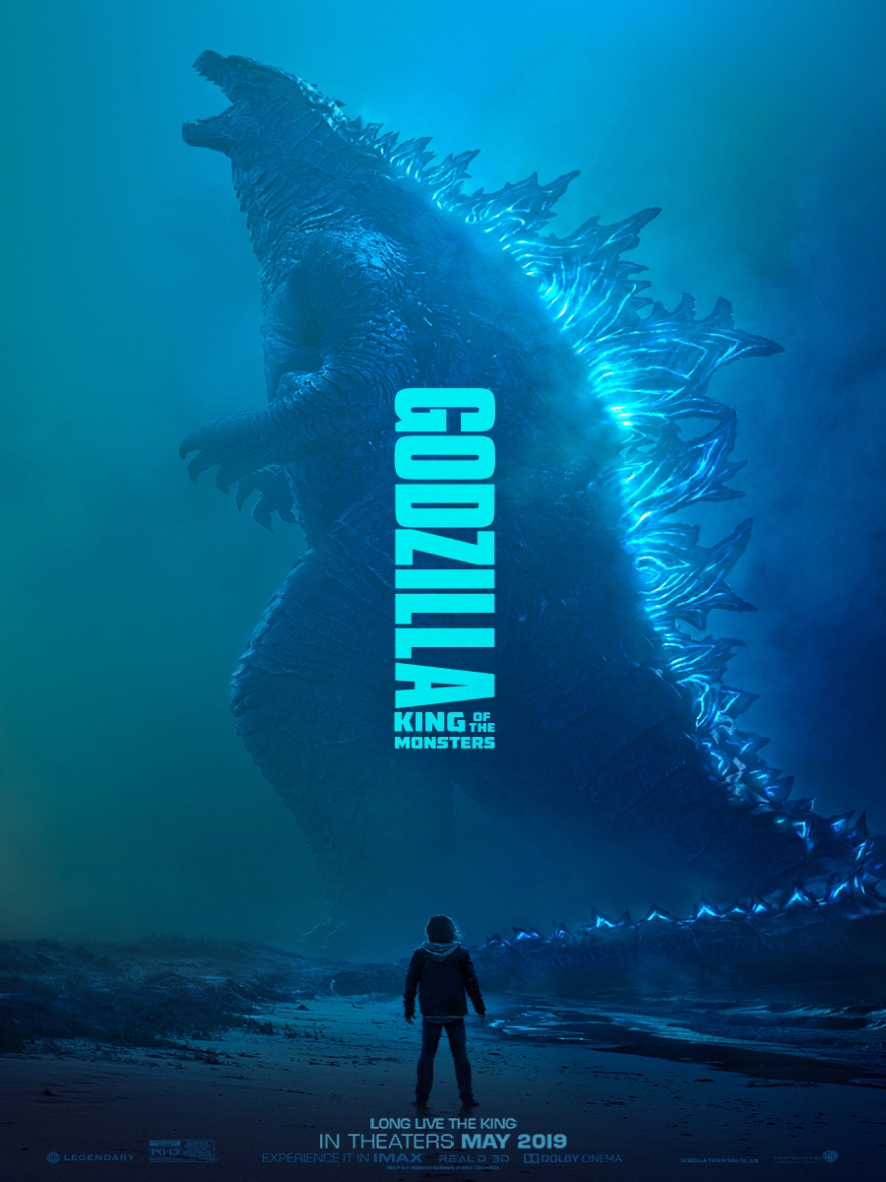
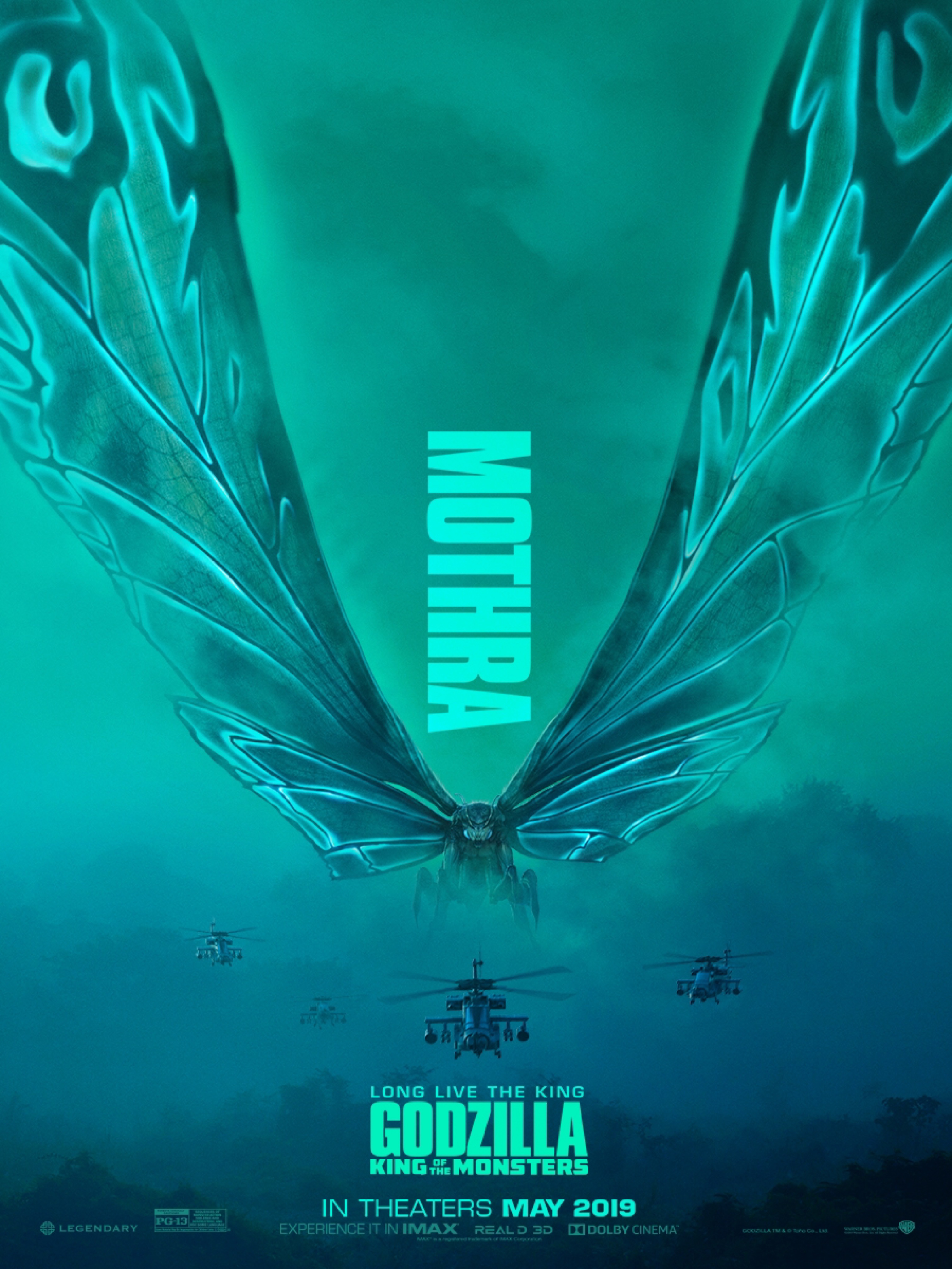
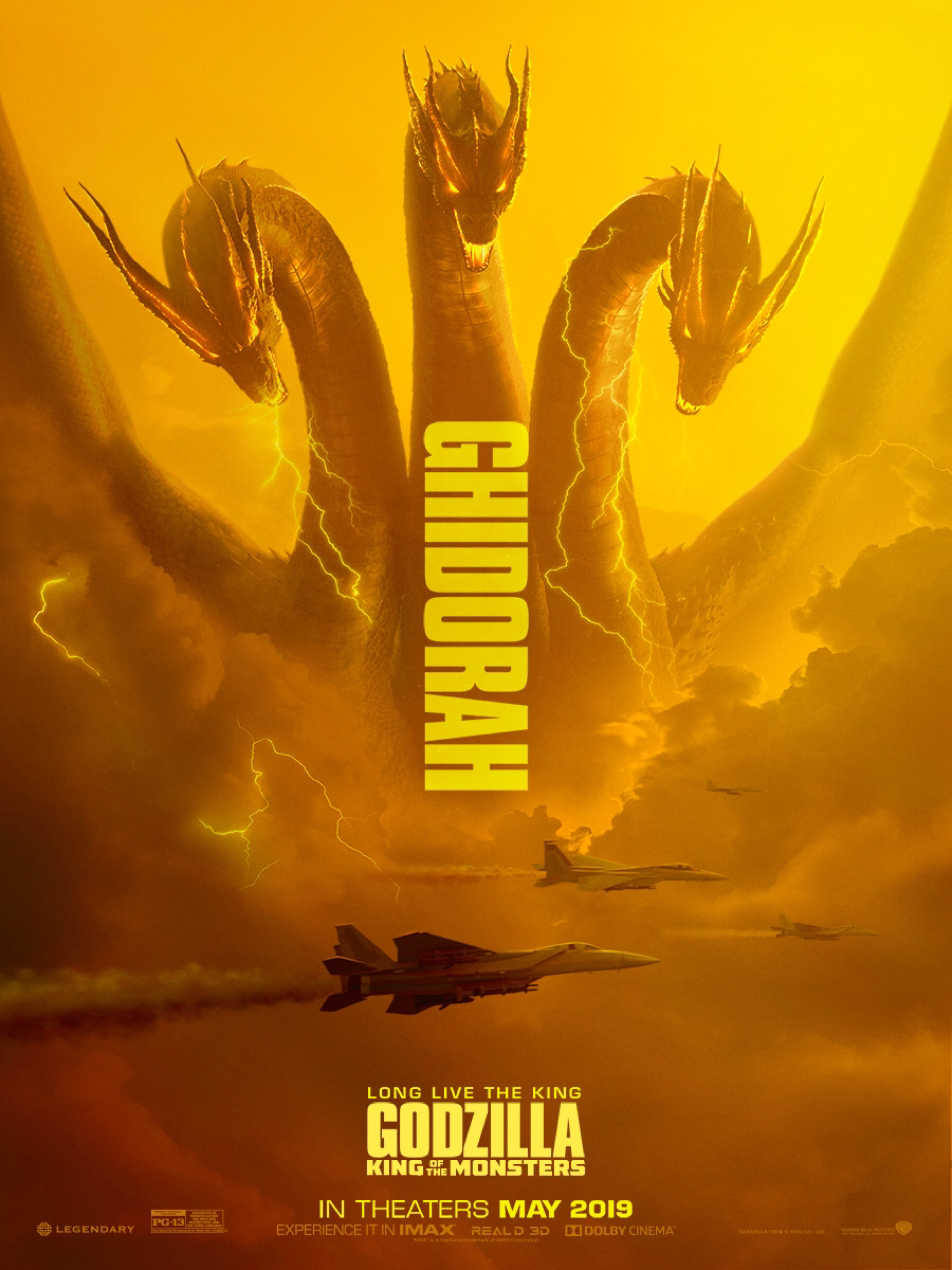
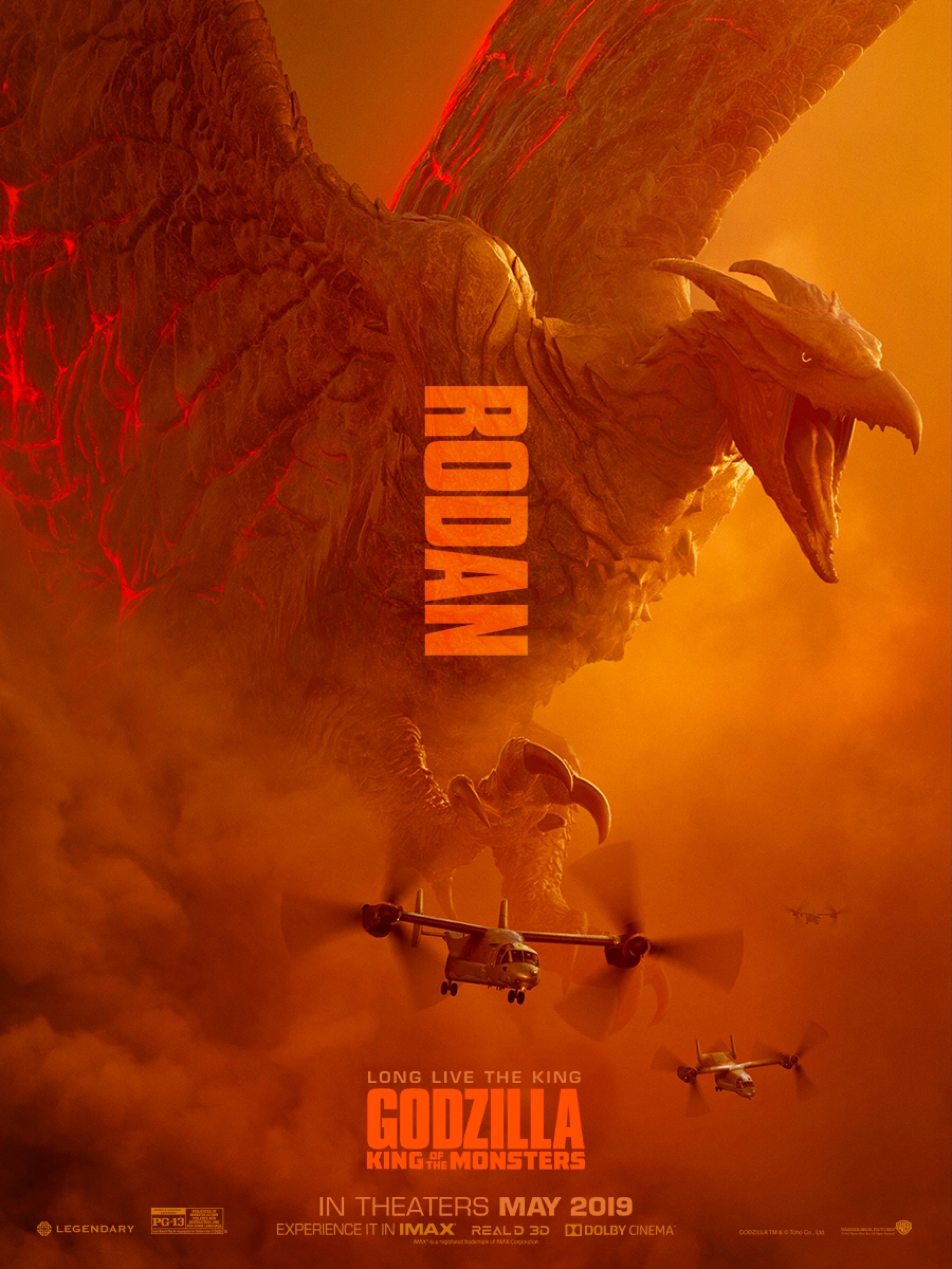
The Competition Winners
Now you know what Warner Bros wanted to see from the creative submissions lets take a look at the winners and why their work stood above the rest!
1.
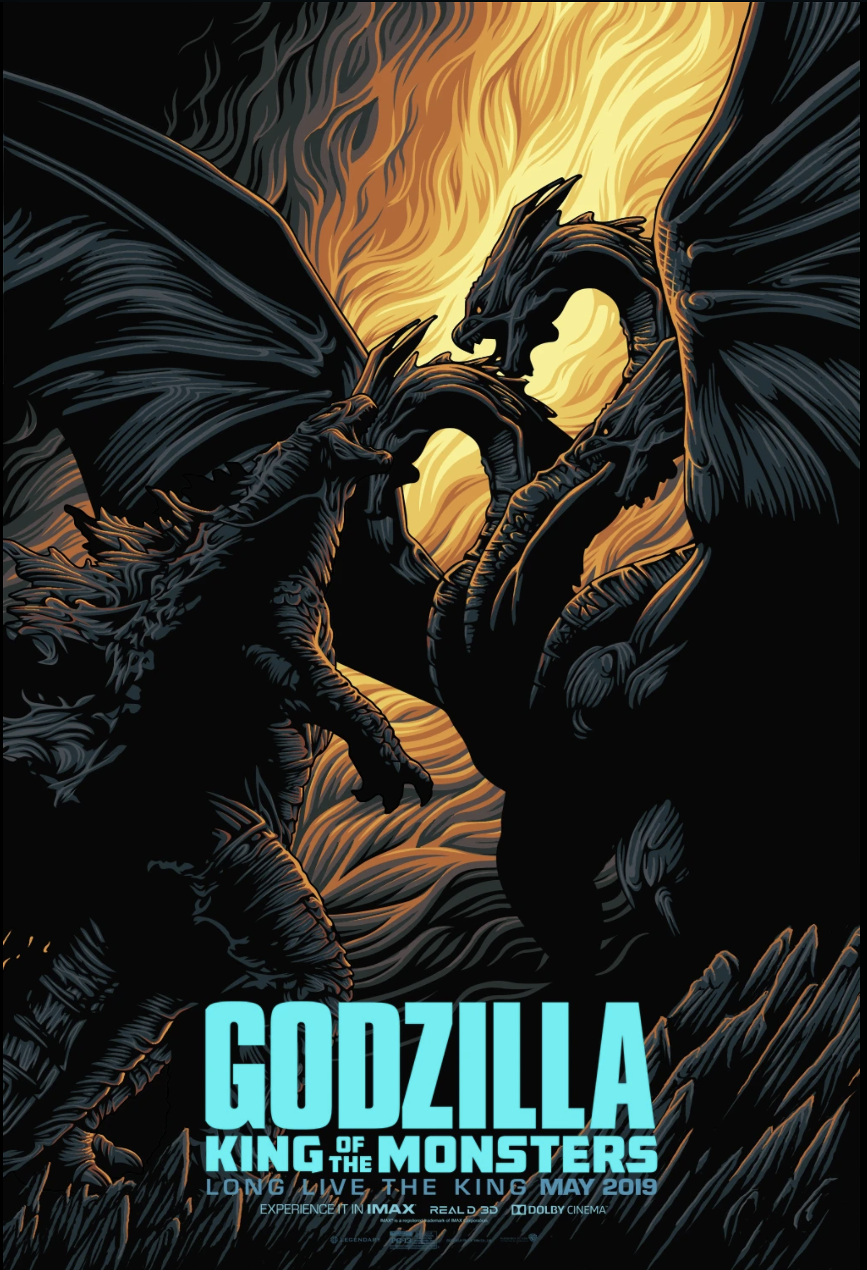
Design by Gus Mertha
This is our favourite of the top five submissions and here's why:
- It's has a strong composition with easy to identify focal points and leading lines to help your eye navigate the design.
- There's a nice flow to the design because of the use of line in the flames framing the monsters.
- The style of illustration is visually interesting and contemporary.
- There's a high level of contrast within the design.
Check out the video for a full break down of what Martin loves about this poster. Also discover a few things we think could be tweaked and see if you agree!
2.
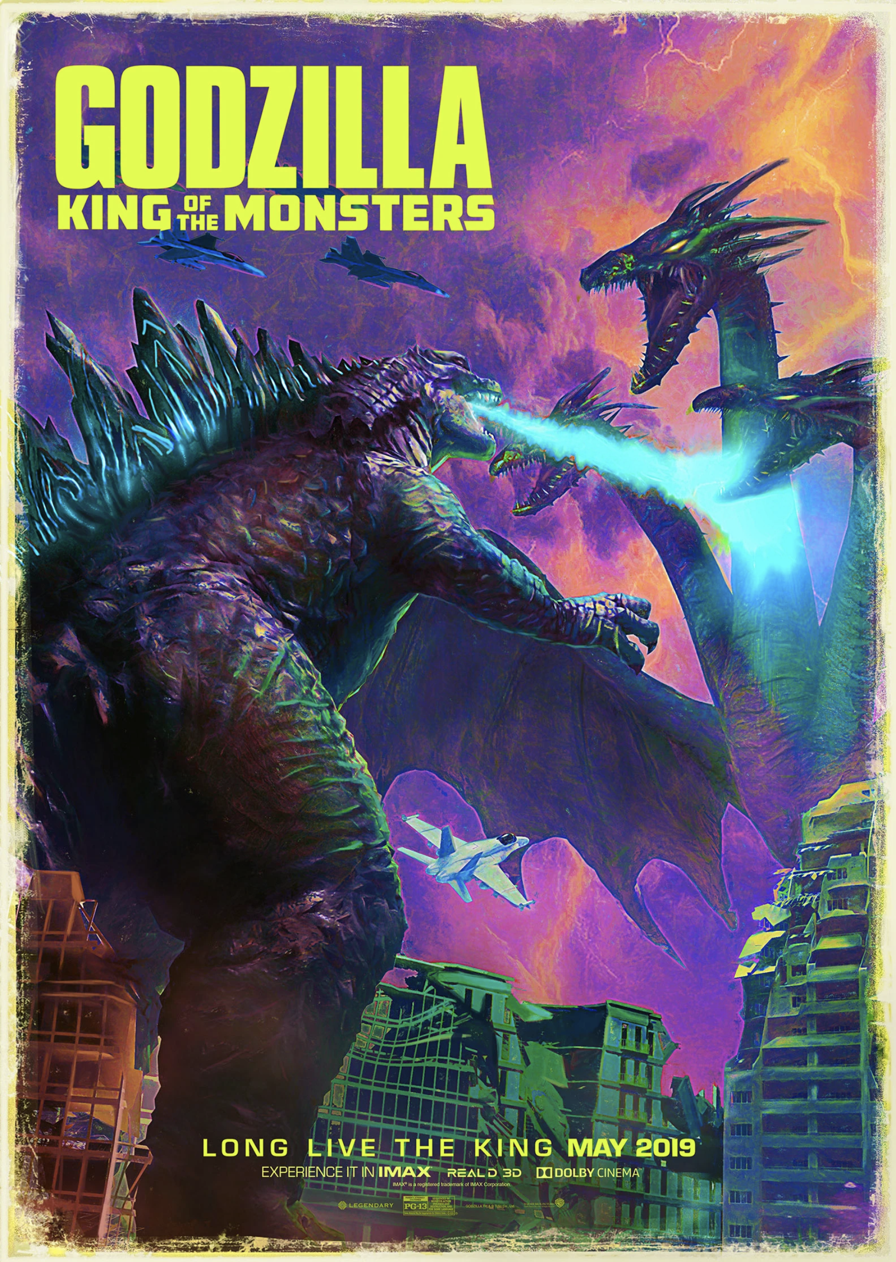
Design by Chris Ramirez
Here we really like the general style the designer went for and the vibrate yet dirty color palette. However even though visually the poster is very strong the structure feels a bit off.
You can see how Godzilla's arm overlaps Ghidorah wing and creates an uncomfortable line/break in the composition.
It's hard to get scale, perspective and composition totally right in one design! Here we think a little tweaking in the size and placement of the characters could have helped a lot with the overall composition which feels a little unbalanced.
3.
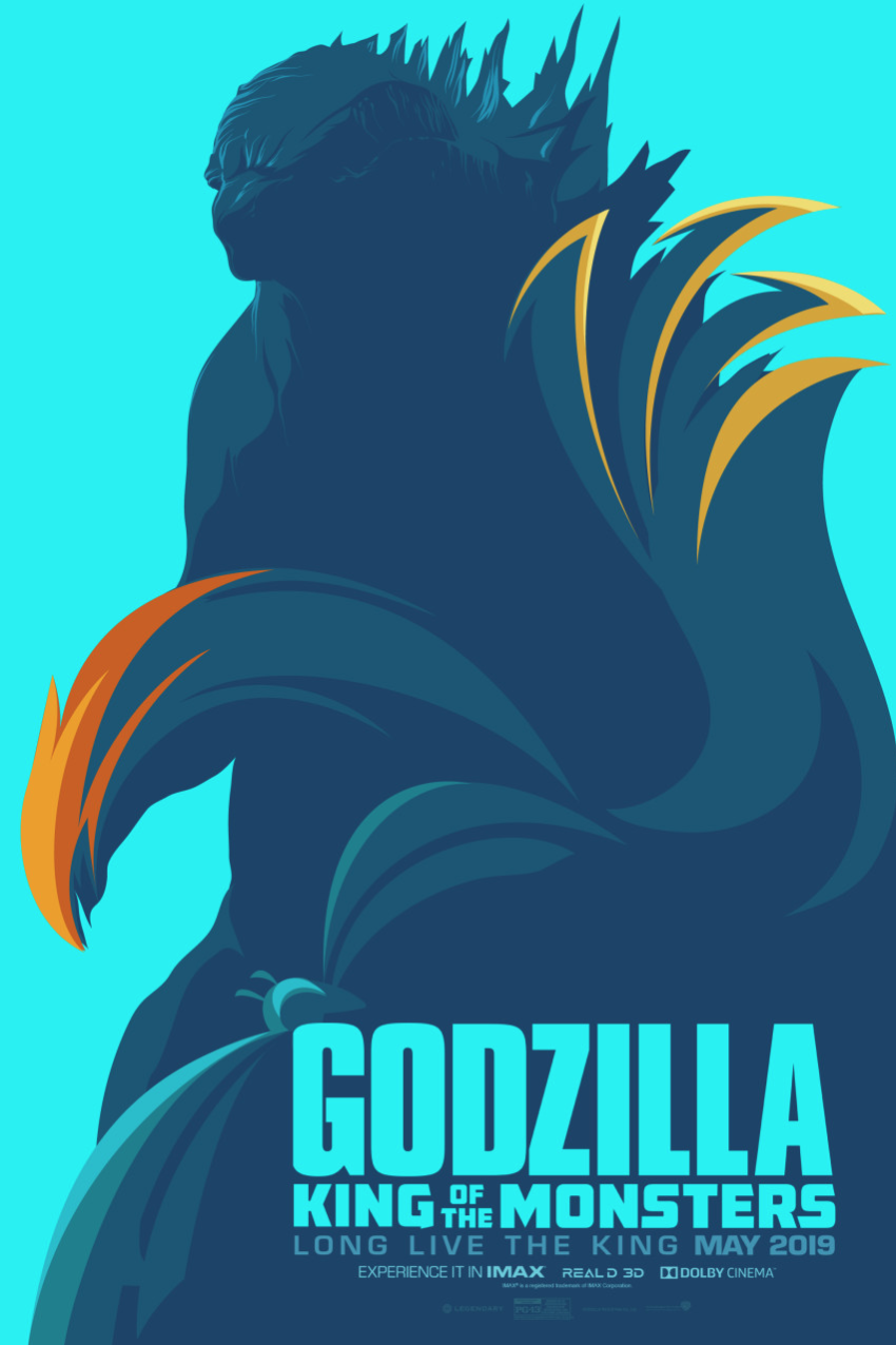
Design by JB Villafuerte
Here we love how the designer has managed to capture the shape and form of Godzilla in a very minimalist style which only hints at wider details. Being able to use minimal shading in illustration to successfully portray a character is not an easy task!
The artist has also managed to combine the other characters outlines into the composition which is a very cool concept but quite abstract and a lot of people might not notice the subtle shapes and outlines.
Maybe we're just not looking hard enough what do you guys think?
4.
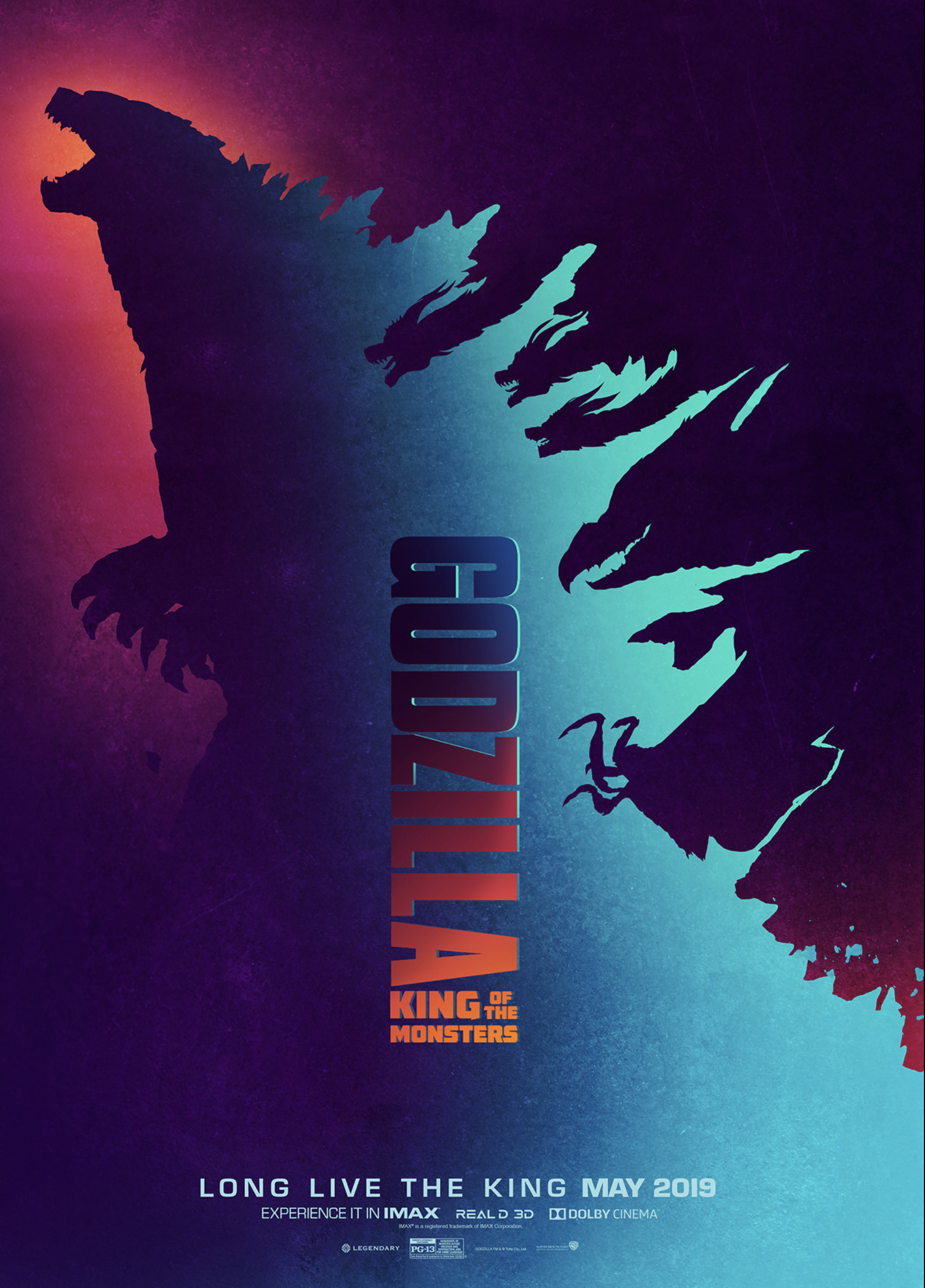
Design by JB Villafuerte
Here the artist clearly understands how to work with negative space well! Using the wing of Godzilla the illustrator has introduced the silhouettes of all the other main characters.
Considering these are all large monsters with complex silhouettes he has done an amazing job and it looks great! Overall the composition for this poster is really strong and the colours work well!
5.
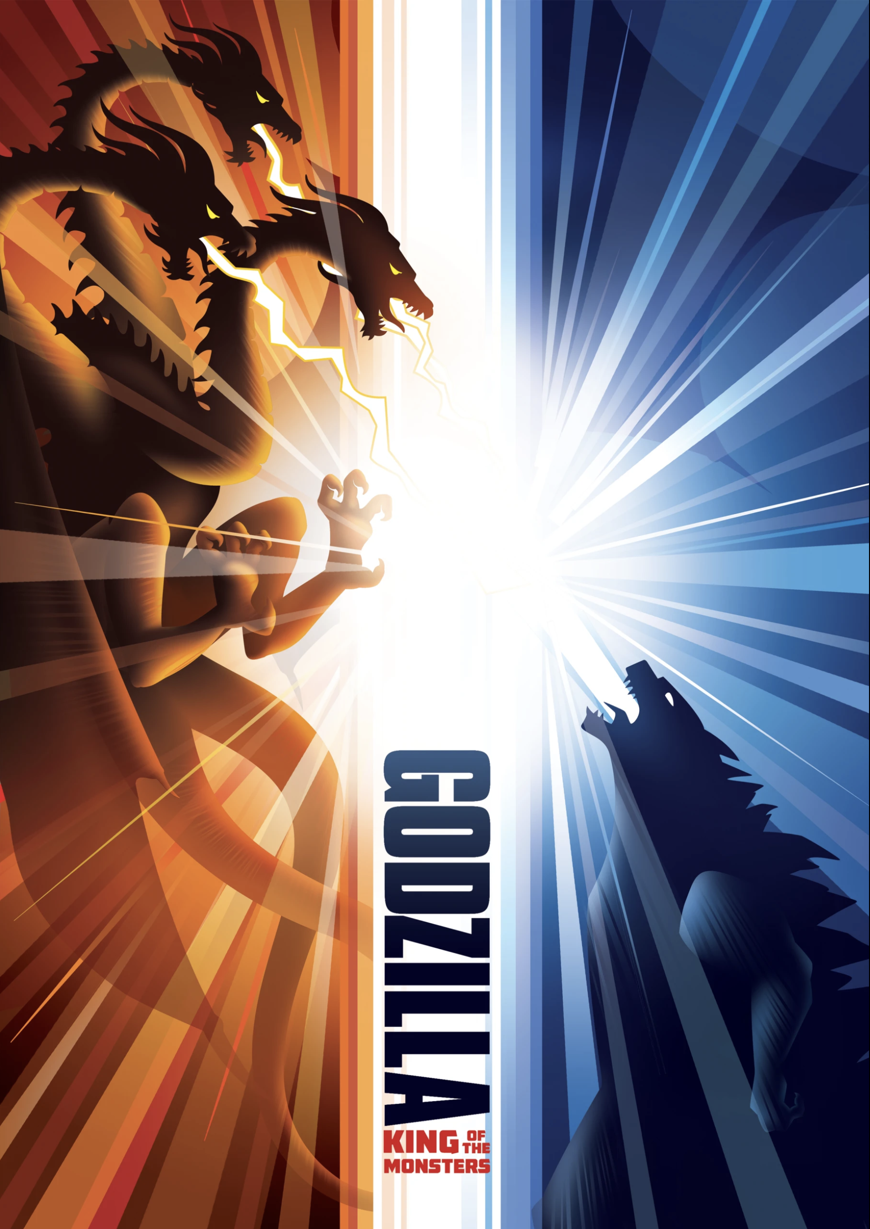
Design by Tuck Yin Foong
This poster uses a nice symmetrical design ensuring the poster feels balanced and not too cluttered. There is a simple but recognisable monochrome colour palette which mirrors the colours used in the main posters that represent the two different monsters.
Finally, we like the use of leading lines emanating from the bright light in the centre and leading towards the edge of the design again this is a good compositional element.
All of these designs are great pieces of work and definitely deserving
winners we would love to hear which is your favourite!
Our Top Picks
There were loads of entries to this competition and after a look though the rest of the creative work Martin choose a few which really stood out to him personally!
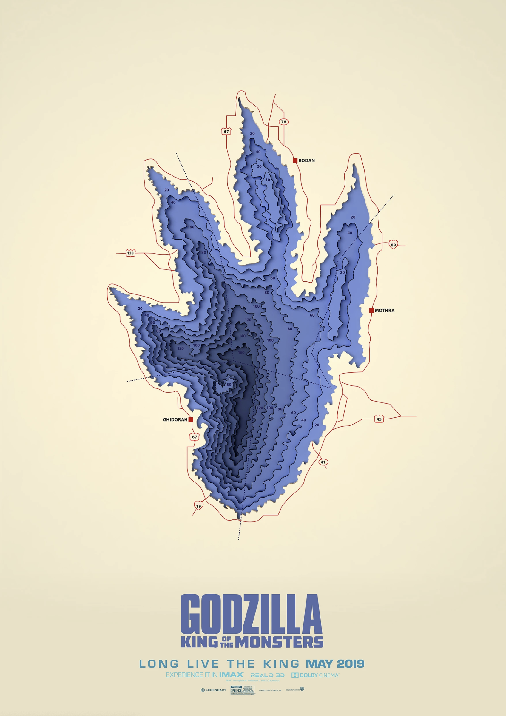
Kamen Anev
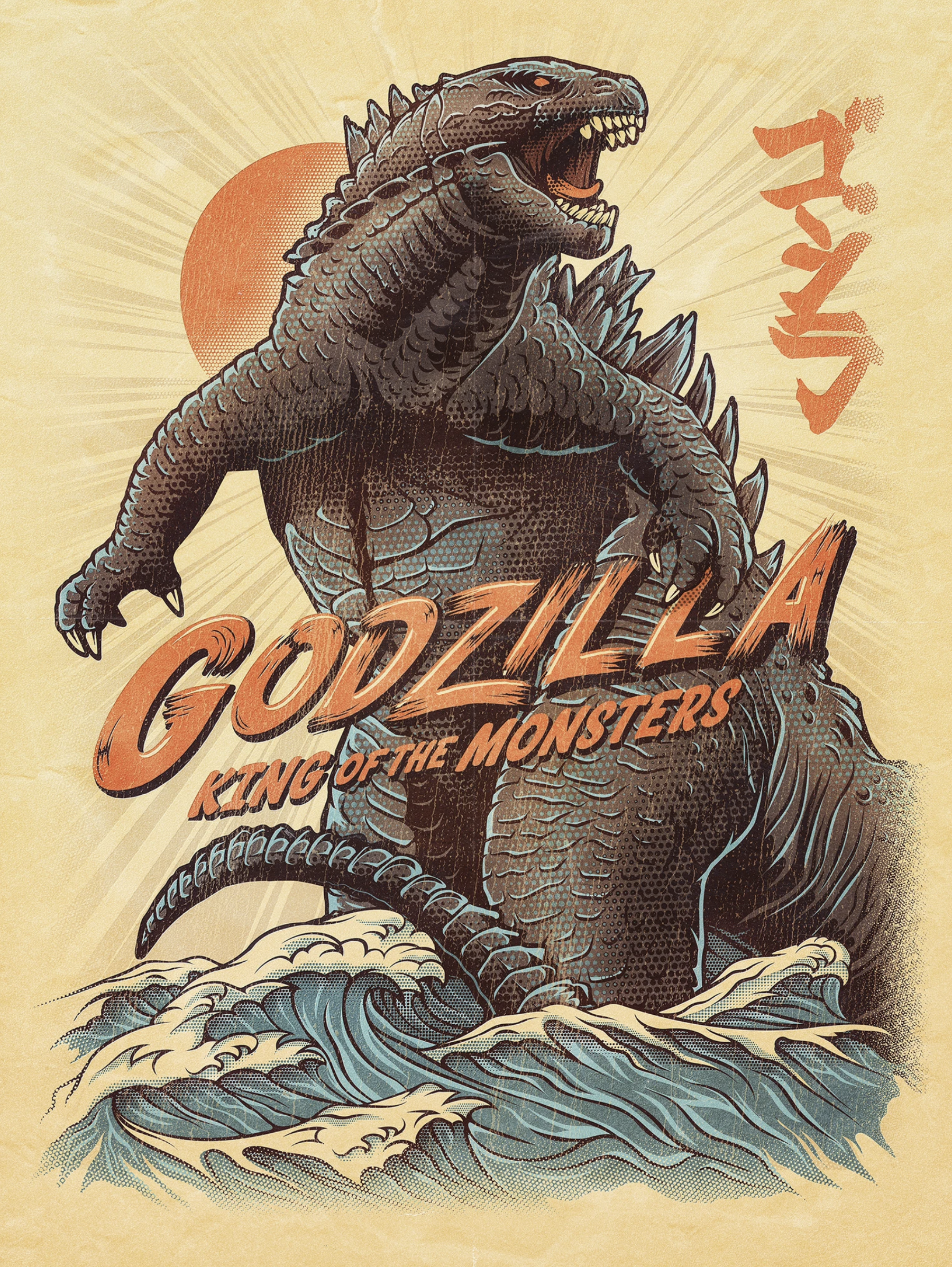
Joel Jensen
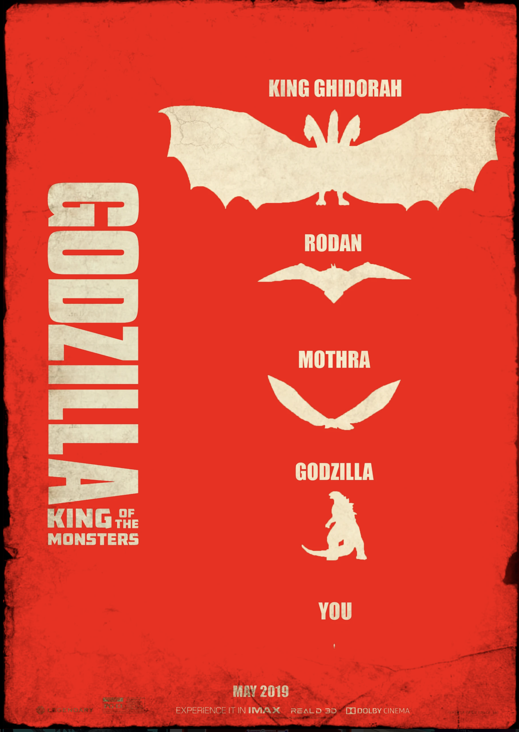
Selcuk Gucer
This is just a few of the Godzilla fan art designs he selected check out the rest and why he thinks they are strong poster designs in the full video tutorial here.
We hope you enjoyed this post and found it useful. Let us know which is your favourite design in the comments section below and thanks for reading!
In need of some more creative inspo? Try this post about the new time saving features which were introduced to Adobe Color.
Want to master design trends?
We think you will enjoy our online courses!

