A lot of the most famous logos designs which stand the test of time use geometric shapes at their core which makes them easy to remember and recognise without a wordmark and in a lot of cases even without color!
Don't have time to read? Pin it for later!
Everyday we see hundreds of logo designs on everything from our cereal packets to phone screens or on our favourite shoes. A lot of the time you may not stop to really think about what shapes they use and why.
The shapes which are used in a logo design have a big influence over the opinion an audience has about a brand/company. In extension they help us decide if we want to work with, buy or support the brand.
Different types of shapes communicate different messages to a viewer. That is why it's important to understand the target audience you want to appeal to before you start designing any kind of logo.
Geometric shapes are great because they can help create balanced, even and consistent designs. These shapes are easy to recognise and remember plus a lot of people (without even knowing) think of them as trust worthy. They are probably the easiest and most reliable shapes to work with in Adobe Illustrator.
Famous Logo Designs
What makes them great?
1. Adidas
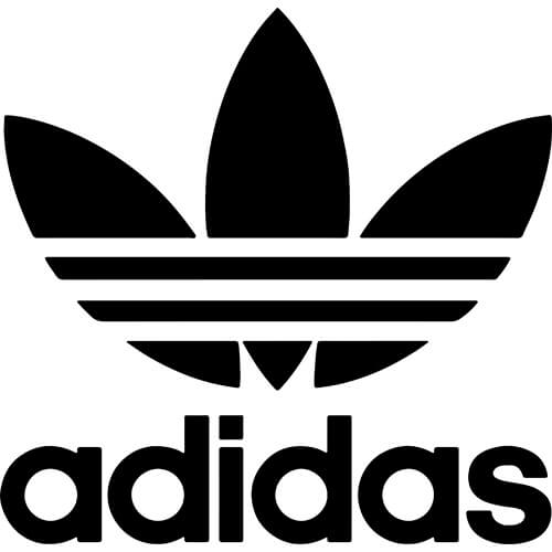
Original logo from 1971
Newer logo from 1997
No doubt you have seen both of these logos used on Adidas products and they are both still used by the brand. The original design quickly became more than just a sportswear logo but a lifestyle symbol.
That is when the logo on the right was introduced. This version of their logo is used on sport focused products.
The three stripes of the newer logo represent the mountain athletes need to climb to become the best at what they do. A lot of the time geometric shapes can be used to hint at wider ideas without being to literal.
Do you think the design would be as successful if they had gone for a mountain illustration? Not sure we would all want to wear that at the gym.
2. Adobe
Current Logo
Original Logo
Here is one we all know and love!
Adobe is a software giant and they have only changed logo design once! The current design is credited to Marva Warnok and it was derived from their original logo.
Adobe have many products, events and partners. This means a more 'generic' logo is necessary. It acts as a kind of umbrella for all business ventures.
The simplicity and timelessness of geometric shapes can come in really handy for brands who need a strong symbol which they can stick with.
3. Red Cross
The Red Cross is an international organisation present across America, Britain & Australia. The logo was designed in 1863 by Henri Dunant and is a sign of protection and safety.
The design is an emblem of a red cross with arms of equal length. This is probably one of the few examples of a logo which should be easy to replicate because it's used as a symbol of help and safety.
Probably not a challenge you are likely to come up against anytime soon but it's useful to know logo design is not all about complexity or individuality.
4. Twitter
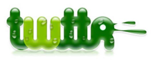
Pre-launch Logo

Current Logo
If you're ever worried you have not hit the mark with a logo design first time, just look at Twitters first try. I'm sure you'll feel much better.
This logo was never launched (probably for the best) but the idea was to create something which 'inspired youthfulness'. It didn't quite hit the mark but everything is a work in progress and it's a great example of the fact 'less is usually more'.
To reach its current logo Twitter has cycled through a few minimal designs with each stage the logo has become more minimal.
Logo designs can become too complex but try to keep it simple. You can be experimental with your marketing and advertising. The logo does not need to say it all.
MINI TUTORIAL
Did you know the Twitter logo is actually made entirely from circles? Yup pretty cool right and we have this one-miuntutorial below which will show you how to recreate it yourself!
5. Spotify

Spotifys logo made this list because of its softer approach to using geometric shapes.
The rounded corners and arch in the lines give the design a softer more friendly and very modern feel which works perfectly for the streaming service which needs to appeal to a very broad audience!
Don't feel restricted to using harsh corners or feel like geometric shapes can't feel more relaxed and fun if they need to. It's all about experimentation.
6. HSBC

Previous Logo

Current Logo
HSBC is one of the world’s largest banking organisations, with customers in 67 countries. They updated their look last year and dropped the classic Serif we were all used to seeing for a more modern San Serif.
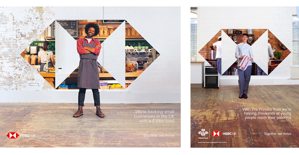
The geometric logo is used in more playful and experimental ways across their marketing materials.
HSBC's hexagon logo is so easy to recognise that a quick glance at one of these advertisements is all you need to recognise the brand.
7. Target
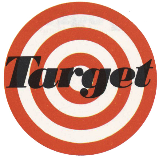
Original Logo
Current Logo
We could not leave off the iconic Target logo! Check out the retro and original version on the left. I have to say I think I might prefer their original design. Vintage typography is back and in a big way. Should they take a step back in time and bring this version back?
8. YouTube
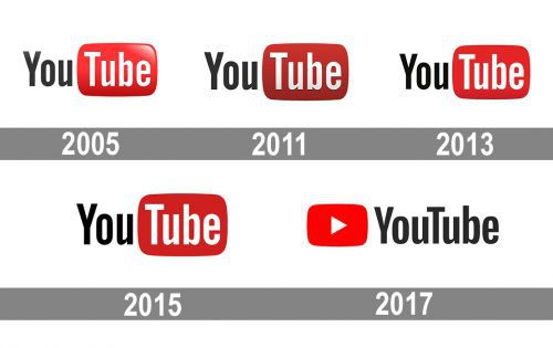

This has to be one of the most famous logos in the whole world. Do you agree?
The original marque was designed to resemble a TV screen which echoed the idea that YouTube was created to 'broadcast yourself'.
This concept has stayed with the brand as it has evolved since 2005.
The most recent update is the biggest change they have ever gone though it now means the simple TV element can be used separately across marketing materials etc.
This makes the logo easier to work with and even more iconic!
To sum up geometric shapes are likely to make memorable logos which will last. They are often used for tech and forward-thinking companies because their simple, smooth shapes make for a slick-looking logo.
Creating Logo Designs
Feeling inspired by our list? Get stuck in to this tutorial. It will teach you to start working with simple shapes to create a Celtic Knot design!
This tutorial is the perfect way to improve your Adobe Illustrator skills. Then you will be ready to get stuck into new Logo Design projects! Remember it is all about practise so once you have watched the video try the exercise a few times so the technique really sinks in.
UP NEXT
In this post we will share 5 inspiring dog logos of this year and discuss how to to nail your next logo design project!


