Superhero Movie Poster Ranking
Graphic designers over-analyse everything from the choice of a font in a menu, a layout of a magazine,
prints on t-shirts to movie posters. After all one of the best way of learning and improving your design is
simply by watching how others do it (or don’t)!
This month we have ranked 10 superhero posters and review them from a graphic design
point of view.
Watch our full video on Superhero Posters Ranking and learn what makes some superhero movie posters better than others. Martin will be judging them by their overall composition. The full video also showcases few of our favourite posters that did an amazing job in putting together a composition with so many characters but did not make it to this list!
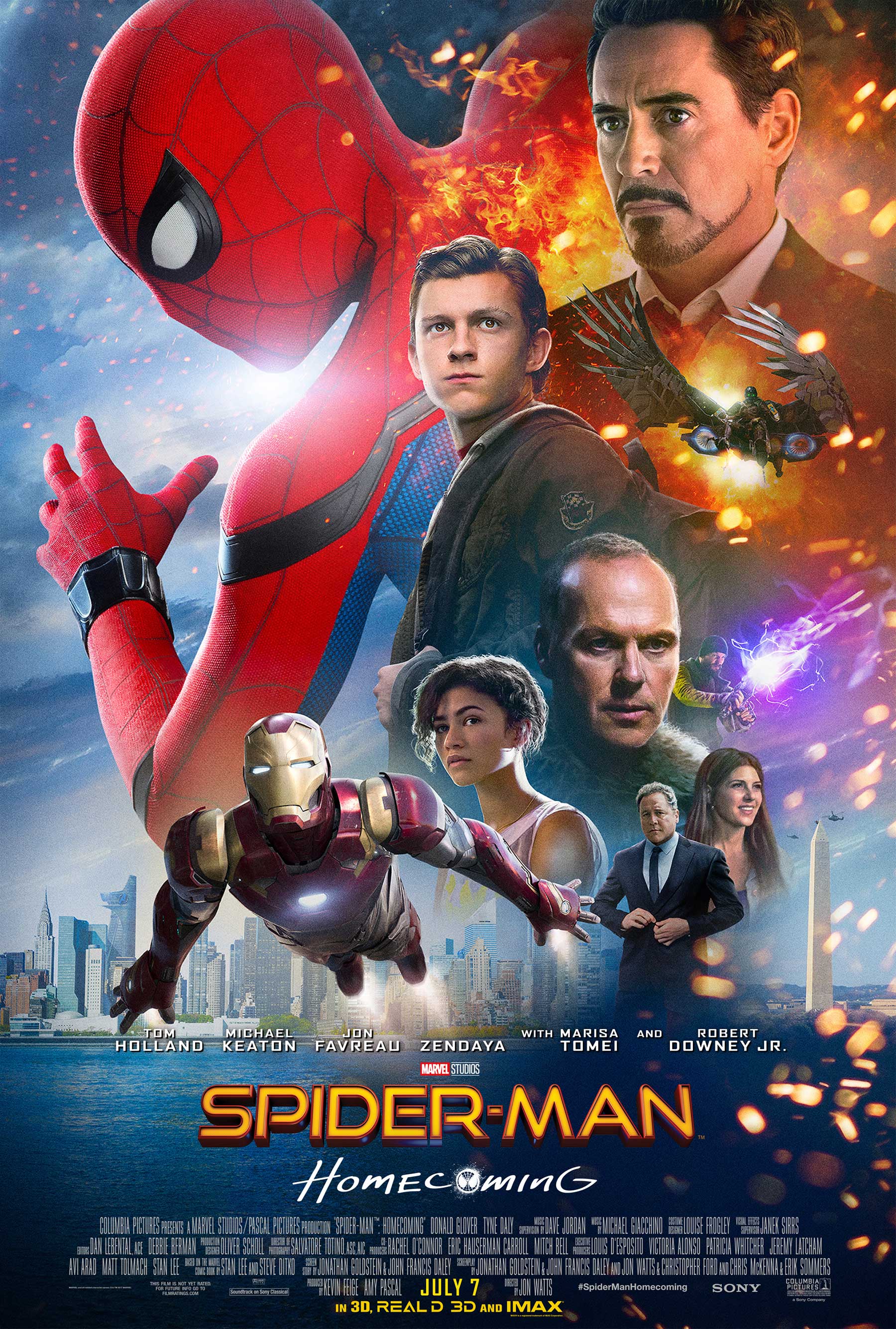
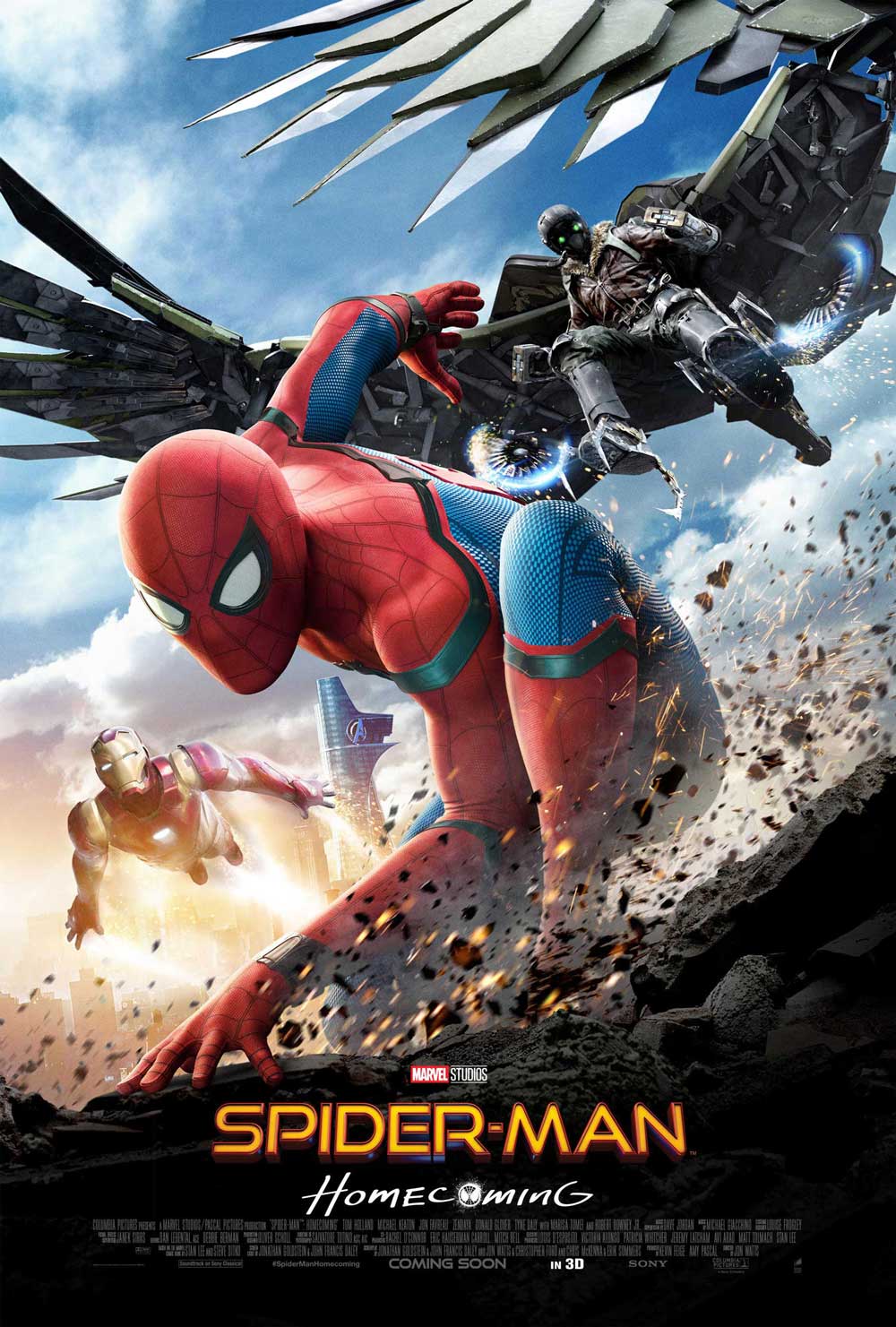
10 Spider-Man Homecoming
This was one of the most controversial Spider-Man posters and received a lot of criticism!
Overall the design is weak, the colours, balance and proportions are all off, There are too many characters, floating heads and elements that are cramped on the right side of the poster. This makes the design look noisy and weak.
Check out our video on What Went Wrong as Martin dives deep into the design mistakes! And then watch and learn how he improves the poster!
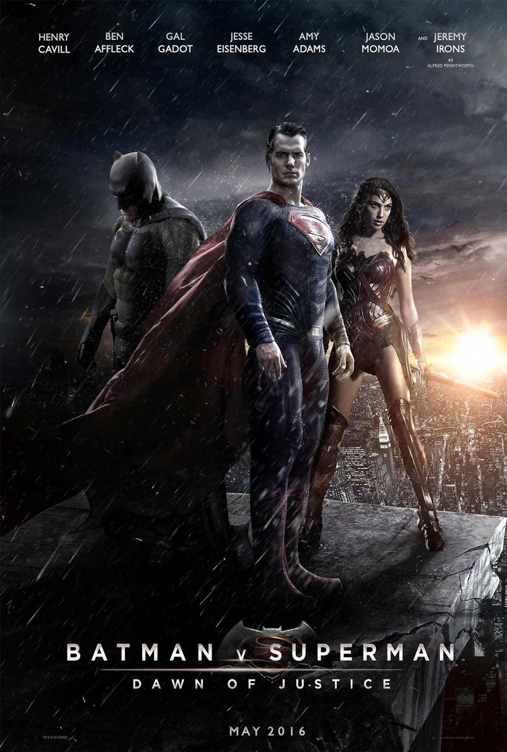
9 Batman V Superman
Dawn of Justice
The poster fails on many different levels,
it is very static, the poses of the superheros are very stiff and flat. The composition is actually okay but the perspective is really poor and the poster feels out of balance.
The colours of the poster are very dark and the important characteristics of the superheros get heavily lost. Batman’s silhouette is behind Superman’s cape and in addition, Superman’s cape is hardly visible.
The perspective of the poster doesn’t seem right. Wonder Woman’s sword is supposed to guide our eyes to the horizon however it is in a really odd angle. The characters seem like they have been stacked together on a background without giving much thought into it.
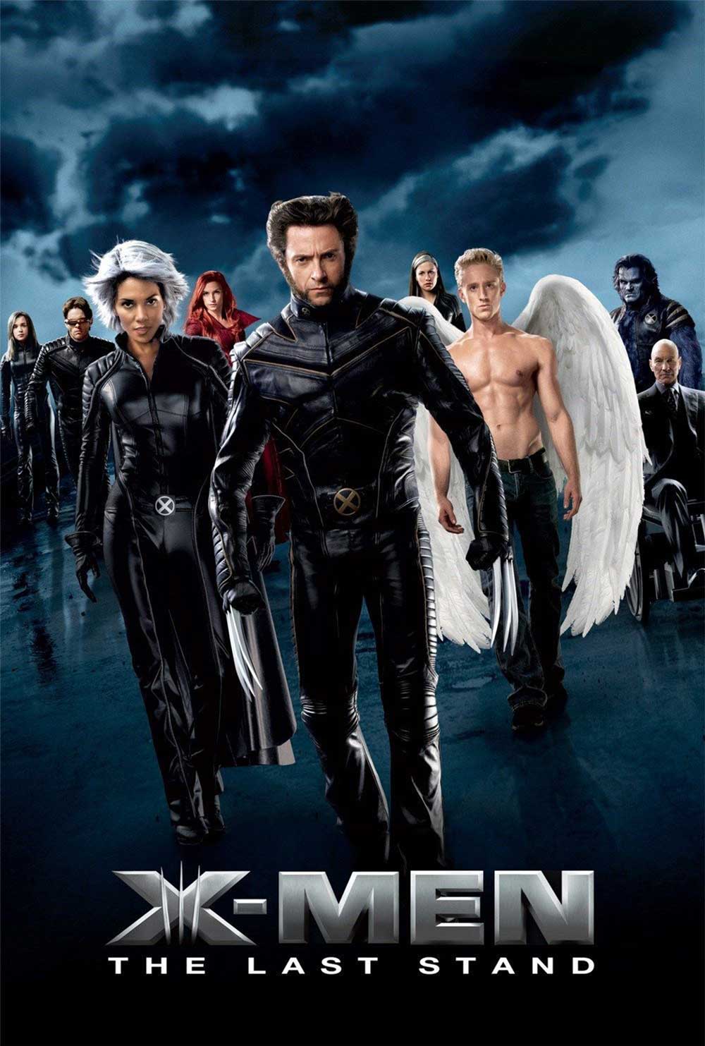
8 X-Men the last stand
This poster is very interesting, we like seeing
a lineup of characters looking and walking towards the viewers. Here we can see the hierarchy of characters with the main characters in the centre line.
This poster also has a little tilt in the composition to show movement. However,
from a design perspective, we have spotted few problems with the poster.
Firstly there are issues with colour and contrast, the poster is dominantly in dark colours but the character with the wings is too bright and becomes the focal point. Secondly in order to create a diagonal composition, the poster needs more of a defined angle, unfortunately, the poster still looks slightly static. And finally, the background looks very flat, boring as the clouds are not in same perspectives as the characters.
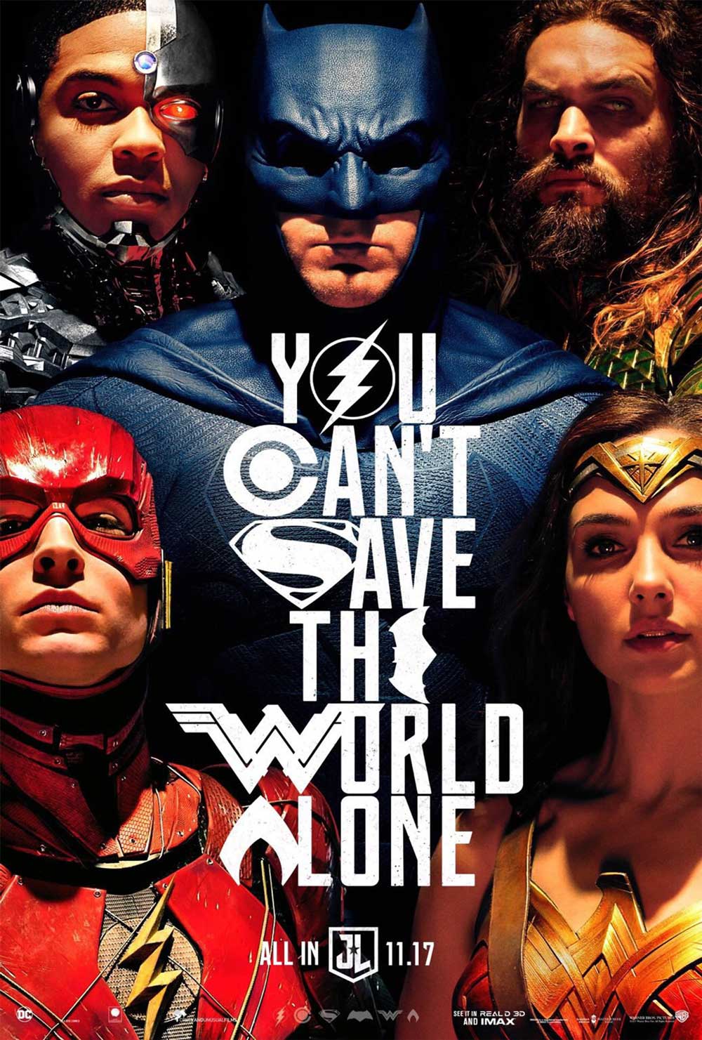
7 Justice League
This design composition feels slightly cramped as all the characters are squashed together which makes it look slightly claustrophobic.
There are also issues with the lightning of the poster as it favours the menacing effect on Batman’s eyes however it doesn’t work well with all the other characters especially for Wonder Women.
We are not a big fan of the typography either, the typeset looks really forced as characters of the word is replaced with the symbols of the superheros, it is very smart but looks overcomplicated.
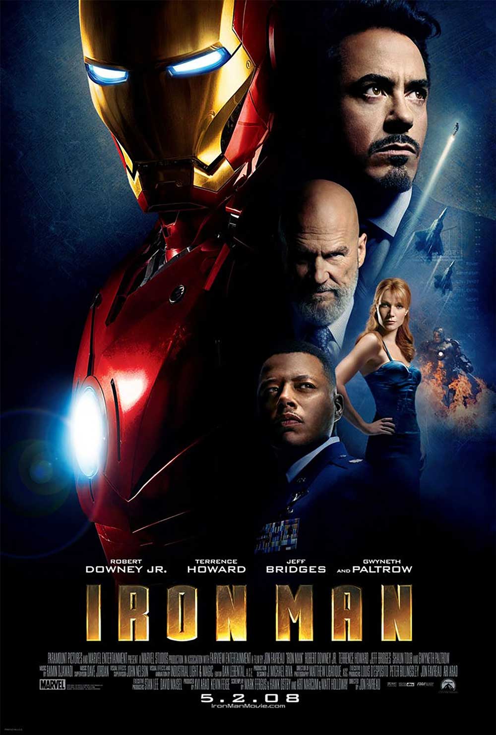
6 Iron Man
This poster is a good example of a great design composition, it has a strong sense of diagonal lines, the placement of the characters in the poster follows the Golden Spiral rules whereby the focal points are on the main characters, the Iron Man on the left and Tony Stark on the right.
However there are few things in posters that don’t quite work, there are few lighting issues and the big negative space in the centre of the poster creates a poor division between two sides of the poster.
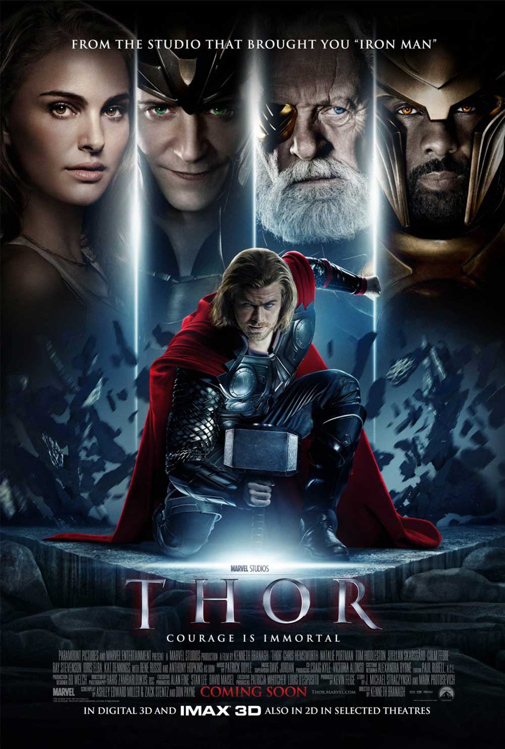
5 Thor
This is a great example of a poster that has a perfect superhero silhouette of the main character placed in the centre of the composition. It automatically creates a sense of action and it creates a feeling that ‘Thor has just landed on the ground’!
This is further emphasized by having shattered concrete slabs flying around and the vertical lines.
However the main problem with this poster is the upper third of the composition, we have the supporting characters too tightly cropped and slightly off proportions.
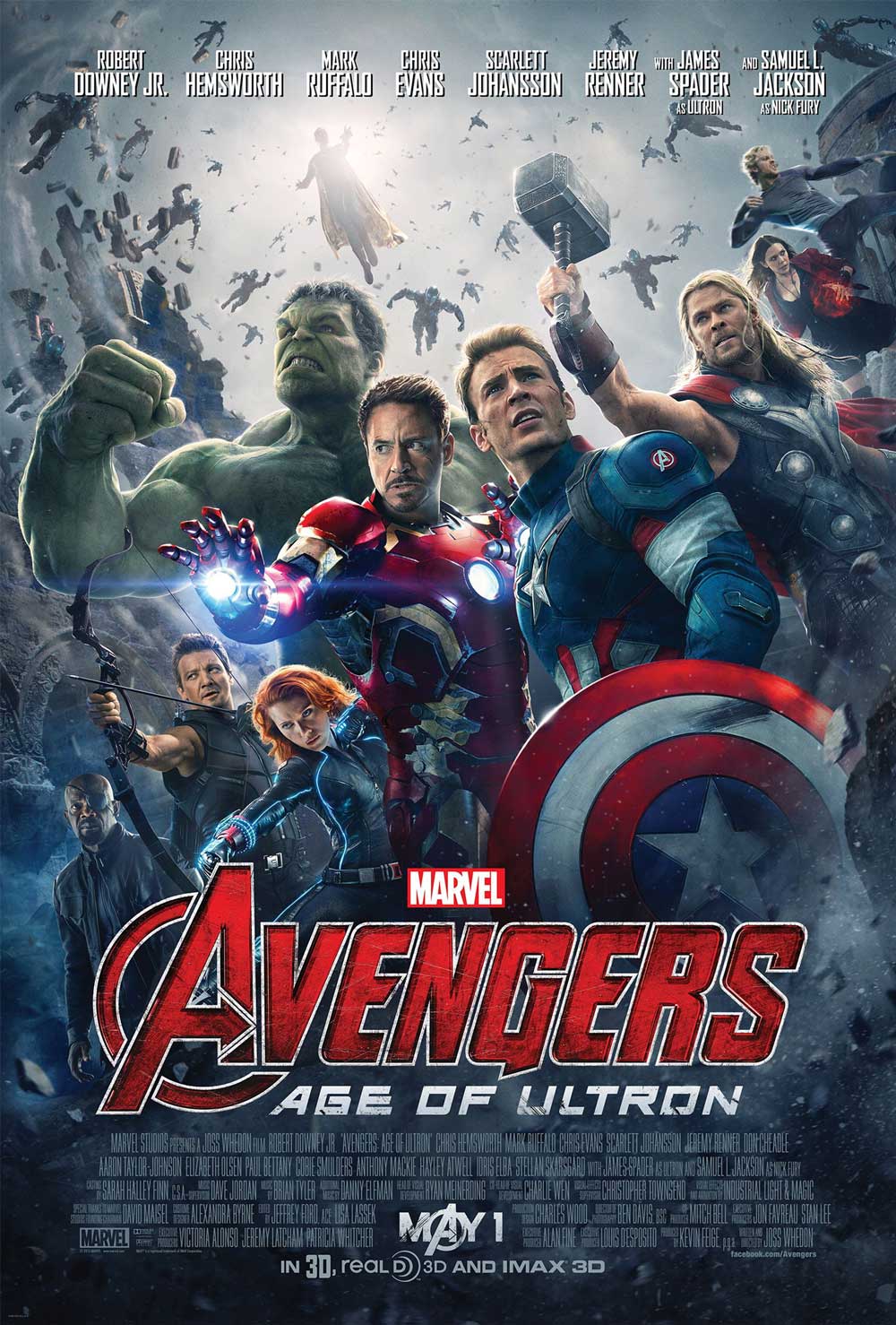
4 Avengers - Age of Ultron
This poster has a great circular composition. As you can see it has a very tricky circular perspective of characters in action from below which is a brilliant way of adding depth.
Notice how details like Hulks arm and Hulkeye’s bow is further emphasising the curved composition which is only broken by key details like Thor’s hammer.
Other than just a few little alignments issues, overall the placement of the characters work in harmony, the colours work well and we love the bold typography.
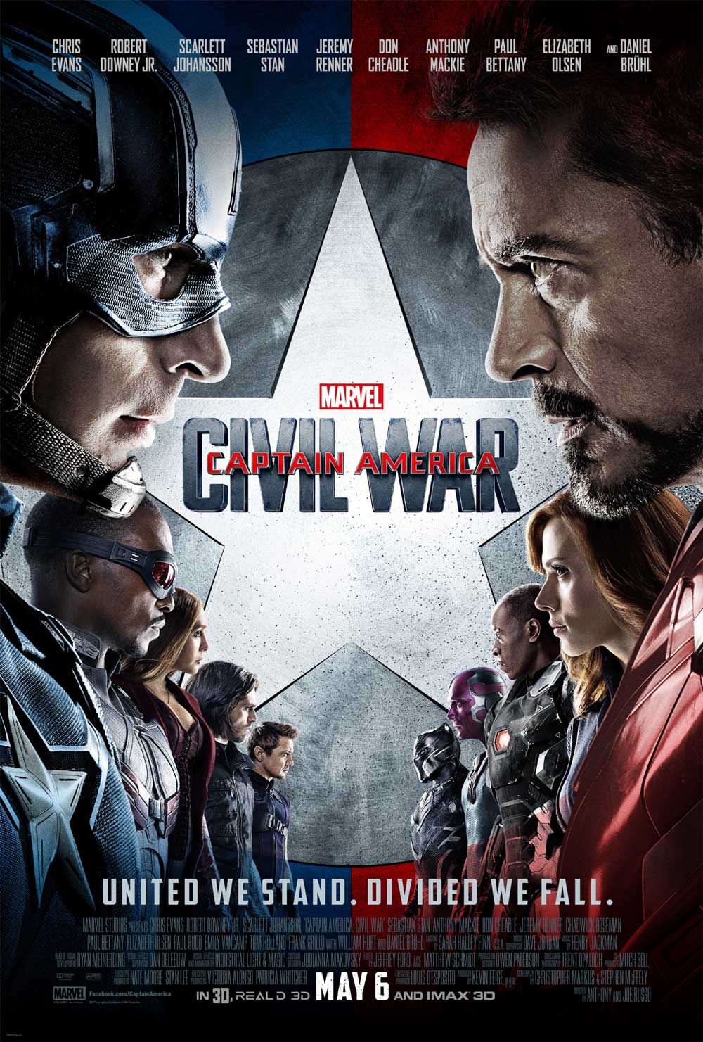
3 Captain America Civil War
This poster is an amazing symmetrical composition showing balance, complementary colours, hierarchy and contrast.
We have the most important characters in large size to the less important ones in the background. As a graphic designer, you can clearly see that the composition follows the Golden Spiral rule, having the focal points equally on Iron Man’s eye and Captain America’s eye.
We also love that the shield of Captain America is used as a backdrop to place the typography.
It is a very clever, simple composition that is very effective.
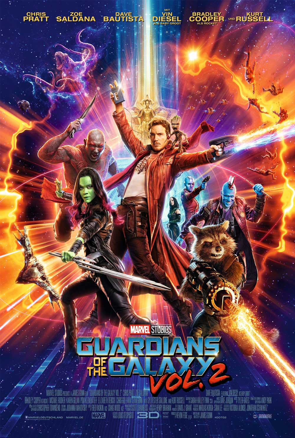
2 Guardians of the Galaxy vol.2
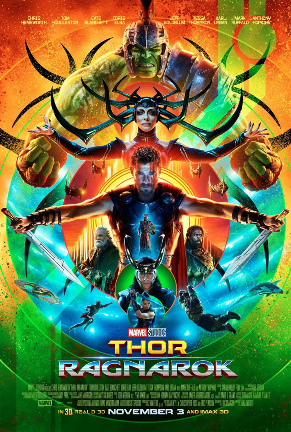
1 Thor - Ragnarok
This is our overall winner from a graphic design point of view. The superhero characters are all placed in circular composition and the design has a lot of hidden messages to it (which I am sure Thor fans will understand).
The design has nine rings in the composition that be interpreted as the nine world of the Scandinavian folklore where Thor superhero is based on.
If you look at the placement of the characters, you can also see a tree outline, which references to the tree of life. Other than the hidden connotations, we love the retro 80s design style, use of colours and the strong poses of each character.
Interested in finding out more on our courses?
We have covered everything from Adobe Photoshop MasterClass, Adobe InDesign MasterClass and Adobe Illustrator MasterClass. You can also check our daily free tutorials on youtube channel!


