Everybody loves dogs right? Or maybe you just want to discover some great new logo designs. Either way in this post we will share 5 of the most current dog logos this year.
This list isn't in any particular order but we would love to hear which logo design is your No.1 choice in the comments below. Let's jump in.

Don't have time to read? Pin it for later!
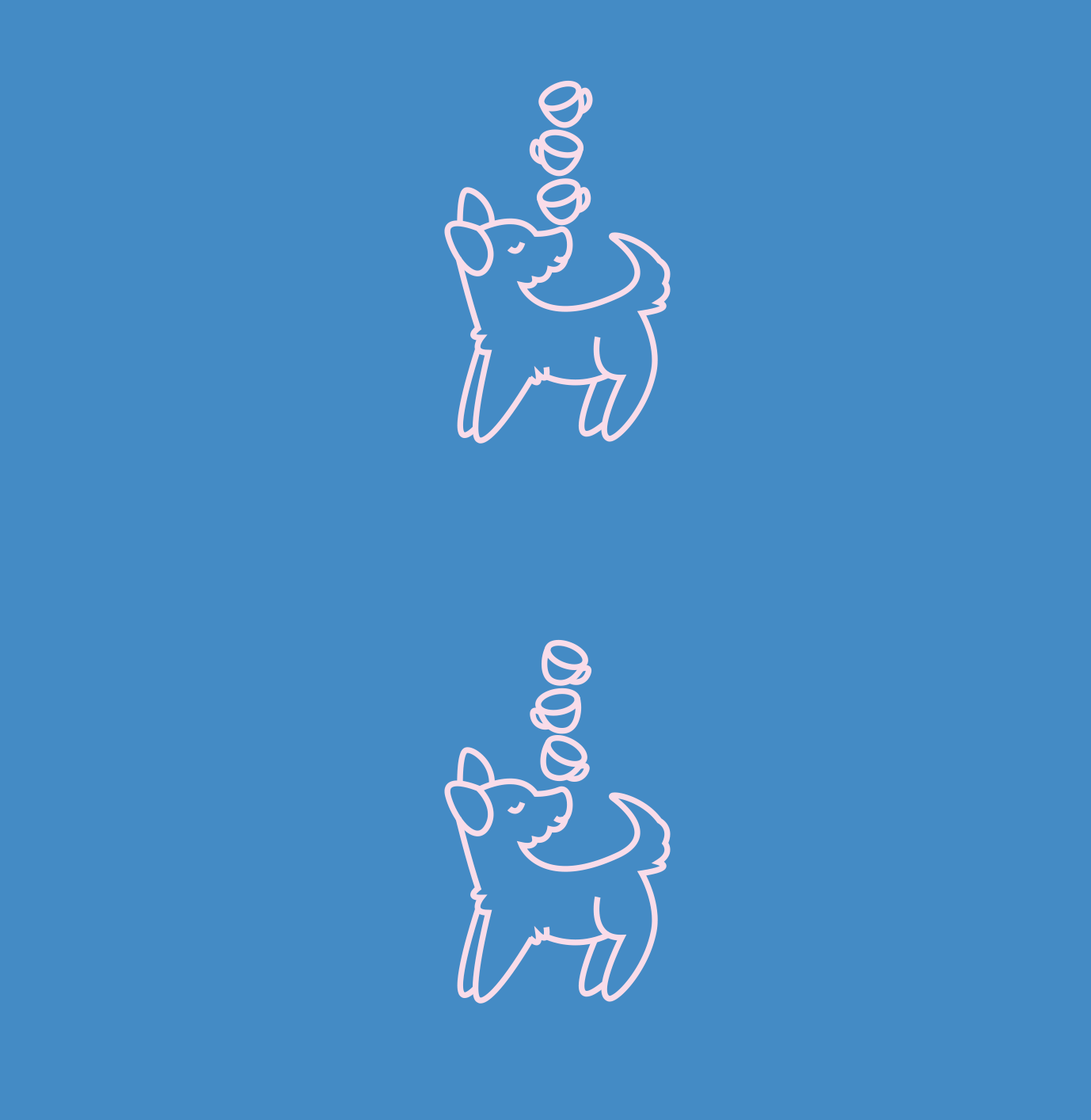
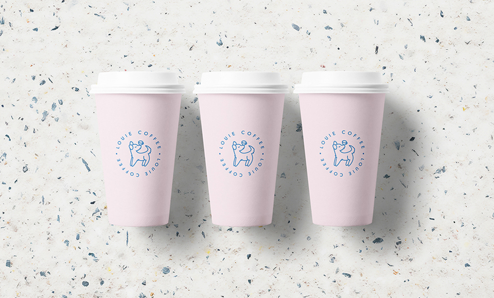
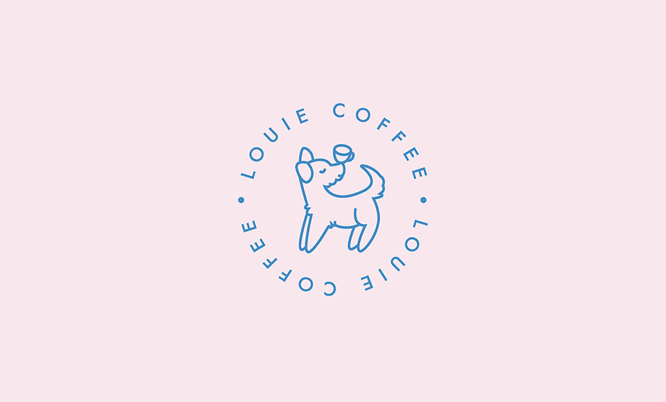
The combination of Dogs and Coffee is hard to get wrong but this design absolutely nails it.
It was created for an independent coffee shop and the business of course was named after a well loved pooch called Louie.
Using familiarity is not always a good idea in logos but here it works. The logo has a sense of warmth and familiarity which is useful for small independent businesses. Especially cafes. Link to full project.
Why this is a good logo:
- The name of the business is clear and easy to read.
- Simple Animation has been easily introduced which is currently a popular trend for logos.
- Text frames the illustration making for a balanced and visually pleasing composition.
- The design uses a simple line art style which looks great big/small and is easy to apply elsewhere.
This is not strictly a Dog logo BUT House of Paws is a Pet Center. So I think we can get away with it.
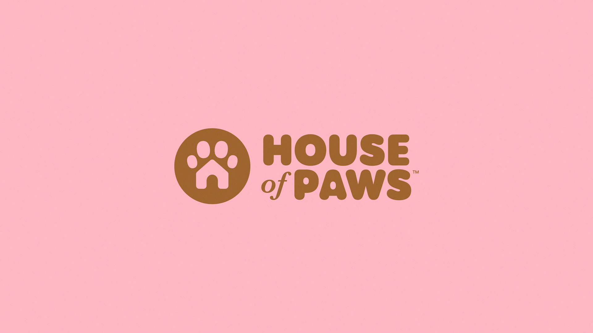
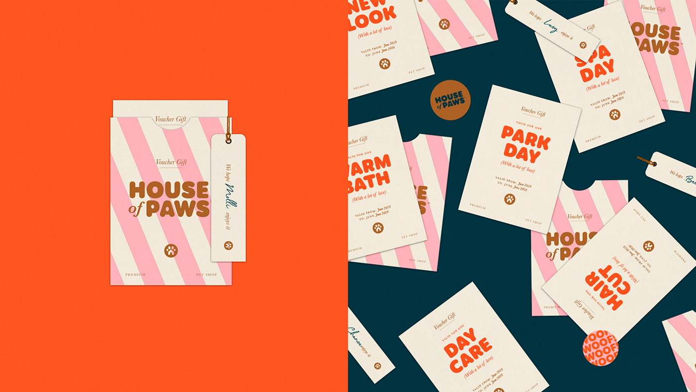
This logo made the top 5 because of its playfulness and flexibility. It has both a wordmark and illustrative icon. These work together to form the entire logo but work just as well, if not better when used separately. The logo can be used playfully across marketing materials, like in the image above and the designs never look same or boring which can be a common problem especially with more corporate healthcare businesses like Kennels or Vets.
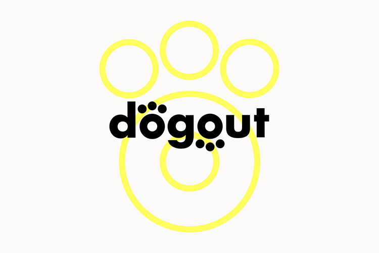
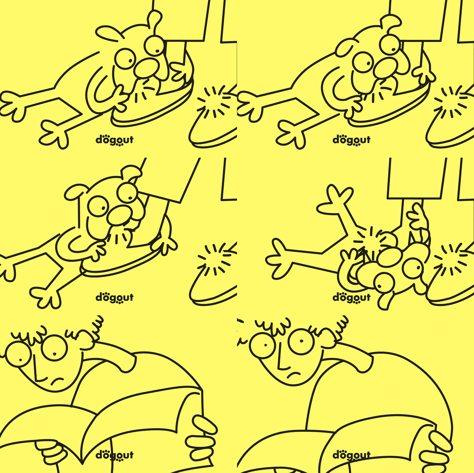
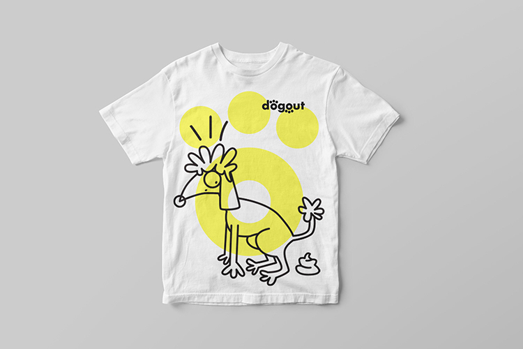
Dogout is an dog-friendly map of Europe you can download from the App Store. The name and the idea for the business are both clever and they have a logo to match.
Why The Design Works:
- It can easily be incorporated into other more playful/fun designs in the wider brand.
- The marque fits the clean vector style we expect from modern online applications.
- The color choice is bold and grabs attention which is important it can be hard for apps to stand out.
- There are plenty of ways to use the logo across marketing materials and it's not to static.
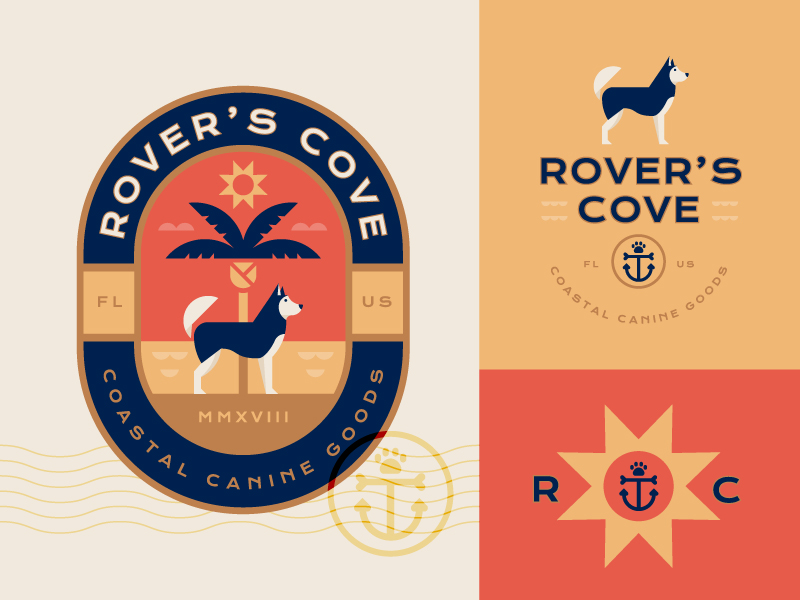
This approach to logo design is bang on trend. Instead of a designer making one core logo they make
a logo system.
Just like you see above, each design uses similar elements and a similar style and any of the designs can be used to represent the brand.
Why The Design Works:
- Great combination of colors.
- Clean style which works on and off screen.
- Balanced and even compositions.
- Clear, easy to read typography.
- Designs would look good very big/small.
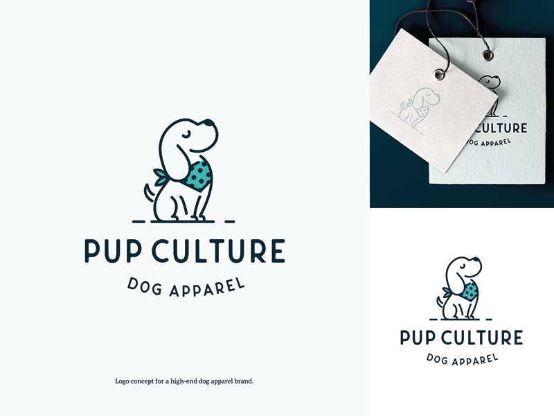
This logo caters for a whole new clothing industry. Dog apparel...who knew?
The design uses one of the biggest trends in Illustration and Icon design this year. Using thick strokes/lines which are broken at points in the design which leave small white gaps.
Why The Design Works:
- The icon uses a contemporary style of Illustration.
- Overall design includes a nice splash of color which helps draw attention.
- The logo has a simple, clear type
lock-up. - Its friendly which suits the products and wider business.
BONUS FEATURE
Making contemporary and current design work is so important BUT let's take a second to appreciate a timeless logo design.
Finish on a classic!
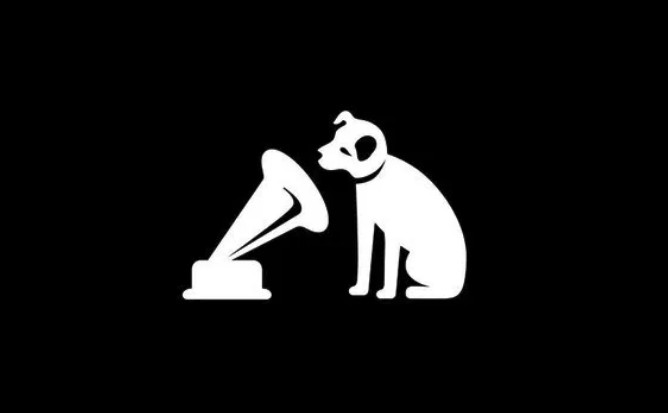
This logo for His Masters Voice is one of the biggest trademarks in the recording industry.
It's actually been nicknamed 'The Nipper' where a small dog named Nipper listens to a Gramophone.
What makes this logo timeless:
- Logos that work well in black and white as they do in colour. When you are creating a logo, colour should always come last!
- It is a universally recognisable silhouette. Anyone, anywhere can recognise the marque and it means the same thing now as it did 20 or 30 years ago.
- A little personality goes a long way. The dog looks curious and everyone can relate to that feeling when you first hear an amazing song.
Feeling inspired after discovering all that great work? Perfect because we have this handy tutorial where Martin Perhiniak, YES Founder and Adobe Instructor reviews dog logo's designs submitted to a 99designs contest.
99design is a great platform for any designers looking to improve and take part in real client projects!
We are proud that one of our very own students won this competition after joining our Pro Membership program to improve his design skills. A big congratulations to Danta Griffthy!
Logo Design Review Tutorial
What you will learn:
- What goes into creating a competition winning logo.
- Learn from 10 logo submissions from other designs and find out their strengths/ weaknesses.
- Discover why legibility is essential to a successful logo design.
- Find out how to implement the idea that 'less is more' and why this is so important.
- Get some tips on how you can stay on brief when working for a client.
If you do decide to make your own logo (dog related or not) we would love to see. Post it up on social media and use the hashtag #yesimadesigner so we can find your creative work!
Thanks for reading , we hope you found this post useful and are feeling inspired to create some awesome logo designs.
For more design trends inspiration you may like this post on design trends of 2019 here.
LEARN ADOBE APPLICATIONS
from Adobe Certified Instructors and industry professionals


