Learn more about Character design, Illustration and telling a story through creative work in our latest YouTube livestream.
Which is now available as a video on our channel.
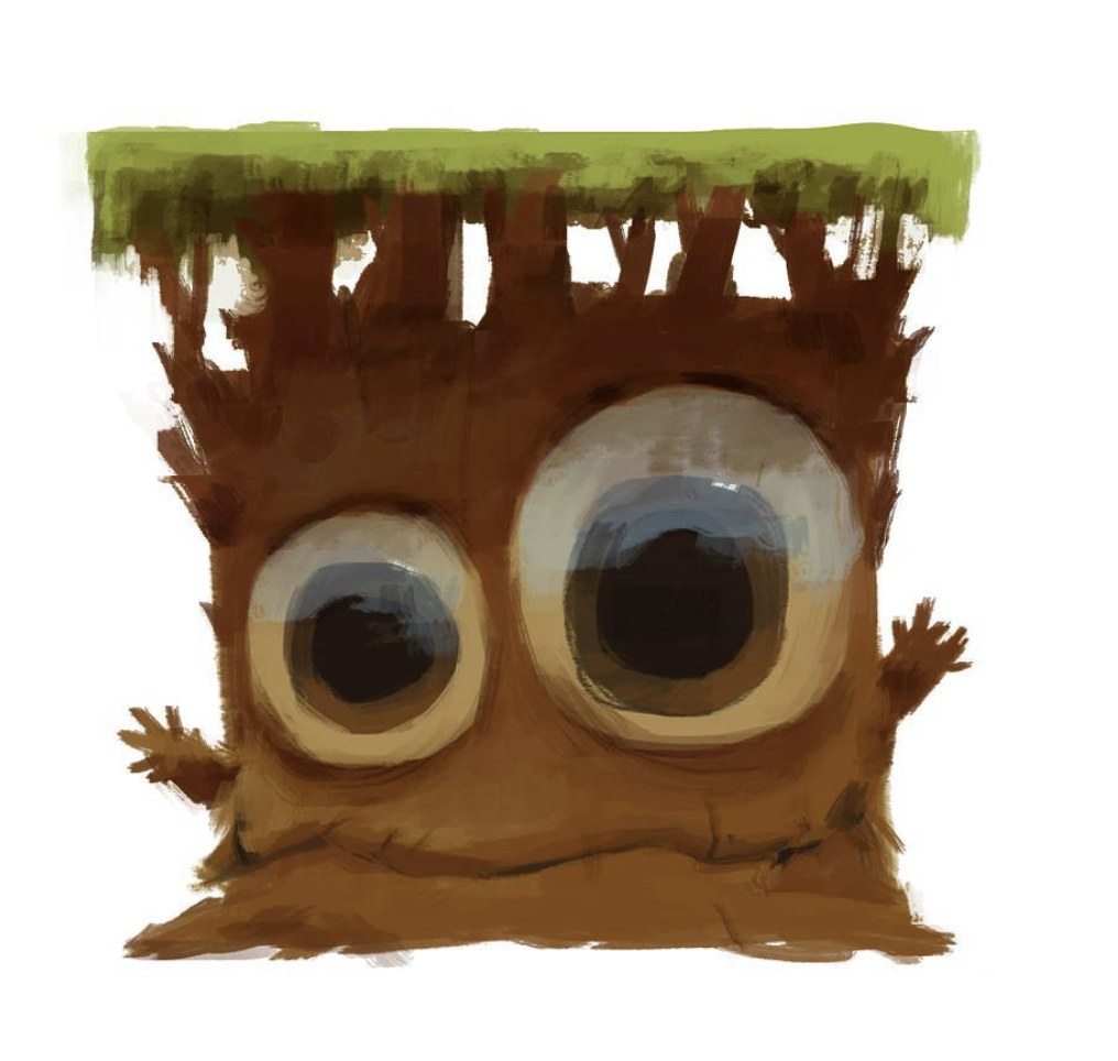
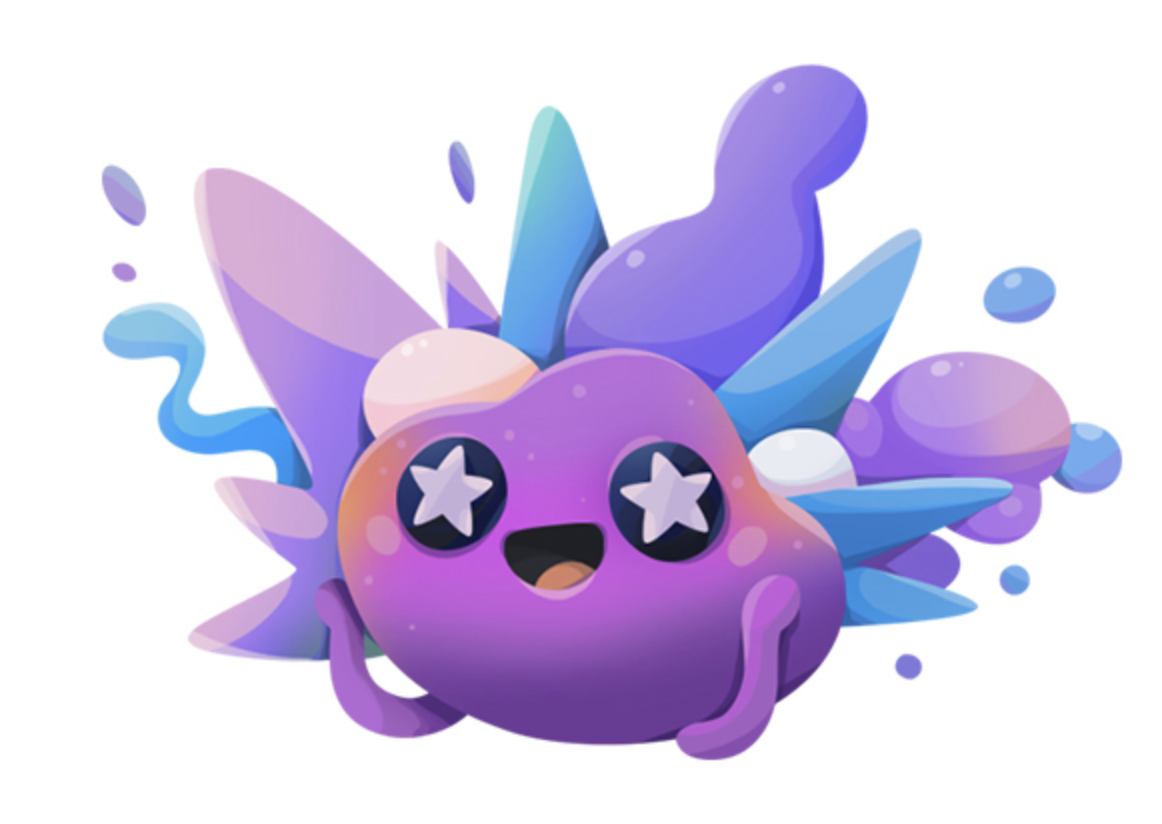
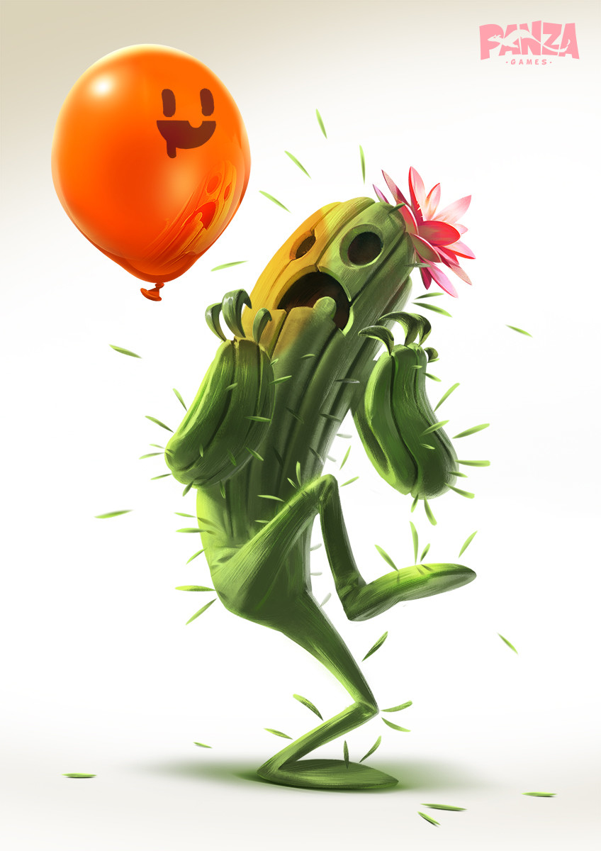
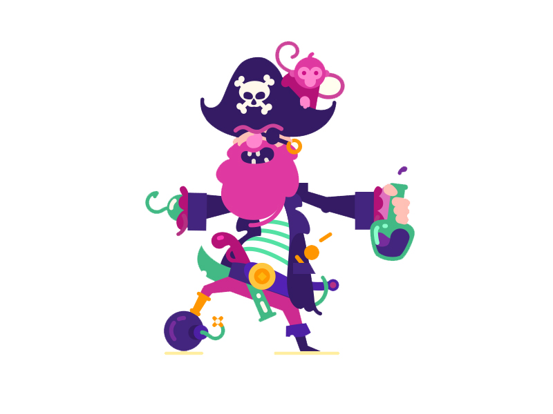
In this video Martin walks through 10 essential principles to Character Design. Once you understand these principles you will know more about what makes a good or bad character design as well as what you should be focusing on when creating a visual style and personality for your own characters.
Understanding the theory behind this topic will make it far easier and way more fun when it comes to actually sitting down to draw or create!
If you would prefer to keep reading learn about the main points Martin makes and see some examples of the work he talks about in the video.
Summary
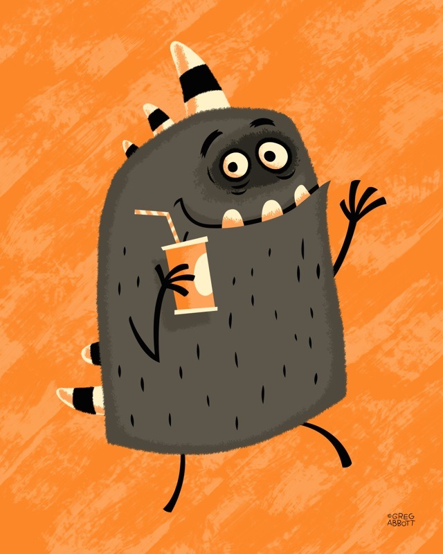
1. Tell a story
Stories are what spark our interest and help us become invested in a Character. Think of film plots and games. We become intrigued by a characters story and personality traits and this also applies to illustration. Even the most simple stories make a character more relatable and memorable.
2. Shapes and lines
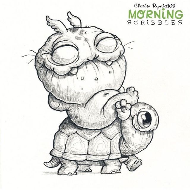
A lot of very successful Character designs are made up of simple shapes used very effectively. Each shape you choose has its own meaning attached to it. For example we see round shapes as soft and approachable and more angles shapes as dangerous and shady.
It's important to choose the right shape for the personality or story you are trying to create around a character. If you have an extremely friendly character which uses lots of jagged harsh lines and shapes the audience may not connect with the character the way you intended them to.
3. Silhouettes
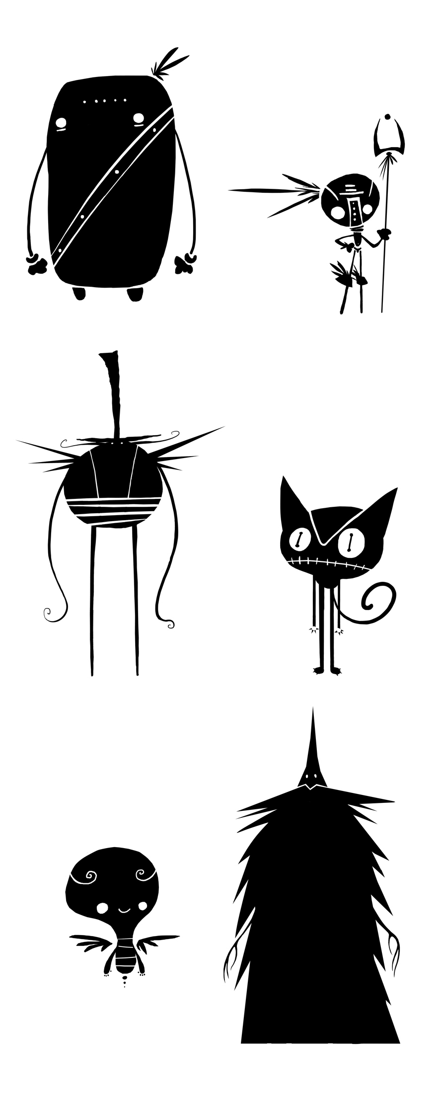
As humans we have very clever eyes, Martin goes into more detail about just how clever in the video but safe to say they are pretty amazing and can immediately recognise familiar characters by just their silhouettes if they are well designed and use the right shapes and lines.
If you remove detail from your character and test it out as a silhouette and still looks recognisable that is usually a sign of a strong design
4. Proportions and exaggeration
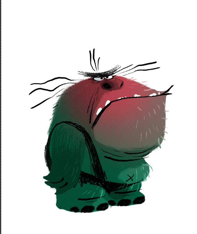
Using outrageous proportions or exaggerating the length and size of body parts, even with smaller details like fingers can really help to build the personality of your character. You can make them appear stronger or clumsy even more evil all through exaggerating features of their physical appearance. Learn more about using the right kind of proportions for the right character in the video.
This is also true of their walk and movements if you were to go on and animate the character.
5. Expression
The first thing we tend to look at when we look at a character is it's eyes. Real life human and animal eyes are full of expression and a good way to get an idea of what someone is thinking or feeling. So naturally we look to the eyes in an illustration.
Another good tip is to exaggerate an expression so it really comes across, have fun with how the character is feeling and don't make the audience work to hard.
6. Posture and stance
Thinking about the way a character is stood or how it holds itself is another way to communicate more about its personality and to help you to tell a story.
You can make characters look strong, imposing, frightened, confused, angry etc just by considering their stance.
7. Scale
Knowing the scale and size of a character is important and it can be hard to imagine the size of especially more abstract designs. This is where introducing other objects such as trees, houses or desks and plants can help us to understand hoe big the character is to these elements we are familiar with.
8. Color
Using colour can help to set the mood of a character, it can make them look more serious or fun. Using the right shades for skin tone, fur, clothes etc also helps the viewer understand what kind of character they are looking at and even if it if it has a friendly or not so friendly personality.
Remember using a more fun, out there and unrealistic colour palette will make your character more fun and playful.
9. Shading
Shading can be as complex or as simple as you like. It really depends on how realistic or detailed you want a character to look.
You can really play with the style and final visual look of your character when you are thinking about shading. It's a way to introduce some tones/tints of the existing colours you have used and generally to put your own stamp or slant on a character design.
Using some sort of shading usually makes your work look more polished and professional. Have a really good look at how other illustrators go about it and try out a few different techniques.
10. Texture
You don't always need to use texture in Character illustration , if you are going for a clean vector look it might be better to leave it off. However if you would like your illustration to feel more organic and natural introducing some texture might be the way to go.
Again it's good to look at how others are using texture and trying out a few different effects in the Adobe applications to help develop the style of a character.
Check out the full video to also see time lapses of Martins own Character Illustrations a topic he taught at Adobe Max late last year.
Are you feeling inspired and want to become an illustrator? You may want to check out our viral tutorial on Learn to Draw Anything with Adobe Illustrator CC
Thanks for reading!
Want to master design trends?
We think you will enjoy our online courses!

