We get tons of questions from aspiring creatives asking how they can become better as a graphic designer. One of the fastest ways to get better at graphic design is simply by analysing other people's work and finding ways to improve it.
Watch our first video from our YouTube series on becoming a Better Designer below to move straight to the tutorial!
In this post, we will show how a notebook cover design created in Adobe Illustrator by one of our Pro Member Student improves using some simple compositional techniques.
Analysis of the original design
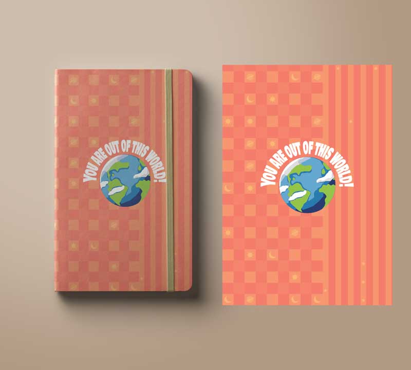
Before we get started here is the original design submitted by our Pro Member student for Sabiha Rishan!

- Great use of fun, a positive phrase that has no gender restrictions
- Space theme, popular for targeted age group
- Complementary colour scheme providing contrast and harmony
Improvements of the original design!
Now let take a look at three alternatives examples created by Adobe Instructor and Graphic Designer Martin Perhiniak!
Example 1

Play around with the position of the design elements. By positioning the focal point in the optical centre, it helps the design to feel balanced while adding interest.
Divide up the typography into two separate lines, so it reads cleary! You can reduce the font size less essential words such as 'of.'
Align the text using the centre of the illustration! (in this case, it will be the globe illustration. To learn more about this technique - watch the full video tutorial
Example 2

Example 3

Get creative with typography. A great tip is to use the Touch-Type tool that allows you to select individual characters and adjust the scale, rotation and position.
Introduce an element of fun by creating less confined illustrations and allow parts of an image to spill out of the frame seemingly!
Emphasise depth to help create a 3D effect. Position some of the text in front of or behind the illustration.
Experiment with the scale of the main illustration. The scale is a significant part of the composition, so don't be afraid to increase the size of the image – you don't have to show the whole picture.
Make sure you check out the video for full tips and techniques!
Conclusion!
As with any designs, try to create multiple versions. It's essential to test out many styles and different design routes. This will be important when working for a client, but equally, it makes it easier for you to see what works.
UP NEXT
Learn how to create and modify your own Geometric patterns in Illustrator

Are you interested in becoming a Graphic Designer or Illustrator?
Join 10,000+ creatives and subscribe to our FREE Graphic Design Survival Kit newsletter.
You’ll get instant access to our resource library and feel well equipped to make that next big leap in your design career.
LEARN ADOBE APPLICATIONS
from Adobe Certified Instructors and industry professionals


